
The widely accepted incorrectly colored version of the Nordiques proposed jerseys
We hit pay dirt on Thursday when the creator of the widely accepted image himself posted his account of how the image came to be.
I had to log in to reply to this (I haven't been a regular reader or contributor here for nearly ten years).
I drew the famous "incorrectly coloured" jerseys in Adobe Illustrator based on a black and white photo scanned from a newspaper. I knew that navy was the main colour but completely guessed on the shades of the others. When I drew them over a decade ago THERE WAS NO GOOD INFORMATION ON WHAT THE ACTUAL COLOURS WERE so perhaps we could tone down the rhetoric about drawing them "with no regard."
I did post them on this board but I did not intend for them to become the definitive image of the unused Nordiques jerseys.
As far as incorrect graphics goes, I'll admit it is frustrating to see logos, etc. that are rendered incorrectly if logos and crests are your "thing." I tried for years to get the Detroit Free Press to stop using my incorrectly drawn Red Wings logo but to no avail.
The internet is forever, kids. Try not to read too much into it.Armed with this new information we have now gone back and edited our original article to reflect the facts behind the creation of the incorrect image and how those colors were based on an educated guess while working from only a black and white image and no further description of the other colors at the time. We also apologize to the original artist for any offense taken by any terms used in our original story.
Since the creation of that original artwork, which we must point out was entirely accurate otherwise, a color photo of the Nordiques proposed jerseys was published, which illustrated the correct black arm stripes as well as the generous use of teal in the crest, striping and customization of the numbers.
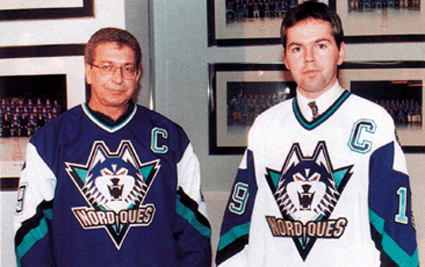
The only known photo of the proposed Quebec Nordiques jerseys
Using the above photo of the actual jerseys, here is what the correct version of the Nordiques unused jerseys should actually look like - a much bolder, brighter and higher contrast look which uses the trendy colors of teal and black that were all the rage in the mid-1990's rather than the incorrectly colored, widely accepted version with it's dull, muted colors found so commonly online.

Please feel free to spread the word and save the above image, as well as using it wherever and whenever you find the need, especially when you can use it to replace the incorrect version so commonly found online. Email us, and we'll even send you the larger version we created or download it from this address.
In addition, here is the correctly colored logo of the husky dog, of which the full size version is available by clicking here.
Special thanks to Libertyernie2 for their help in spreading the word by uploading the correctly colored images to the Quebec Nordiques page on Wikipedia. We appreciate the efforts!
We also have to take a moment and share with you another concept from the SportsLogos.net forum we discovered while researching or original post. Forum member GoNordiques posted his version of the new Nordiques logo, and it's excellent.

Isn't that amazing? We of course like the use of the accurate colors in addition to the graphic design! For more of Jesse's fine work, please check out his website here.
But please remember, sometimes the things you see online, regardless of the page you saw them on or how believable they appear, just because you saw it on the internet, doesn't mean it's a fact. Be diligent and aware and do your homework.


No comments:
Post a Comment
We welcome and encourage genuine comments and corrections from our readers. Please no spam. It will not be approved and never seen.