History of Jersey 83-93 Banner sm photo History of Jersey 83-93 Banner sm.jpg

Saturday, August 15, 2009

1999-00 Phoenix Coyotes Keith Tkachuk Jersey

Curious, Weird and Ugly™ makes it's second trip down to Phoenix, this time to examine the Coyotes primary home and away jerseys.

When the Winnipeg Jets relocated to the desert the team acquired a new nickname in a "name the team" contest, and as a result of "Coyotes" being selected the winner, a complete overhaul of the team's identity was undertaken. Gone were the familiar blue, white and red colors of the Jets and we now had jerseys that were black, brick red, hunter green, sand with sienna and purple appearing in the new geometric coyote logo, one of the oddest primary logos in NHL history with it's blank stare which did not inspire either intimidation or attraction.

The jerseys featured a southwestern inspired ornate trim pattern used on the striping of the jerseys, appearing on the sleeves, waist and even the collar. I can see where they were going with this idea, but it just seems too busy and too much of it, especially when you consider the angled sleeve stripes only serve to make the length of the stripes on the arms longer, and thus busier still. Then factor in squeezing the pattern onto the collar and you have one of the most complex jerseys in the league at the time.

I rather liked the sand color names and numbers trimmed in brick red used in conjunction with the black jerseys, but never embraced the font itself. The numbers were narrow overall, had some oddly proportioned digits, the 2 and 5 in particular. Also consider the inside corner of the 7 is pointed, while the outside is rounded. The names also had the occasional unexpected curved letters, such as the rounded E's to keep the viewer off balance.

These jerseys were used from 1996-97 until 2002-03 when the team underwent a branding overhaul which included a new, much more realistic logo and a much needed streamlining of the team's color palette, with the hunter green being dropped from the jerseys and sienna and purple disappearing from the new logo, which went from six colors to three when compared to the previous logo.

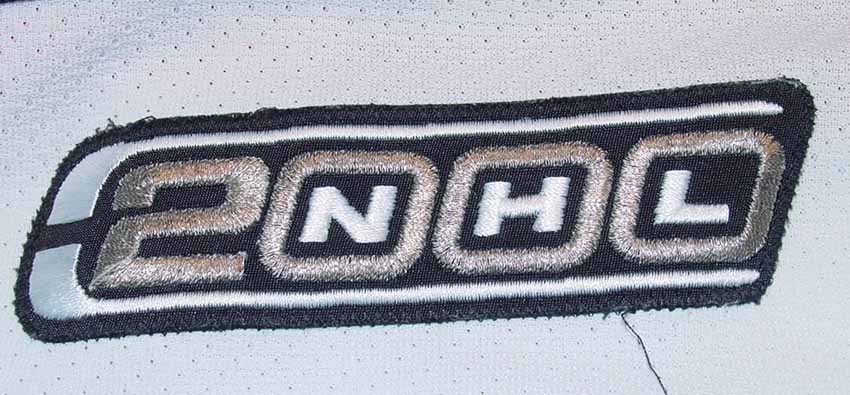
The black NHL 2000 patch was the only season-long patch ever worn on these jerseys.

I don't believe the general public, outside of the Phoenix area, ever embraced the Coyotes unconventional look, particularly in long established hockey markets in the north. Without any Stanley Cup victories to relate the jersey to, it also fails to benefit from being associated with any particularly successful or memorable era in Coyotes hockey history.

I rate this jersey to be "Weird" due to the somber color combination, overly complex and busy striping pattern, unusual font for the numbers and letters and odd and overly complicated primary logo. I won't go so far as to call it ugly though, as the black jersey with it's brick red trim and sand colored stripes and numbers is an attractive combination and the team must be given credit for breaking out of the standard use of primary colors employed by nearly every other team, especially when you take into account the Coyotes used colors inspired by the desert southwest, and not trendy colors of the day, like eggplant and jade or teal (yes, Anaheim and San Jose, I'm looking at you), that would become dated as soon as the next color trends arrived.

Phoenix Coyotes 99-00 F
Phoenix Coyotes 99-00 B

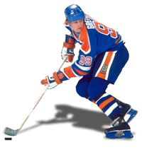
Here are some playoff highlights versus the Detroit Red Wings wearing both their home whites and road black jerseys.


Friday, August 14, 2009

2002-03 Nashville Predators Alternate Tomas Vokoun Jersey

Today the Curious, Weird and Ugly™ Collection features another alternate jersey, this time from the NHL's Central Division.

First unveiled for the 2001-02 season, this Nashville Predators alternate jersey generated swift, outspoken reaction to just about every feature of the jersey, from the unusual squared neckline to the borderline cartoonish new main crest and the secondary fossilized skull logos, neither of which appeared on the home and away jerseys at the time, and the unique double layered fabric of the body of the jersey.

But drawing the most reaction, of course, was the unexplainable choice of the strange and repulsive mustard color of the jersey, which has been compared to, among other things, puss, vomit, urine and baby poop!

Most of the successful alternate jerseys in my mind simply promoted a teams third color to become the main color of it's alternate, such as the Chicago Blackhawks did with their black jerseys, but Nashville instead tried to reinvent the wheel, coming up with a new jersey cut, carried over no logos from the primary jerseys and made the jersey a color not even in their palette and picked perhaps the most horrid color ever used on a professional sports team's jersey to compound the problem.

Not only was the color of the jersey unique in the NHL, the jersey fabric was as well. It uses a mustard colored top mesh layer over a solid dark blue layer, which shows through the holes in the mesh of the mustard layer, making an already muted color appear even darker and muddier.

The jersey was used through the 2006-07 season and did influence the home and away jerseys, to some degree, as it's secondary fossilized skull logos were transferred to the shoulders of primary jerseys for the 2005-06 season, replacing the original design used since the team's inception.

The only patch worn on this jersey was the Nashville Predators 5th Anniversary patch in 2002-03 as shown on my jersey below. The actual patches are impossible to come by other than on game worn examples, so the patch on my jersey is one of my custom made patches using my transfer printing method.

I classify this jersey as "Ugly" due to the awkward neckline, overly detailed primary logo, strange fabric construction and horrendous color choice. If your jersey is conjures up repeated comparisons to various unpleasant bodily fluids, you have an ugly jersey on your hands.

Nashville Predators 02-03 F
Nashville Predators 02-03 B

Here are a pair of videos that seem to suggest that the Detroit Red Wings and the Dallas Stars hate the Predators alternate jerseys as much as I do.


Thursday, August 13, 2009

1997-98 Tampa Bay Lightning Alternate Darcy Tucker Jersey

Today the Curious, Weird and Ugly™ Collection hits the high seas with the Tampa Bay Lightning's first alternate jersey.

The 1997-98 Tampa Bay Lighting Alternate jersey is also sometimes known as "The Seasickness Jersey". While the Vancouver Canucks and Pittsburgh Penguins jerseys that kicked off the Curious, Weird and Ugly™ Collection did not have nicknames, this Tampa Bay Alternate has risen to the level of the named jersey. Once a jersey receives a nickname, it is a sign that it has risen to a new level of notoriety among both fans and collectors alike.

This jersey was first introduced for the 1996-97 season and depicts a raging storm at sea, with angry, tossing waves across the bottom and streaks of subtle black and grey pelting rain across the main body of the jersey. The black sleeves are adorned with violent streaks of lightning down each arm, creating a scene so well executed you can almost hear the crashing of the thunder and feel the sting of the spray against your face. This jersey was only made possible by the use of dye-sublimation to create the rain, waves and lighting bolts on the sleeves.

The jersey is completed with the fantastic "electric" numbers and bold, vertically arched names on the back, which are both highly visible and only add to the visual excitement of the complete package. A very clever and unique jersey that was well executed and whose life span was all too short. Yes, as you may have sensed by now, we really love this jersey here at Third String Goalie.

During it's first year of use, this jersey was worn without any additional patching, but the 1997-98 season would see them wear the #12 shamrock patch as a tribute to teammate John Cullen, who was diagnosed with non-Hodgkin's lymphoma in 1997 and would miss the season fighting the disease, before returning briefly the following season. Tampa Bay would host the 1999 NHL All-Star Game and therefore wore the 1999 All-Star Game patch on all their jerseys during the 1998-99 season, the last for this alternate jersey style.

For some unexplained reason, the Lighting would begin the season wearing their "paintbrush" font from their standard home and away jerseys on the "Stormy Weather" jersey, a font that adds nothing to the theme of the jersey and looks very out of place when compared to the "electric" numbers. The team did change back to the jerseys original "electric" numbers after the first two months of the season, making the "paintbrush" numbered alternates a rarity.

While this jersey style only lasted three seasons, it is still quite sought after by collectors and never fails to attract a lot of attention when they become available.

I definitely classify this one as "Curious" since I don't find it weird nor ugly and it's curious that it only lasted three seasons and the odd choice of the "paintbrush" font for the start of the 1998-99 season.

Tampa Bay Alt 97-98 F
Tampa Bay Alt 97-98 B

I couldn't come up with any video clips of this jersey in action myself, so feel free to send any youtube links via the comments function and I'll post the best ones.


Wednesday, August 12, 2009

1999-00 Phoenix Coyotes Alternate Jeremy Roenick Jersey

Today's Curious, Weird and Ugly™ Collection jersey is one of the strangest jerseys to ever see the ice in an NHL contest.

With hockey fans already thinking the basic Coyotes home and away jerseys of the day were odd enough, this eerie "Midnight in the Desert" or as I prefer "Peyote Ugly", look really has to make one wonder what the designers were smoking at the time they created it.

It's dark hunter green, black and sienna colors, accented with purple (!) landscape of cacti against the mountains of the desert southwest under a crescent moon create a dark, spooky feeling, only added to by the unyielding stare of the main crest, a coyote head wearing just half a goalie mask and an unblinking eyeball staring at the viewer.

The package is completed by using a strange font for the name and numbers that I feel safe in predicting won't be seeing the back of any new NHL jerseys anytime in the near future. It's occasional rounded corners keep the viewer off-balance, as you never can predict which letters will get them and which won't. The thin, and occasionally oddly proportioned numbers such as the 2 and the 5, are also visually jarring to those more used to traditional block numbers.

This alternate jersey was first introduced in 1998 and tweaked for the 1999-00 season, as the main crest would receive a bold sand colored outline that it would retain for the remainder of it's run until the 2002-03 season before the Coyotes identity package would receive a complete overhaul, including all new logos and a greatly simplified color scheme.

The only patch worn on this alternate jersey was the green version of the NHL 2000 patch in 1999-00, as shown on my jersey below.

Not only do I classify this jersey as "Weird", I think it's the single weirdest jersey ever as far as the NHL goes. There's really never been anything like it in terms of having a landscape depicted on a jersey before or since, especially one in the dark of night with a creepy floating animal head staring out at you in such a dark and unusual color palette.

Phoenix Coyotes Alt 99-00 F
Phoenix Coyotes Alt 99-00 B
Phoenix Coyotes Alt 99-00 P

Here is some game action of he Coyotes alternates in action, including the uncommon sight of a team wearing it's alternate jersey during the playoffs, along with a Jeremy Roenick highlight package of his time with the Coyotes.


Tuesday, August 11, 2009

1995-96 Pittsburgh Penguins Alternate Mario Lemieux Jersey

The Curious, Weird and Ugly™ Collection continues with another jersey from the initial batch of NHL alternate jerseys, a 1995-96 Pittsburgh Penguins Alternate Mario Lemieux jersey.

This jersey, similar to the Vancouver Canucks jersey profiled yesterday, is one of the original dye-sublimated jerseys, a process which now allowed for gradients to be incorporated into the designs, and the Penguins wasted no time in taking advantage of the opportunity.

The horizontal stripe around the chest begins as a yellow color on the right side of the jersey, fading to grey as it approaches the center of the jersey and it's main crest, creating a very unappealing, muddy shade of yellow in the process. On the opposite side of the crest the process is repeated, as the darker grey lightens in tone as it reaches the left side of the jersey.

Oddly, the sleeves are not symmetrical in the least, with bold yellow and white stripes at an angle midway down the right arm with a grey cuff that darkens in tone from the outer side of the sleeve to the inner, while the left sleeve has three grey stripes running around the cuff that mimmic the chest stripes on the same side of the jersey.

The shoulders are the same triangular shape as the ones on the home white jersey of the era, only these are grey with horizontal yellow pinstripes running from side to side.

Overall, I always found this jersey to be very dark and morose and have never been a fan of it. While I find many jerseys and their colors and stripes to be exciting to look at, this one always created a feeling of depression with it's dark body, dismal grey color and muted yellow tones of the chest stripe. It's got a rather futuristic apocalyptic feel to it. Hardly what draws me to jerseys in the first place.

Even worse, it became the road jersey for the 1997-98 season, replacing it's diagonally "Pittsburgh"crested predecessor that I have always a fan of, and lasted until the 2001-02 until being retired in favor of the then current alternate jersey, which featured the return of the original "Skating Penguin" logo.

It's seven season life span ranks it #2 for longevity among the original 1995-96 class of alternate jerseys, second only to the Boston Bruins Winnie the Pooh Alternate, which was used for 10 seasons.

Patches worn on this jersey were few, with only the black version of the NHL 2000 patch and the Game ONe Japan 2000 patch worn on this jersey for just one game versus the Nashville Predators on October 8th, 2000 for the second of their opening pair of games of the NHL season played in Tokyo, Japan to kick off the 2000-01 season.

I classify this jersey as "Weird" due to the dark colors, asymmetrical design and poor use of the gradients, especially on the chest stripes, the yellow side in particular.

Pittsburgh Penguins 95-02 F
Pittsburgh Penguins 95-02 B

Here is a video of this jersey in action in a memorable four overtime game between Pittsburgh and the Washington Capitals from the 1996 Stanley Cup Playoffs.


Monday, August 10, 2009

1995-96 Vancouver Canucks Alternate Trevor Linden Jersey

Today kicks off a new theme to fill the dog days of the hockey off season where the historical events in hockey history are few and far between.

Without further delay, we give you The Curious, Weird and Ugly™ Collection. I don't actually dislike all of the jerseys that we will be featuring, in fact we quite like a few very much. But there are others that are so bad, so horrible, that they make us downright angry at the thought process that led to them seeing the light of day in the first place. Seriously, it was bad enough that some dummy came up with the concept in the first place, but then a whole series of people in authority had to approve them before they ever saw the light of day!

First up, a 1995-96 Vancouver Canucks Alternate Trevor Linden jersey.

Now, there had been diagonal elements in jerseys prior to the introduction of this red (or is it black?) Vancouver Canucks first-ever alternate jersey, such as the Mighty Ducks of Anaheim jerseys of 1993-94, but gradients were a new development in 1995-96. To the best of my knowledge, the dye-sublimation printing process, which allowed for the gradients to be incorporated into the jersey designs, had never been used before in the NHL but made it's presence known with the jerseys introduced as part of the NHL's new alternate jersey program with jerseys featuring gradients from the Los Angeles Kings, Pittsburgh Penguins and Vancouver Canucks.

While a case can be made for the St. Louis Blues jersey being a two color jersey, the Canucks was a genuine two color affair, with the amount of black and red being much closer to 50-50 than the Blues predominately blue road sweaters.

The main design element of the Canucks jersey is the rather clever extension of the coloring of the Canucks logo across the body of the jersey. The black background of the logo, as was the yellow lettering of the word "Canucks" that made up the skate blade, were both extended outward from the diagonally oriented logo, with the striping on the left side of the jersey fading away to nothing. An odd decision was the upward angle the stripes took on the right side of the jersey, giving the stripes a "checkmark" look instead of having them continue uninterrupted to the side of the jersey, as the Mighty Ducks and St. Louis Blues jerseys did.

Yet another curious choice was that the upward tick to the chest stripes were not in alignment with the arm stripes. You would think as long as they decided to make the chest stripes change direction in midstream, they would have continued those stripes at a matching angle across the arm instead of orienting the arm stripes at their own unique angle independent of the chest stripes.

Unlike some of the contemporary alternates introduced by other clubs that same season, which were quickly rejected failures, the Canucks new alternate jerseys lasted two full seasons, worn with solid black socks their first season and with red socks with stripes similar to the jerseys the second. No additional patches were worn on this alternate jersey during it's brief two-season existence.

This Canucks jersey does have a few things in it's favor though. The list of players who wore it is rather impressive, as the Canucks were filled with recognizable names like Alexander Mogilny, captain Trevor Linden, Cliff Ronning, Martin Gelinas, Jyrki Lumme, Esa Tikkanen, Bret Hedican, Adrian Aucoin, Markus Naslund, goaltender Kirk McLean and superstar Pavel Bure, who was temporarily wearing sweater #96 at the time.

Another thing it has going for it is the way it fits in with the home and road jerseys, as it uses the same main crest and uses what is normally a trim color, red, as a primary color. The names and numbers are all very legible, with the yellow standing out nicely from the red background, and are done in the same fonts as the home and road jerseys for a consistency across the entire set.

Overall, I classify this jersey as "Curious" due to mainly the "checkmark" chest stripe and the introduction of the gradient stripes.

Vancouver Canucks 95-97 F
Vancouver Canucks 95-97 B

Here's a lucky find, the Vancouver Canucks red alternates in game action versus the Hartford Whalers (for a truly excellent jersey matchup), although it's more fist throwing action than puck shooting action, but sometimes you take what you can get. Don't forget to take notice of future Italian National Team goaltender Jason Muzzati in net for the Whalers.

Sunday, August 9, 2009

1988-89 Los Angeles Kings Wayne Gretzky Jersey

On August 9th, 1988 the hockey world was rocked as the Edmonton Oilers traded Wayne Gretzky, along with Marty McSorley and Mike Krushelnyski to the Los Angeles Kings for a package that included Jimmy Carson, Martin Gelinas, the King's first round draft picks in 1989, 1991 and 1993 plus $15 million dollars.

"The Trade" ended an era in Oilers hockey and caused a great deal of reaction, including politicians demanding the government block the trade and Oliers owner Peter Pocklington being burned in effigy outside the Oilers home arena, the Northlands Coliseum. Many blamed Gretzky's wife Janet, whom he had married in a wedding broadcast live throughout Canada less than a month earlier, for wanting to live in Los Angeles to continue her acting career.

His impact on the Kings was immediate, scoring on his first shot and leading the Kings to the fourth best record in the NHL while earning the Hart Memorial Trophy. Ironically, the Kings would meet the Oilers in the first round of the playoffs and, after falling behind 3 games to 1, would come back to eliminate the Oilers from the playoffs.

The long term effects of Gretzky's move to Los Angeles can be debated, but are often credited with kick-starting the NHL's expansion into the southern United States, beginning with the arrival of the San Jose Sharks in 1991 and the Mighty Ducks of Anaheim in the season following the Kings run to the finals, giving Los Angeles a rival only 35 miles away. NHL teams would eventually find homes in Phoenix, Dallas, Tampa Bay, Miami, Atlanta, North Carolina and Nashville.

While a member of the Kings, Gretzky would win the Hart Memorial Trophy as the league's Most Valuable Player once in his first season in Los Angeles, the Art Ross Trophy as the league's leading scorer three times (1989-90, 1990-91 & 1993-94) and the Lady Byng Memorial Trophy as Most Gentlemanly Player twice (1990-91 & 1991-92).

Today's featured jersey is a CCM 1988-89 Los Angeles Kings Wayne Gretzky jersey as worn during Gretzky's first three seasons in Los Angeles when the Kings wore two color names (on a nameplate) and two color numbers in sliver outlined in black. 1991-92 would see the Kings change to three color names, no longer using nameplates for the remainder of the life of this jersey style, and three color numbers and then change once more the season after that to one color names with three color numbers, only finally changing to a more visible black numbers. We will never understand why they didn't use black numbers on the white jersey to begin with and why it took four seasons to decide to make the change.

This jersey sports the assistant captain's "A" as worn during Gretzky's first season in Los Angeles, as Dave Taylor was the current captain on Gretzky's arrival. Wayne would be named the King's captain the following season and remain so for the remainder of his time with the Kings until being dealt to the St. Louis Blues in 1996.

Los Angeles Kings 88-89 F
Los Angeles Kings 88-89 B

Here are highlights of the reaction to the trade and Gretzky showing off his new Kings jersey.


This video documents the second half of Gretzky's career after the trade to Los Angeles through his move into coaching.


hit counter for blogger