Friday, August 20, 2010
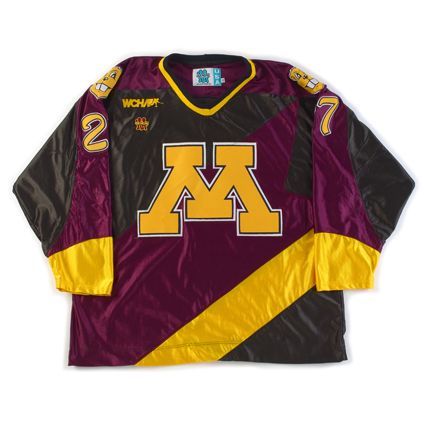
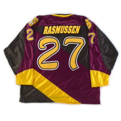
1997-98 University of Minnesota Golden Gophers Erik Rasmussen Jersey
The Curious, Weird and Ugly™ Collection now features a college jersey from the WCHA.
This hideous nightmare of a jersey is a 1997-98 University of Minnesota Alternate Erik Rassmussen jersey.
Designed by then Golden Gophers player Casey Hankinson, and crafted entirely out of "dazzle cloth" by Gemini Athletic Wear, this jersey features the traditional "M" logo, but the similarities between it and the regular Gophers home and away jerseys ends there.
The torso has diagonal black, a very purplish shade of maroon, bright gold and black bands of color, of unequal widths of course. Even weirder is the black extension of the left arm coloring into the upper left chest area. What is the reason for that? It looks like a crude patch sewn to repair some imaginary game worn tear.
The maroon shoulder coloring runs down the top of the sleeves until wrapping around the arms just above the bright yellow cuffs and over the black coloring on the lower part of the arms. It's a grotesque patchwork quilt of lines running this way and that in dark and depressing colors only broken up by jarring flashes of gold - all with a glitzy shine that makes the entire package all the more tacky.
But that's only the front of the jersey. Taking a look at the shoulders gives us the bizarre sight of the severed head of Goldy Gopher smiling away, completely oblivious to the ghastly scene unfolding beneath him.
The tacky, bloated font for the names are italicized for no apparent reason other than to contradict the direction of the diagonal lines leaning the opposite direction on the back of the jersey, and are placed on an ill-advised, italicized(!) dazzle cloth name plate that overlaps into the purple maroon area of the jersey if the name is of sufficient length.
Topping off the whole package is the just plain ridiculous font for the numbers, done in three colors to mimic the "M" on the front. The numbers are an unexplainable combination of calligraphy and the Flintstones, appearing hand-drawn, yet crude at the same time.
The Gophers wore this jersey for only a few games, perhaps even only just once as we have also heard, because the players rightfully thought they were dreadful and no longer wanted to wear them. Replica versions do periodically show up on ebay, but you better have an expert customizer on your side to recreate the name and numbers worn on this one.
We classify this jersey to be "Curious", as in we're curious what the approval process for this trainwreck was really like, "Weird" due to the appalling pattern of the diagonally striped construction of the body and simply terrible font for the numbers, and "Ugly" because it is, without hesitation, the worst looking jersey in the Third String Goalie collection.
It's truly "the perfect storm" of bad ideas poorly executed.
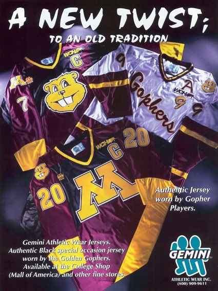
But if you think that the jersey worn on the ice was bad, check out this ad for Gemini that shows an unused prototype variation featruing a giant Goldy Gopher head as the main logo, which takes the entire package to an entirely new farcical level!
If the "Gopher Head" version actually been worn, we can only imagine that they would have been the second ever jersey to be rejected during a game.
Thursday, August 19, 2010
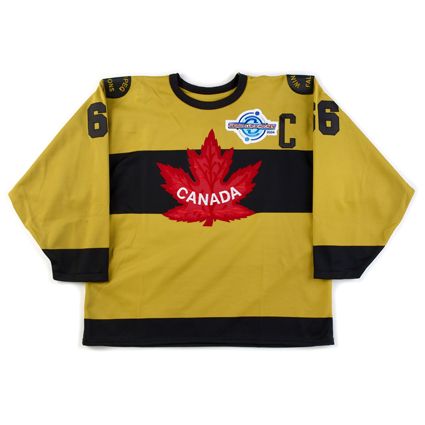
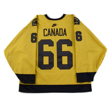
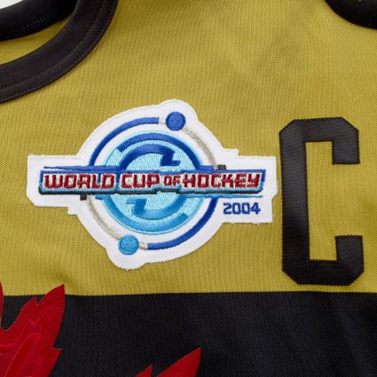
2004 Team Canada "Winnipeg Falcons" Mario Lemieux Jersey
Today's Curious, Weird and Ugly™ Collection moves outside of the NHL and into the international hockey realm.
In 1920, the Winnipeg Falcons won the the Allan Cup as the top senior amateur team in Canada and, as a result, were chosen to represent Canada at the inaugural Winter Olympics in Antwerp Belguim, where they became the first ever winners of the gold medal in ice hockey.
The Toronto Star reported on March 26, 1920;
"The team which represents Canada at the Olympic games in Belgium will wear jerseys instead of sweaters, as the weather will be too warm for the latter. The jerseys are now being manufactured. The colors will be old gold and black. Across the breast the name "Canada" will be woven and on the back there will be a large maple leaf."
Why old gold and black were chosen remains a mystery, since apparently the Falcons normally wore blue and green. When the 2004 World Cup of Hockey was planned, Hockey Canada chose to recreate the Winnipeg Falcons old gold jerseys for use in the tournament.
As the Nashville Predators have shown before, "mustard" is never a good color for a jersey you are attempting to market to the buying public, regardless of it's historical significance.
For the 2004 World Cup, the jerseys were "old gold" with a black stripes across the chest, waist and cuffs on the sleeves. In addition, one color numbers were used on the back and sleeves, while all jerseys had "CANADA" in place of individual player names on the back, perhaps as a sign of unity and a team first attitude as first seen on the 1972 Summit Series jerseys.
The jerseys were worn on August 31st, 2004 in a 2-1 win over the United States.
We classify this jersey as "Curious" in an effort to be nice. We can understand that Hockey Canada and Nike chose, in an effort to fill their coffers through sales of replicas to the hockey mad fanbase in The Great White North, to select a historically significant team to pay tribute to. The problem is that the jerseys they wore just happened to be a putrid color with a boring lettering choice that did not go over well with the current tastes of the fans in the early part of the 21st century.
While the red 1924-based jerseys worn in the 2002 Salt Lake Olympics were a treat to look at, Team Canada proceeded to lay an egg in their opening game vs. Sweden and the jerseys were immediately abandoned as "bad luck", never to be worn again, which was a real shame.
We are uncertain if the plan was for the 1920 Falcons jerseys to be worn just the one time, but they were never worn again by Team Canada in the World Cup or subsequent World Championships, despite their "lucky" 1-0 record. It's possible that they were only intended for use just once, or perhaps abandoned due to their being not very well received due to their unattractive looks despite their historical significance.
The only other appearance for the Winnipeg Falcons jerseys was in a exhibition game on December 20th, 2004 in Winnipeg as Team Canada's World Junior Team, which included Sidney Crosby, defeated Finland 6-0 in preparation for the 2005 World Junior Tournament.
Here is some footage of these jerseys in action.
Wednesday, August 18, 2010
1999-00 Phoenix Coyotes Keith Tkachuk Jersey
Curious, Weird and Ugly™ makes it's second trip down to Phoenix, this time to examine the Coyotes primary home and away jerseys.
When the Winnipeg Jets relocated to the desert the team acquired a new nickname in a "name the team" contest, with the "Coyotes" being selected as the winner. With the change in name, a complete overhaul of the team's identity was undertaken. Gone were the familiar blue, white and red colors of the Jets and we now had jerseys that were black, brick red, hunter green and sand with sienna and purple appearing in the new geometric coyote logo, one of the oddest primary logos in NHL history with it's blank stare which did not inspire either intimidation or attraction.
The jerseys featured an ornate, southwestern inspired striping pattern which appeared on the sleeves, waist and even the collar. We can see where they went with this idea, but it's just too busy and too much of it. Then factor in squeezing the pattern onto the collar and you have one of the most complex jerseys in league history.
We rather liked the sand color names and numbers trimmed in brick red used in conjunction with the black jerseys, but never embraced the font itself. The numbers were quite narrow overall and had some oddly proportioned digits, the 2 and 5 in particular. Also consider the inside corner of the 7 is pointed, while the outside is rounded. The names also had the occasional unexpected curved letters, such as the rounded E's to keep the viewer off balance.
These jerseys were used from 1996-97 until 2002-03 when the team underwent a branding overhaul which included a new, much more realistic coyote head logo and a much needed streamlining of the team's color palette, with the hunter green being dropped from the jerseys and sienna and purple disappearing from the new logo, which went from six colors in the original down to three in the new one.
The black NHL 2000 patch was the only season-long patch ever worn on these jerseys.
We don't believe the general public ever embraced the Coyotes unconventional look, particularly in long established hockey markets in the north. Without any Stanley Cup victories to relate the jersey to, it also fails to benefit from being associated with any particularly successful or memorable era in Coyotes hockey history.
We rate this jersey to be "Weird" due to the somber color combination, overly complex and busy striping pattern, unusual font for the numbers and letters and odd and overly complicated primary logo. We won't go so far as to call it ugly though, as the black jersey with it's brick red trim and sand colored stripes and numbers is an attractive combination and the team must be given credit for breaking away from the use of primary colors employed by nearly every other team, especially when you take into account the Coyotes used colors inspired by the desert southwest, and not trendy colors of the day, like eggplant and jade or teal (yes, Anaheim and San Jose, we're looking at you), that would become dated as soon as the next color trend arrived.
Here are some playoff highlights versus the Detroit Red Wings wearing both their home whites and road black jerseys.
Labels:
Curious Weird and Ugly,
Phoenix Coyotes
Tuesday, August 17, 2010
1995-96 St. Louis Blues Wayne Gretzky Jersey
Today's Curious, Weird and Ugly™ Collection jersey is one of the earliest jerseys to qualify for the collection.
When the Mighty Ducks of Anaheim joined the NHL in the 1993-94 season their jerseys debuted a new look never before seen in an NHL jersey, the diagonal waist stripe. Up until that point 24 out of 24 teams had horizontal waist stripes and the most radical things seen on an NHL jersey were the Pittsburgh Penguins pointed shoulder areas and the San Jose Sharks teal colored jerseys.
With that precedent established, SME Design, who created the Florida Panthers logo in 1993 and has also done work for the Mighty Ducks of Anahiem, New York Rangers, Atlanta Thrashers, Columbus Blue Jackets, Tampa Bay Lightning, Los Angeles Kings, Boston Bruins, Phoenix Coyotes, Calgary Flames, New Jersey Devils, Toronto Maple Leafs, Washington Capitals, Minnesota Wild, the NHL and USA Hockey among others was chosen to design the new jerseys for the St. Louis Blues. Oddly, they seem to have swept their work on the New York Islanders "Fish Sticks" jerseys under the rug...
The Blues jerseys were surprising in that they promoted the former trim color red to a much more predominate position, now taking up roughly 40% of the road jersey. Also impossible to miss were the multiple stripes along the transition area from the main body color to the waist and sleeve ends, four small ones and one thicker one to represent the musical staff, running at the same diagonal angle as the Mighty Ducks jerseys. Also new was the secondary shoulder logo featuring a trumpet.
Aside from the increased use of red and the multiple diagonal stripes, the most unusual feature of the jerseys were the oddly proportioned back numbers, which parallel to the diagonal stripes, which created a wedge shape, condensed on the left and growing larger as the stripe falls away on the right, while maintaining a consistent, level line across the top edge. The resulting look is a number that grows larger as it moves from left to right, an effect greatly exaggerated by two digit numbers, especially numbers with wider first digits, such as those in the twenties, thirties and say, the upper nineties, opposed to those in the teens.
I classify this jersey as "Curious", as it's not so far out there to be "weird" enough, when compared to something like the Coyotes Alternates, to earn one of the coveted nicknames reserved for the worst of the worst jerseys. While many did not like this jersey, we found it to be fine for it's era of experimentation. Even though they were a bit too much, we can understand what the designers were trying to accomplish with the multiple "music staff" stripes, and the numbers that grew in size were at least innovative, if they weren't necessarily attractive.
This jersey lasted from 1995-96 to 1997-98 and carried no additional patches during it's short three year run, until replaced by the more traditional alternate jersey first used in 1997-98.
Here is Brett Hull scoring his 500th goal in this jersey.
Here is some great footage of the hard-fought seven game series between the Blues and Detroit Red Wings the year Gretzky played in St. Louis in today's featured jerseys.
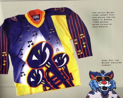
Bonus jersey: You just knew no review of Curious, Weird and Ugly™ jerseys would not be complete without a mention of the proposed St. Louis Blues unused Alternate jerseys, which were supposed to join the initial five alternates which debuted in the 1995-96 season.
A step beyond anything seen before, these jerseys, which would have been considered loud and garish in a roller hockey league, were approved by both the NHL and the Blues, and scheduled to debut in Gretzky's first game in St. Louis (which would have seen Gretzky wear two of the worst jerseys of all time in the same season), were rejected by then Blues coach Mike Keenan. While I am no fan of Keenan's, one has to give him credit for taking a stand against these monstrosities before they were allowed on the ice. Apparently one example of this jersey exists and we recall reading that it was, at one time, hanging in either the Blues or the NHL offices as a reminder of what not to do ever again. Perhaps someone has a link to this story or a better memory of it and can forward it to me.
This is the one and only photo of this jersey on the internet. We'd like to have the opportunity to see if the back was supposed to be a copy of the front, or if it were perhaps simplified to accommodate the player's name and number. We also would have loved to have seen the proposed fonts for the names and numbers to have been used on this jersey and can only imagine the possible horrors the designers had in mind.
No doubt had this jersey made it onto the ice it would have been categorized as "Curious, Weird and Ugly" and given their fans the blues after having to look at it in action.
Labels:
Curious Weird and Ugly,
St. Louis Blues
Monday, August 16, 2010
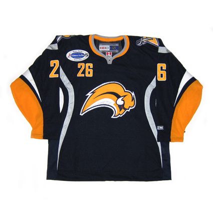
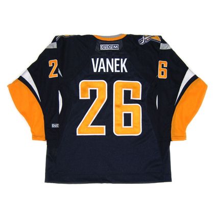
2006-07 Buffalo Sabres Thomas Vanek Jersey
The Curious, Weird and Ugly™ Collection now must examine, against our will, a 2006-07 Buffalo Sabres Thomas Vanek jersey.
Some feel that the Sabres have been wandering the hockey jersey wilderness since the team rebranded itself in the 1996-97 season, moving away from their original blue and yellow colors and circular logo jerseys worn since their inception in 1970, changing to a new red and black color scheme with a modernized Buffalo head logo and innovative new jersey template, which gave the impression of Buffalo horns running up the side of the jersey. Remember, this was back in 1996 when prior to that every jersey had horizontal waist stripes except the St. Louis Blues and Mighty Ducks of Anaheim diagonal stripes.
Designers started to take risks and start thinking outside the traditional box, as evidenced by the new Calgary Flames, Washington Capitals, the outlandish New York Islanders and unique Colorado Avalanche jerseys, not to mention the free thinking seen on the first batch of alternate jerseys chronicled here on this blog the last several days.
The Sabres new black and red look was a very well done modernization of the Sabres look and it's frankly somewhat amateurish original logo. Unfortunately the new look, instead of being introduced for an expansion team with no previous history to live up to, was saddled with the responsibility of having to compete with Buffalo's entire past and the fanbase's passion for their classic look. They derisively called the new logo "The Goat Head" and longed for a return to the Sabres original colors and logo.
And in a classic case of "Be Careful What You Ask For, You Just Might Get It™", in the 2006-07 season the Sabres went back to the old familiar blue and yellow colors - only this time with a new logo.
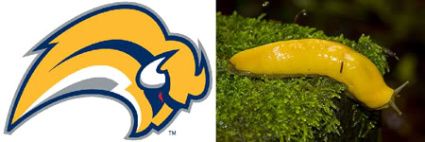
The reaction was swift and severe, with the logo becoming the most ridiculed logo in the history of professional sports and was given the nickname of "The Buffaslug", so named for it's legless form, bright yellow color and undeniable resemblance to the lowly Banana Slug. There was even an online petition against the new logo which topped 30,000 signatures!
On September 16th, 2006, the complete jersey was unveiled at an open practice and quickly became a top seller, as the team was on a high from nearly making the Stanley Cup Finals the previous season, led by stars Daniel Briere and Chris Drury plus the emergence of goaltender Ryan Miller. Sales were also no doubt aided in the return of the blue and yellow colors, as the previous seasons black and red jerseys were now entirely out of date.
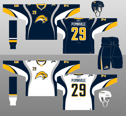
Aside from the logo, the jerseys were controversial in their own way, as they had wild, curving striping along with apparently random color blobs, which suggested neither horns nor sabre blades. Just what exactly is the silver striping that runs from the waist up to the shoulders and down the back, curving this way and that as it goes, supposed to suggest or represent? And the white armpit flares? They don't resemble the horns of the buffalo in the logo, which curve upwards. Are they there for a reason?
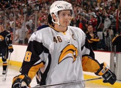
The appearance of these sweaters in action was even worse than the graphic representation of them shown above, where the shapes and lines could at least be made out, as the mishmash of colors all bunched up under the arm pits while being worn created a distracting traffic jam of color that served no purpose other than confusing the viewer as to what the designer meant for these shapes to convey.
We rate this jersey as "Ugly" with a big dose of "Weird". We find the logo to be ugly and weird due to it's giant head coupled with it's legless body, arcing in a path too short and tight. Also factor in the downward angle of the head of the Buffalo. He appears to be milliseconds away from a colossal face-plant, rather than charging forward to victory.
He's also very detached and oblivious to everything around him. There's no connection to the viewer, unlike the previous logo that stared right at you, daring you to challenge him. The Buffaslug is not looking at you as he speeds by to a rendezvous with a first round playoff exit. He's just a big head in a big hurry who wants nothing to do with anyone or anything, especially you.
The jerseys on their own, separate from the logo are also ugly and weird. We're just not a fan of the seemingly random color blobs and meandering striping that are utterly without reason.
The logo appears to be falling out of favor with the Sabres management, as the updated version of the original charging buffalo now adorns center ice at the Sabres home rink and has taken a backseat on the Sabres own website.
Here is a highlight film of the Sabres first season under the watchful (red) eye of the Buffaslug. Be sure to take note of the retro alternate jerseys also worn that season in the style of the original Sabres uniforms.
Labels:
Buffalo Sabres,
Curious Weird and Ugly
Subscribe to:
Comments (Atom)

