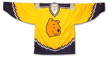
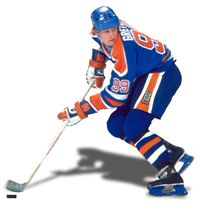
First introduced in 1995, this jersey was the longest surviving of the original alternate NHL jerseys, lasting until the 2005-06 season. Dubbed the "Winnie the Pooh" jersey, it features a primary logo with perhaps the most docile looking bear this side of Gentle Ben. It's buttery gold color also does nothing to strike fear into the hearts of the Bruins opponents either.
Friday, August 13, 2010
1998-99 Boston Bruins Ray Bourque Jersey
The Curious, Weird and Ugly™ Collection continues with another jersey from the inaugural class of NHL alternate jerseys, a 1998-99 Boston Bruins Alternate Ray Bourque jersey.
First introduced in 1995, this jersey was the longest surviving of the original alternate NHL jerseys, lasting until the 2005-06 season. Dubbed the "Winnie the Pooh" jersey, it features a primary logo with perhaps the most docile looking bear this side of Gentle Ben. It's buttery gold color also does nothing to strike fear into the hearts of the Bruins opponents either.
First introduced in 1995, this jersey was the longest surviving of the original alternate NHL jerseys, lasting until the 2005-06 season. Dubbed the "Winnie the Pooh" jersey, it features a primary logo with perhaps the most docile looking bear this side of Gentle Ben. It's buttery gold color also does nothing to strike fear into the hearts of the Bruins opponents either.
Often overlooked because of the logo and color is the unusual broken striping pattern on the jersey. It's not claw marks. It's not teeth marks. It's not much of anything except all jagged and zig-zaggy for no apparent reason. If anything, when laid flat, it gives the impression of a bird with it's wings spread open. Which is fine if your team is called the Falcons, Eagles or Hawks, but if your mascot is a bear, perhaps it should be something that relates to, perhaps, a bear?
Patches worn on this jersey were the Boston Bruins 75th Anniversary patch from 1998-99 and the black version of the NHL 2000 patch in 1999-00, which was also the season that the Bruins changed the font for the numbers on all three of their jerseys, going with a serifed font when up until then they used a cleaner sans-serif font. Of note, this jersey was in use during the 1995-96 season when Boston hosted the NHL All-Star Game, but only wore the All-Star Game patch on their home and road jerseys but not this alternate.
We classify this jersey as "Curious" with a dose of "Weird" thrown in for good measure. We find it curious that they chose such a docile, if not actually smiling, bear head for the logo and we find the jagged striping effect a curious decision since it really defies explanation - which is weird. It's also curious that this jersey was used for such a long period of time and weird that they actually made Ray Bourque wear it. We've never been a fan of gold or yellow jerseys personally, but understand that the Bruins are limited in their choices for a third jersey. So limited that their current alternate jersey is black, the same color as their home jersey.
Here is an early rumored prototype of this jersey which was apparently rejected due to licensing issues with Disney, the then current owners of the Mighty Ducks, who didn't want another team in the NHL with a logo more cartoonish and kid-friendly than theirs, but the Bruins managed to come up with one anyway.
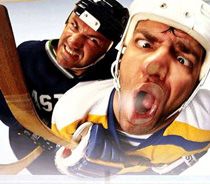
Is it just us, or is it hard to look tough with Winnie the Pooh on your jersey?
Well, maybe it is possible if you are P. J. Stock...
Labels:
Boston Bruins,
Curious Weird and Ugly
Thursday, August 12, 2010
1997-98 Tampa Bay Lightning Darcy Tucker Jersey
Today the Curious, Weird and Ugly™ Collection hits the high seas with the Tampa Bay Lightning's first alternate jersey.
This 1997-98 Tampa Bay Lighting Darcy Tucker jersey is also known as "The Seasickness Jersey". While the Vancouver Canucks and Pittsburgh Penguins jerseys that kicked off the Curious, Weird and Ugly™ Collection did not have nicknames, this Tampa Bay Alternate has risen to the level of the named jersey. Once a jersey receives a nickname, it's a sure sign that it has risen to a new level of notoriety among both fans and collectors alike.
This alternate jersey was first introduced for the 1996-97 season and depicts a raging storm at sea, with angry, tossing waves across the bottom and streaks of subtle black and grey pelting rain across the main body of the jersey. The black sleeves are adorned with violent streaks of lightning down each arm, creating a scene so well executed you can almost hear the crashing of the thunder and feel the sting of the spray against your face. This jersey was only made possible by the use of dye-sublimation to create the rain, waves and the lighting bolts on the sleeves.
The jersey is completed with it's fantastic "electric" numbers and bold, vertically arched names on the back, which are both highly visible and only add to the visual excitement of the complete package. A very clever and unique jersey that was well executed and whose life span was all too short. Yes, as you may have sensed by now, we really love this jersey here at Third String Goalie.
During it's first year of use, this jersey was worn without any additional patching, but the 1997-98 season would see them wear the #12 shamrock patch as a tribute to teammate John Cullen, who was diagnosed with non-Hodgkin's lymphoma in 1997 and would miss the season fighting the disease before returning to the ice briefly the following season. Tampa Bay wore the 1999 All-Star Game patch on all their jerseys as hosts of the 1999 NHL All-Star Game during the 1998-99 season, the last for this jersey style.
For some unexplained reason, the Lighting would begin the season wearing their "paintbrush" font from their standard home and away jerseys on the "Stormy Weather" jersey, a font that adds nothing to the theme of the jersey and looks very out of place when compared to the "electric" numbers. The team did change back to the jerseys original "electric" numbers after the first two months of the season, making the "paintbrush" numbered alternates a rarity.
While this jersey style only lasted three seasons, it is still quite sought after by collectors and never fails to attract a lot of attention when they become available.
Since we don't find it weird nor ugly we must classify this one as "Curious". Curious that it only lasted three seasons and the odd choice of the "paintbrush" font for the start of the 1998-99 season.
W couldn't come up with any video clips of this jersey in action , so feel free to send any youtube links via the comments function and we'll post the best ones.
Wednesday, August 11, 2010
1999-00 Phoenix Coyotes Jeremy Roenick Jersey
Today's Curious, Weird and Ugly™ Collection jersey is a 1999-00 Phoenix Coyotes Jeremy Roenick jersey, one of the strangest jerseys to ever see the ice in an NHL contest.
With hockey fans already thinking the basic Coyotes home and away jerseys of the day were odd enough, this eerie "Midnight in the Desert", or as we prefer, "Peyote Ugly", alternate jersey really has to make one wonder what the designers were smoking at the time they created it!
It's dark hunter green, black and sienna colors, accented with purple(!) landscape of cacti against the mountains of the desert southwest under a crescent moon create a dark, spooky feeling, only added to by the unyielding stare of the main crest, a coyote head wearing just half a goalie mask and an unblinking eyeball staring at the viewer.
The package is completed by using a strange font for the name and numbers that I feel safe in predicting won't be seeing the back of any new NHL jerseys anytime in the near future. It's occasional rounded corners keep the viewer off-balance, as you never can predict which letters will get them and which won't. The thin, and occasionally oddly proportioned numbers such as the 2 and the 5, are also visually jarring to those more used to traditional block numbers.
This alternate jersey was first introduced in 1998 and tweaked for the 1999-00 season, as the main crest would receive a bold sand colored outline that it would retain for the remainder of it's run until the 2002-03 season before the Coyotes identity package would receive a complete overhaul, including all new logos and a greatly simplified color scheme.
The only patch worn on this alternate jersey was the green version of the NHL 2000 patch in 1999-00, as shown on today's featured jersey below.
Not only do we classify this jersey as "Weird", we think it's the single weirdest jersey ever as far as the NHL goes. There's really never been anything like it in terms of having a landscape depicted on a jersey before or since, especially one in the dark of night with a creepy floating animal head staring at you in such a dark and unusual color palette.
Here is some game action of he Coyotes alternates in action, including the uncommon sight of a team wearing it's alternate jersey during the playoffs, along with a Jeremy Roenick highlight package of his time with the Coyotes.
Labels:
Curious Weird and Ugly,
Phoenix Coyotes
Tuesday, August 10, 2010
1995-96 Pittsburgh Penguins Alternate Mario Lemieux Jersey
The Curious, Weird and Ugly™ Collection continues with another jersey from the initial batch of NHL alternate jerseys, a 1995-96 Pittsburgh Penguins Alternate Mario Lemieux jersey.
This jersey, similar to the Vancouver Canucks jersey profiled yesterday, is one of the original dye-sublimated jerseys, a process which now allowed for gradients to be incorporated into the designs, and the Penguins wasted no time in taking advantage of the opportunity.
This jersey, similar to the Vancouver Canucks jersey profiled yesterday, is one of the original dye-sublimated jerseys, a process which now allowed for gradients to be incorporated into the designs, and the Penguins wasted no time in taking advantage of the opportunity.
The horizontal stripe around the chest begins as a yellow color on the right side of the jersey, fading to grey as it approaches the center of the jersey and it's main crest, creating a very unappealing, muddy shade of yellow in the process. On the opposite side of the crest the process is repeated, as the darker grey lightens in tone as it reaches the left side of the jersey.
Oddly, the sleeves are not symmetrical in the least, with bold yellow and white stripes at an angle midway down the right arm with a grey cuff that darkens in tone from the outer side of the sleeve to the inner, while the left sleeve has three grey stripes running around the cuff that mimmic the chest stripes on the same side of the jersey.
The shoulders are the same triangular shape as the ones on the home white jersey of the era, only these are grey with horizontal yellow pinstripes running from side to side.
Overall, we have always found this jersey to be very dark and morose and have never been a fan of it. While we find many jerseys exciting to look at because of their bright colors and dynamic stripes, this one always created a feeling of depression with it's dark body, dismal grey color and muted yellow tones of the chest stripe. It's got a rather futuristic apocalyptic feel to it. Hardly what draws us to jerseys in the first place.
Even worse, it became the Penguins road jersey for the 1997-98 season, replacing it's old school diagonally crested predecessor which we were always big fans of. This moody jersey lasted until the 2001-02 until being retired in favor of the then current alternate jersey, which featured the return of the original "Skating Penguin" logo.
It's seven season life span ranks it #2 for longevity among the original 1995-96 class of alternate jerseys, second only to the Boston Bruins Winnie the Pooh Alternate, which was used for 10 seasons.
Patches worn on this jersey were few, with only the black version of the NHL 2000 patch and the Game ONe Japan 2000 patch, worn on this jersey for just one game versus the Nashville Predators on October 8th, 2000 for the second of their opening pair of games of the 2000-01 NHL season played in Tokyo, Japan.
Patches worn on this jersey were few, with only the black version of the NHL 2000 patch and the Game ONe Japan 2000 patch, worn on this jersey for just one game versus the Nashville Predators on October 8th, 2000 for the second of their opening pair of games of the 2000-01 NHL season played in Tokyo, Japan.
We classify this jersey as "Weird" due to the dark colors, asymmetrical design and poor use of the gradients, especially on the chest stripes, the yellow side in particular.
Here is a video of this jersey in action in a memorable four overtime game between Pittsburgh and the Washington Capitals from the 1996 Stanley Cup Playoffs.
Monday, August 9, 2010
1995-96 Vancouver Canucks Trevor Linden Jersey
Today kicks off a new theme to fill the dog days of the hockey off season where the historical events in hockey history are few and far between.
Without further delay, we give you The Curious, Weird and Ugly™ Collection. we don't actually dislike all of the jerseys that we will be featuring, in fact we like a few of them very much, but there are others that are so bad, so horrible, that they make us downright angry that they ever saw the light of day in the first place. Seriously, it was bad enough that some dummy came up with the concept in the first place, but then a whole series of people in authority had to approve them before they ever saw the light of day!
Without further delay, a 1995-96 Vancouver Canucks Trevor Linden jersey.
Now, there had been diagonal elements in jerseys prior to the introduction of this Vancouver Canucks red (or is it black?) first-ever alternate jersey, such as the Mighty Ducks of Anaheim jerseys of 1993-94, but gradients were a new development in 1995-96. To the best of our knowledge the dye-sublimation printing process, which allowed for the gradients to be incorporated into jersey designs had never been used for NHL jerseys before, but the process made it's presence known with the first NHL alternates introduced in early 1996 with gradients incorporated into the designs from the Los Angeles Kings, Pittsburgh Penguins and Vancouver Canucks.
While the diagonally striped jerseys from the Mighty Duck of Anaheim and the St. Louis Blues had a different color below the lower stripe, the Canucks was really the first genuine two color affair, with the amount of black and red being much closer to 50-50 than the Mighty Ducks mainly eggplant jerseys and the Blues predominately blue road sweaters.
The main design element of the Canucks jersey is the rather clever extension of the coloring of the Canucks logo across the body of the jersey. The black background of the logo, as was the yellow lettering of the word "Canucks" that made up the skate blade, were both extended outward from the diagonally oriented logo, with the striping on the left side of the jersey fading away to nothing. An odd decision was the upward angle the stripes took on the right side of the jersey, giving the stripes a "checkmark" look instead of having them continue uninterrupted to the side of the jersey, as the Mighty Ducks and Blues jerseys did.
Yet another curious choice was that the upward tick to the chest stripes were not in alignment with the arm stripes. You would think as long as they decided to make the chest stripes change direction in midstream, they would have continued those stripes at a matching angle across the arm instead of orienting the arm stripes at their own unique angle independent of the chest stripes.
Unlike some of the contemporary alternates introduced by other clubs that same season, which were quickly rejected failures, the Canucks new alternate jerseys lasted two full seasons, worn with solid black socks their first season and with red socks with stripes similar to the jerseys the second. No additional patches were worn on this alternate jersey during it's brief existence.
This Canucks jersey does have a few things in it's favor though. The list of players who wore it is rather impressive, as the Canucks were filled with recognizable names like Alexander Mogilny, captain Trevor Linden, Cliff Ronning, Martin Gelinas, Esa Tikkanen, Bret Hedican, Adrian Aucoin, Markus Naslund, goaltender Kirk McLean and superstar Pavel Bure, who was temporarily wearing sweater #96 at the time.
Another thing it has going for it is the way it fits in with the home and road jerseys, as it uses the same main crest and uses what is normally a trim color, red, as a primary color. The names and numbers are all very legible, with the yellow standing out nicely from the red background, and are done in the same fonts as the home and road jerseys for a consistency across the entire set.
Overall, we classify this jersey as "Curious" due to mainly the "checkmark" chest stripe and the introduction of the gradient stripes.
Here's a lucky find, the Vancouver Canucks red alternates in game action versus the Hartford Whalers (for a truly excellent jersey matchup), although it's more fist throwing action than puck shooting action, but sometimes you take what you can get. Don't forget to take notice of future Italian National Team goaltender Jason Muzzati in net for the Whalers.
Labels:
Curious Weird and Ugly,
Vancouver Canucks
Subscribe to:
Comments (Atom)


