History of Jersey 83-93 Banner sm photo History of Jersey 83-93 Banner sm.jpg
Showing posts with label Setting the Record Straight. Show all posts

Monday, January 6, 2014

Setting the Record Straight - The 1911-12 Montreal Canadiens

On the Montreal Canadiens website, there is an extensive history section, unlike any other NHL team's website, which is in fact it's own separate dedicated website.

Naturally, one of the features of the Canadiens history website we refer to from time to time is the "Jerseys and Logos" section, which begins back in 1909 with the birth of the franchise, and not just the start of the National Hockey League, which did not arrive until 1917, by which time the Canadiens had supposedly worn eight different sweaters.

 photo dd109560-820b-46d5-9b48-da343b15594e.png
The Canadiens jersey history from their pre-NHL days
on their dedicated history website

Fans who remember the Canadiens centennial celebrations will recall four of these jerseys from the franchise's early development having been worn as throwback jerseys from October of 2008 through November of 2009, especially the negative reaction to the 1912-13 barberpole jerseys, before a change in ownership led to the end of wearing the throwback jerseys prior to the final two scheduled dates in early 2010.

Canadiens centennial jerseys photo Canadienscentennialjerseys.jpg
The Canadiens centennial throwback jerseys

Of those early sweaters, we have seen evidence of the blue 1909-10 sweaters in both hockey cards and player portraits, as well as being worn as a throwback, the red 1910-11 in hockey cards and as throwbacks, the 1912-13 barberpole jerseys as throwbacks and in a vintage team photo as well as the 1915-16 style in vintage player portraits taken back then and again as a throwback jersey.

Montreal Canadiens 1912-13 Throwback jerseys photo Busystripes.jpg
The Canadiens polarizing barberpole throwbacks were certainly
a topic of conversation and have made regular appearances
on numerous "Worst Jersey" lists ever since

The 1913-15 "CA" style appears in vintage team photos, as does the 1916-17 sweater, the first with the iconic "CH" logo, which leaves us with two sweaters with little documentation, the first being the 1912-13 listed on the Canadiens website as having been a mid-season addition as an alternate to avoid confusion when playing the Ottawa Senators and their red, black and white barberpole sweaters.

One point to clarify before continuing. There were so few clubs in the early days of hockey that teams did not wear separate home and road sweaters, as each club had but a single sweater style which was different enough from the other clubs that they were able to wear them for all games, both home and road, without any confusion regarding being able to tell the teams apart.

From 1917-18 to 1926-27, each NHL club had just a single style for all games and it wasn't until the league expanded from it's original four franchises to ten that teams began to double up on colors. The Toronto Maple Leafs were the first team to introduce a second sweater style when they began to wear a plain white sweater with their blue maple leaf logo in games against the upstart New York Rangers in 1927-28, who became the second team to wear a blue sweater.

For the 1911-12 season in question, the NHA was comprised of four member clubs, the Quebec Bulldogs (white sweaters with blue bands across the chest), Ottawa and their red, black and white barberpoles, the Montreal Wanderers (white jerseys with a red band across the chest) and the Canadiens also with their barberpoles. Research shows Montreal meeting Ottawa for the first time on January 4, 1913 (a 7-3 Ottawa win) and again on January 18th, a 6-0 win for Montreal, which would have likely been the game to generate complaints of confusion by the Senators, looking for an explanation for their lopsided loss.

If our assumption is true, this would have necessitated the Canadiens wearing their new change jerseys, the Canadiens first ever with a blue band across a red sweater, on February 1st, a 2-1 win for Ottawa. The clubs would meet again on February 15th for the final time that season, meaning the alternate sweater would have been worn perhaps just twice, no more than three times in the unlikely event of Ottawa complaining of confusion following their original meeting back in early January when the Senators dominated with a 7-3 win.

Still, we have managed to find photographic evidence of the Canadiens alternate 1912-13 sweater, a studio portrait of Alphonse Jettè, a defenseman for Montreal from 1911 to 1915. While there are not many photos of Jettè online, there is a large one which clearly shows the red change sweater worn during clashes with the Senators with a single color, rounded "C" logo on the front.

 photo AlphonseJetteacute1912-13MontrealCanadiensAlternate.png

Additionally, we have found a photo online of an original Montreal Canadiens 1912-13 alternate worn by Hyacinthe Guévermont on display at the Canadiens own Hall of Fame at the Bell Centre in the "Century of Greatness" exhibit.

 photo montrealcanadiensjersey1912-13alernatemuseum.jpg

With evidence of the exceedingly rare 1912-13 sweater confirmed, this now brings us to our point of contention - the white Montreal Canadiens 1911-12 sweater.

 photo MontrealCanadiens1911-12jersey.jpg
The illustration of the Canadiens 1911-12 jerseys from the
history section of their own website

As shown above, the white sweater is depicted with blue and red stripes around the cuffs and waist, but also with a bold diagonal sash of the blue and red stripes from the upper right shoulder sweeping down to the lower left waist, topped off with an old English "C" logo on the upper left chest, for which we can find no evidence of. There appears to have been no team photos, nor any apparent action shots of The Habs from the 1911-12 National Hockey Association season, which technically did not begin until January 3, 1912.

The Canadiens played in 18 games that campaign, but we have yet to find any evidence of a white jersey with a diagonal sash of any kind, the only suggestion of it being the illustration on the Canadiens web site.

The Canadiens jersey history poster shown below indicates the barberpole sweater immediately followed the red 1910-11 sweater for the 1911-12 season, with no time for the white sash sweater to appear in between as the primary sweater for a full season. The defunct HockeySweaterMuseum.com website also had no documentation of a white sweater between the two well known styles. There are no team composites of portraits, which were popular in the day, no hockey cards we know of which picture the Canadiens from the 1911-12 season - nothing to confirm exactly what the Canadiens wore that season that we can find.

Montreal Canadiens jersey poster photo MontrealCanadiensjerseyposter.jpg
The Canadiens jersey history poster

The C56 (1910-11) hockey cards show the original Canadiens blue sweaters, which pre-date the 1911-12 season, and the 1910-11 Sweet Caporal postcards and both the C55 (1911) and C57 (1912-13) hockey cards all depict the green maple leaf Canadiens sweaters of 1910-11, even though one would expect the 1912-13 cards to show the previous 1911-12 season in question.

A Google image search of the entire 1911-12 roster, one player at a time, reveals not one image of any player, particularly star players Jack Laviolette, Didier Pitre or Georges Vezina in a white Canadiens sweater with a diagonal sash despite numerous photos of their inaugural 1909-10 "C", 1910-11 "maple leaf" and 1912-13 "barberpole" jerseys available online.

A Google image search of the illustration from the Canadiens website of the 1911-12 sash jersey, using both the url method and uploading the image method, returns nothing more than copies of the exact same illustration. Not one other variation of the illustration, or especially any photographic confirmation, of the sash jersey was found.

Until…

A single photo of a lone player, Hector Dallaire, again appears on the Canadiens own history site.

 photo HECTORDALLAIRE1911-12Canadienssweater.png

But there is clearly no sash evident in this photo!

So we must question the illustration of the sash jersey on two fronts.

First, if the photo of Dallaire is the one and only photo of the 1911-12 Montreal Canadiens sweater, there is clearly no sash as part of the design and the Canadiens illustration is incorrect. This photo plainly documents that there is only the striping on the neck, which is not indicated in the illustration, and the waist. The stripes on the cuffs of the sleeves cannot be confirmed due to Dallaire's gloves covering his wrists for this portrait.

 photo HECTORDALLAIRE1911-12Canadienssweaterclose.png

Second, is this in fact, a Montreal Canadiens sweater at all?

While the old English "C" matches precisely that worn in the center of the leaf from the season before, the apparent #7 on the sleeve causes confusion, since the Canadiens history site lists Dallaire as having worn both #8 and #9 during his four seasons with the club, but not #7. Was perhaps this photo of Dallaire taken when he was playing for a different team?

If it truly is a 1911-12 Canadiens sweater, why isn't there a single photo of a single one of Dallaire's teammates, especially star players such as Laviolette, Pitre or Vezina, whose popularity would have dictated at least one of the three being photographed at least once over the course of an entire 18 game season in some manner, be it in the studio for a portrait such as the one above, a team photo or even in action? Where are the rest of the shots from the photo session when Dallaire's picture was taken? It just doesn't add up.

Dallaire has been described as "a part time player", having played 13 games out of 16 games in 1910-11, 12 games out of 18 in the 1911-12 season in question and but a single game in 1912-13 and 5 final ones in 1913-14, just 31 in all, so perhaps this is a sweater given to the players to wear, but not for use as a game uniform, such as these Renfew Creamery Kings sweaters, admittedly of a heavier weight and with buttons.

Perhaps Dallaire's sweater is even from a team in the Montreal City Hockey League during the same time period he could have skated for while not with the Canadiens as a full time player, either the Montreal Astor-Canadians or the Montreal Champetre, and attributed as a Canadiens sweater.

Another pair of suggestions: Perhaps the Canadiens wore their 1910-11 red sweaters with the green maple leaf and this jersey, with it's matching old english "C", was used as an alternate during either 1910-11 against the red clad Creamery Kings, also known as the "Millionaires".

Or, the barberpoles actually debuted for the 1911-12 season as several have listed, and not 1912-13, and this white sweater was worn against Ottawa once before the red alternate sweater with the blue band debuted at a later game. As Charles L. Coleman has it on page 813 of "Trail of the Stanley Cup" Vol. 1, the red maple leaf sweater was worn in 1910-11 immediately followed by the barberpole sweaters in 1911-12 with no additional style worn in between the two. Similar to the Hockey Sweater Museum, Coleman does not show the white style having existed in between the red maple leaf and barberpole sweaters, making the white sweater perhaps a scarcely documented alternate or not even a Canadiens game sweater at all, as we theorized.

Regardless, if this white sweater with the "C" crest was worn by the Canadiens for all or part of the 1911-12 season, we feel certain that the illustration found online incorrectly depicts it as having a diagonal sash as indicated on the Canadiens history site, which was likely a modern interpretation of this newspaper cartoon of the team published back in 1912.

Montreal Canadiens cartoon 1912 photo Teamcartoon1912small.jpg

We suggest, based on the lack of any photographic proof to date, and the photo of Dallaire's white sweater without any sash, that the illustrator took creative liberties when making this drawing, either due to a faulty memory of the actual sweater or just simply wanting to make his illustration more visually interesting regardless of the actual design of any sweaters worn by the Canadiens.

Team cartoon 1912 photo Teamcartoon1912cropped.jpg

If any historians, savvy internet searchers or owners of any hockey history books which may have some vintage photos which are not accessible online can shed any light on the sweaters worn by the Canadiens during the 1911-12 season, we'd sure like to have our theories proved or disproved in an effort to set the record straight.

Saturday, April 28, 2012

Update to Setting the Record Straight - The Quebec Nordiques

After posting our story concerning the actual colors of the proposed Quebec Nordiques unused jerseys on Monday the 23rd, we also posted an edited version of that entry on the Chris Creamer Sports Logo Community Forum, in hopes of not only sharing our research and educating avid sports logo fans to the correct information, but also perhaps jogging the memory of long time board members in hopes of getting the story on the source of the widely accepted, incorrectly colored version of the Nordiques jerseys which has been so widely circulated online for the last 15 years or so.

Nordiques_incorrect colors, Nordiques_incorrect colors
The widely accepted incorrectly colored version of the Nordiques proposed jerseys

We hit pay dirt on Thursday when the creator of the widely accepted image himself posted his account of how the image came to be.
I had to log in to reply to this (I haven't been a regular reader or contributor here for nearly ten years).
I drew the famous "incorrectly coloured" jerseys in Adobe Illustrator based on a black and white photo scanned from a newspaper. I knew that navy was the main colour but completely guessed on the shades of the others. When I drew them over a decade ago THERE WAS NO GOOD INFORMATION ON WHAT THE ACTUAL COLOURS WERE so perhaps we could tone down the rhetoric about drawing them "with no regard." 
I did post them on this board but I did not intend for them to become the definitive image of the unused Nordiques jerseys. 
As far as incorrect graphics goes, I'll admit it is frustrating to see logos, etc. that are rendered incorrectly if logos and crests are your "thing." I tried for years to get the Detroit Free Press to stop using my incorrectly drawn Red Wings logo but to no avail.
The internet is forever, kids. Try not to read too much into it.
Armed with this new information we have now gone back and edited our original article to reflect the facts behind the creation of the incorrect image and how those colors were based on an educated guess while working from only a black and white image and no further description of the other colors at the time. We also apologize to the original artist for any offense taken by any terms used in our original story.

Since the creation of that original artwork, which we must point out was entirely accurate otherwise, a color photo of the Nordiques proposed jerseys was published, which illustrated the correct black arm stripes as well as the generous use of teal in the crest, striping and customization of the numbers.

Nordiques unused 1995-96 jerseys Pictures, Images and Photos
The only known photo of the proposed Quebec Nordiques jerseys

Using the above photo of the actual jerseys, here is what the correct version of the Nordiques unused jerseys should actually look like - a much bolder, brighter and higher contrast look which uses the trendy colors of teal and black that were all the rage in the mid-1990's rather than the incorrectly colored, widely accepted version with it's dull, muted colors found so commonly online.

Nordiques_proposed, Nordiques_proposed

Please feel free to spread the word and save the above image, as well as using it wherever and whenever you find the need, especially when you can use it to replace the incorrect version so commonly found online. Email us, and we'll even send you the larger version we created or download it from this address.

In addition, here is the correctly colored logo of the husky dog, of which the full size version is available by clicking here.

Nordiques proposed correct colors, Nordiques proposed correct colors

Special thanks to Libertyernie2 for their help in spreading the word by uploading the correctly colored images to the Quebec Nordiques page on Wikipedia. We appreciate the efforts!

We also have to take a moment and share with you another concept from the SportsLogos.net forum we discovered while researching or original post. Forum member GoNordiques posted his version of the new Nordiques logo, and it's excellent.

Nordiques logo concept

Isn't that amazing? We of course like the use of the accurate colors in addition to the graphic design! For more of Jesse's fine work, please check out his website here.

But please remember, sometimes the things you see online, regardless of the page you saw them on or how believable they appear, just because you saw it on the internet, doesn't mean it's a fact. Be diligent and aware and do your homework.

Monday, April 23, 2012

Setting the Record Straight - The Quebec Nordiques

Most NHL jerseys have a normal, predictable lifespan. They are designed, produced, worn for a period of time, ranging from a couple of years to decades.

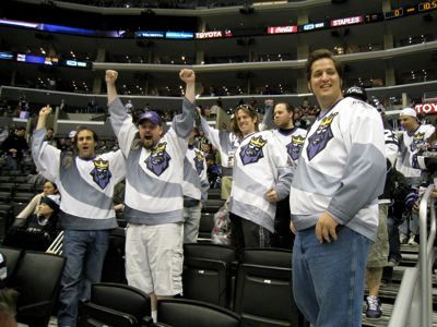
A few are worn for a brief period of time, such as some of the unfortunate designs among the earliest of the third jerseys like the Mighty Ducks of Anaheim "Wild Wing" and the Los Angeles Kings "Burger King" jerseys, which were worn during the second half of the 1995-96 season for approximately six games each before being abandoned for good. But still, those designs live on, as they were produced in retail versions for fans to purchase and still to this day fetch big dollars on ebay, keeping them in the public eye.

Burger King Jersey Appreciation Day Pictures, Images and Photos
The King lives on thanks to Burger King Jersey Appreciation Day

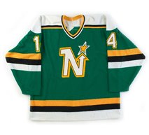
On the other hand, some jerseys have come and gone, sometimes for years, before making a comeback as a vintage jersey re-release, which can cause the finer details of the jersey to blur over the passage of time. A perfect case in point are the Minnesota North Stars jerseys of the late 1980's. When those were first remade by CCM, either someone did not pay attention to the details or there were gaffes in production that went unnoticed, such as the star above the "N" in the crest being sewn on backwards, which caused the star to lean to the left, while the italicized "N" was tilted properly to the right.

North Stars backwards star, North Stars backwards star
A CCM North Stars remake with the star sewn on backwards

Additionally, the specs for the customization of the numbers was also botched, as the "drop shadow" of the numbers went up and to the left, thanks to the top layer of white twill for the number being improperly sewn onto the bottom right of the yellow layer of twill, rather than the top left of the yellow layer, which would have created a proper drop shadow going down and to the right. It's hard to imagine how this was allowed to continue past the initial production run, as the biggest clue as to how the drop shadow was supposed to look was sitting there in plain sight on the other side of the jersey in the form of the main crest!

Another such case of an incorrect version of a jersey becoming considered gospel is the legendary 1996-97 Quebec Nordiques Unused Jersey, which never actually saw action in the NHL, owing to the franchise relocating to Denver, Colorado for the 1995-96 season before the Nordiques could debut their planned new design.

In this Wikipedia world we all live in, where anyone can post anything online, giving it a certain level of credibility regardless of it's often dubious, if any, source.

It must be true, It must be true

What has happened with the proposed Nordiques jersey was that a contributor to the Chris Creamer Sports Logo Community drew the image below of the proposed home and away jerseys based on a black and white photo scanned from a newspaper, knowing only the intended main color of the jerseys was to be navy blue, and was forced to take an educated guess on the other colors based solely on the tones of the shades of grey in the black and white image. Once completed, that artwork was publicly posted on the Sports Logo Community forum.

That one image, based on an educated, but ultimately incorrect, guess, then began to be discovered through image searches, copied and reposted other places online without any idea the original artist had no information on the actual colors to work with.

Nordiques_incorrect colors, Nordiques_incorrect colors
The widely accepted, incorrectly colored version of the Nordiques proposed
jerseys based on an educated guess from a black and white image

To demonstrate, perform a google image search for "Quebec Nordiques unused jersey" and see what the results look like.

Nordiques Jersey search, Nordiques Jersey search

Notice the five highlighted results on page one alone. All five of them are the incorrect version of the proposed Nordiques jerseys, lacking both the color teal as well as the black arm stripes, the first two from Creamer's excellent SportsLogos.net, the third is another fan created concept from "HockeyJerseyConcepts" based on the incorrect version, and the final two, the logo by itself and the pair of home and road jerseys in a single image, are both from the Nordiques entry on Wikipedia, as shown below.

Nordiques Wikipedia, Nordiques Wikipedia
A snapshot of the Quebec Nordiques Wikipedia entry on 4/21/12

But let's take a moment and revisit the google image search results. Notice the very first image returned by the search, which is the key that the accepted version online has the colors wrong.

Nordiques Jersey search, Nordiques Jersey search

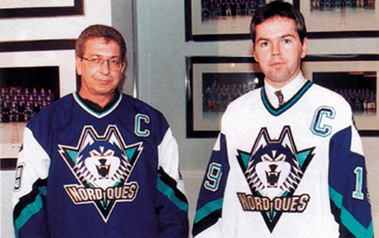
Clicking on that image reveals a publicity photo of the proposed Nordiques home and road sweaters, reportedly being modeled by either Nordiques team executives or members of the media. We've seen the gentlemen in the photo attributed as being both.

Nordiques unused 1995-96 jerseys Pictures, Images and Photos
The only known photograph of the Nordiques new jerseys

This photo clearly shows the generous use of teal on both the home and road jerseys for:
  1. the trim on the collars
  2. the captain's C's
  3. the sleeve numbers
  4. the stripes on the arms
  5. the background triangle behind the Siberian Husky's head in the crest.
Yes, while we are setting the record straight, it is a husky and not a wolf!

Additionally, the photo shows both jerseys also have black stripes on the arms, which is lacking in the accepted version online.

Why this readily available photograph of the actual jerseys, and the only known photo of the proposed jerseys, easily found with a basic google image search, has been so thoroughly ignored for so long by so many sources is beyond us, and it's time to set the record straight.

The commonly accepted colorizing of the proposed Quebec Nordiques new jerseys is wrong, as it lacks the actual teal and black and instead uses silver and periwinkle chosen by someone working from only an early black and white photo which forced him to make an estimation of what the actual colors were going to be based on shades of grey. That image was then copied and repeated on several respected locations across the internet, eventually becoming the accepted version of what the club had planned.

Further evidence of our assertion can be found in a news brief from The Hockey News in April of 1995, which reads:
Nordiques will have new look in 1996-97

Compiled by the THN Staff

The Quebec Nordiques don't have a new arena yet, but a new logo and colors are on the way.

When the Journal de Quebec published the Nordiques' new colors March 30, the team had no choice but to confirm the makeover.

The team's road jersey will be dark blue with a few lines of a teal-like green color, black, white, and silver. The crest has a large head of a husky dog with its teeth bared. They will sport their new colors in 1996-97 and not next season (1995-96) because they failed to meet the NHL's deadline for a logo change.
There's no mention of periwinkle, lavender or light purple. None, and the original creator of the accepted image did not have access to this more detailed information at the time of creating his work.

Again, here are the Nordiques colors from ColorWerx at SSUR.org, documenting the teal (PANTONE Coated 321) used by Quebec for their proposed jerseys, which also documents no periwinkle whatsoever.

QuebecNordiques_ColorWerx, QuebecNordiques_ColorWerx
The Nordiques color palette from ColorWerx

Using those colors, as well as the original photo of the actual jerseys, here is what the correct version of the Nordiques unused jerseys should actually look like - a much bolder, brighter and higher contrast look which uses the trendy colors of teal and black that were all the rage in the mid-1990's rather than the incorrectly colored, widely accepted version with it's dull, muted colors found so commonly online.

Nordiques_proposed, Nordiques_proposed

Please feel free to spread the word and save the above image, as well as using it wherever and whenever you find the need, especially when you can use it to replace the incorrect version so commonly found online. Email us, and we'll even send you the larger version we created or download it from this address. Now all we need is a tutorial on how to upload it to Wikipedia...

In addition, here is the correctly colored logo of the husky dog, of which the full size version is available by clicking here.

Nordiques proposed correct colors, Nordiques proposed correct colors

Today's featured jersey is a 1996-97 Quebec Nordiques Joe Sakic jersey, a jersey intended to be worn during the Nordiques 1995-96 season, but pushed back a year on the schedule due to the Nordiques missing the NHL deadline for approval of a new logo. The jersey was never actually worn on the ice by the club due to the sale and relocation of the franchise to Denver, Colorado for the 1995-96 season.

Some time ago an enterprising ebay seller accurately reproduced the Nordiques proposed road blue jerseys based on the photo shown above, and we were fortunate to be able to add one of them to our collection, as there are now even reproductions on ebay based on the incorrect periwinkle color scheme!

Quebec Nordiques unused 1996-97 F photo QuebecNordiquesunused1996-97F.jpg
Quebec Nordiques unused 1996-97 B photo QuebecNordiquesunused1996-97B.jpg

Today's video selection is a look back at the history of the Nordiques and the eventual announcement of their sale and relocation, which shelved the plan to change to today's featured jersey if they team had remained in Quebec City.


Monday, June 21, 2010

1995-96 Quebec Nordiques Prototype Jersey

On this date in 1995, the NHL gave their approval for the sale of the Quebec Nordiques which resulted in their relocation to Denver, Colorado.

Originally founded in 1972 as one of the original 12 WHA franchises, the Nordiques played seven seasons in the WHA, winning the championship once in 1977.

1976-77 Quebec Nordiques

While the league folded following the 1978-79 season, four of the league's strongest and most stable franchises would enter the NHL as "expansion" franchises, which included the Nordiques.

Life in the NHL proved both exciting and difficult. The Nordiques rivalry with Quebec neighbors the Montreal Canadiens provided some of the most intense battles of the 1980's. After missing the playoffs in 1980, the Nordiques made the playoffs for seven consecutive seasons, including a division title in 1986 and a pair of trips to the conference finals in 1982 and 1985.

1985-86 Quebec Nordiques

Sadly for fans of the Nordiques, the club fell on some very hard times after 1987, missing the playoffs six out of the next seven seasons, including a horrid run from 1988-89 to 1991-92 when the club won a total of 75 games, an average of less than 19 per season, including last place finishes in 1988-89, 1989-90 (33 points behind the second worst team, more than the 31 they actually scored!) and 1990-91.

The Nordiques used the resulting draft picks to select players such as Mats Sundin and Adam Foote (1989), Owen Nolan (1990), Eric Lindros (1991), who they converted into Peter Forsberg, Ron Hextall, Chris Simon, Mike Ricci, Steve Duchesne, Jocelyn Thibault and $15 millon, Adam Deadmarsh (1993). This, in addition to the selection of Joe Sakic (15th overall in 1987), gave the Nordiques a very bright future on the ice, as evidenced by their record-setting turnaround from a 52 point season in 1991-92 to a 104 point season in 1992-93, an improvement of 52 points in one year!

Unfortunately, the future did not look the same off the ice. The weak Canadian dollar hampered the bottom line, as the team's revenues came in Canadian dollars but player salaries were paid in US dollars. No doubt the small size of Quebec City worked against the team and the exclusive use of French in the city both hurt it's ability to attract certain players, sponsorships and contracts with radio and TV outlets. It's home arena, the Colisee de Quebec, bulit in 1949 and it's smaller 15,750 capacity also limited the team's finances.

Nordiques president Marcel Aubut sought financial help from the Quebec provincial government as well as a new publicly funded arena, which was turned down. Eventually the club was sold to Comsat Entertainment Group, already owners of the Denver Nuggets of the NBA, who relocated the team to Denver, Colorado for the 1995-96 season - a year in which they proceeded to immediately win the Stanley Cup with a roster full of players selected to be Nordiques.

Nordiques art

Today's featured jersey is a 1995-96 Quebec Nordiques prototype jersey. The original 1972 Nordiques jerseys used light blue had a considerable amount of red on both the shoulders and waist stripe. The following season the blue was changed to a considerably darker shade and the amount of red was limited to the shoulders on the home jerseys and narrower striping.

The familiar Nordiques style was adopted in 1975 and remained in use through the Nordiques final season in Quebec twenty years later, although a new jersey with a modernized logo was unveiled on March 30, 1995 which was originally intended to be worn by the Nordiques in 1995-96, only it's been reported that the club missed the deadline for approval of the jersey in time for the start of the season and the jersey was now scheduled to become the team's new jerseys for the 1996-97 season, only to see the club relocate to Denver, Colorado, where they would be renamed the Avalanche, leaving the now orphaned jerseys to go forever unworn.

The only known photo of the original jerseys shows (not very thrilled) team executives (or perhaps journalists) modeling the sweaters, failing to show even the full length of the jerseys to reveal the intended waist striping.

Nordiques unused 1995-96 jerseys

None of these jerseys were ever mass produced for retail sale, although some attempts to create them have been made, but none in any great quantities and some less accurate than others.

We've tried to research these jerseys as best we can, but if you have any more details, corrections or additions to our research, feel free to let us know at

Our video section today begins with the 1984 playoffs "Good Friday Brawl"
between the Nordiques and Canadiens.


Here is a report on Eric Lindros refusal to play for the Nordiques, a stance
which would eventually lead to the long-term success of the franchise - after it moved to Denver.


Finally, two more videos showing how the team was playing well, but
financially the club was a state of financial decline.


Sunday, April 11, 2010

The Most Frequently Screwed Up Jersey of All Time™

In anticipation of his retirement, which has not been formally announced yet, Mike Modano was named the #1 star of the game last night in Minnesota, where his career began, and surprised everyone by coming out wearing a Minnesota North Stars jersey.

Photobucket

And predictably, it was customized wrong, as the numbers were lacking the proper drop shadow and the black outline was a separate layer of twill, rather than just black zig-zag stitching, which confirmed our previous declaration that the Minnesota North Stars Mike Modano jersey is The Most Frequently Screwed Up Jersey of All Time™.

Photobucket

Utterly maddening, the CCM 1989-90 Minnesota North Stars Mike Modano jerseys that permeate the hobby are incorrectly customized over 90% of the time. We don't know what idiot originally screwed up the customizing for this jersey, but once it was customized wrong by CCM, it apparently became The Gospel Truth.

Photobucket

Take a look at it. Notice the drop shadow, the key word here being "drop", on the N crest on the front goes down and to the right, but the "drop shadow" on the number goes... up and to the left! What they have done here is located the top white layer of the "9" in the bottom left corner of the yellow layer of twill, instead of the upper right as it should be.

The effect can also be described as a "6" being sewn on upside down, because if you rotate the number 180º, it becomes a 6 with the drop shadow correctly oriented down and away from the white layer. How hard was it to get that right when every photo of the North Stars jerseys from this era not only has the same treatment, but there's a big, fat clue as to how it should look right there on the front of the jersey, as the "N" crest has the drop shadow in the proper orientation, going down and to the right!

While we're at it, notice the star on top of the N. It's backwards! It should lean to the right, following the same trajectory as the arrow part of the N below it. Later production runs of this jersey did have the star corrected, but we've never seen a factory customized jersey ever have the proper drop shadow on the back and sleeve numbers. Why they could fix the specs for the crest but never the numbers is beyond us.

As further proof of our claim of this being The Most Frequently Screwed Up Jersey of All Time™, we present to you the McFarlane's Sports Picks NHL Series 10 Mike Modano Minnesota North Stars figurine.


Even on the front of the packaging you can once more see that the "drop shadow" on the "N" logo goes down and to the right, while on the "9" it once more goes up and to the left. Of course, the "9" on the back of the figurine follows the mistaken CCM placement of the white number within the yellow trim as well.

Here's a challenge for you. Search for "Modano North Stars Jersey" on ebay any time you want. Go ahead. We promise you that 19 out of 20 will be wrong. Guaranteed.

The Mike Modano North Stars jersey. Easily The Most Frequently Screwed Up Jersey of All Time™.

Now, if you want to stand out from the masses and have your jersey done properly by someone who understands how an accurate Minnesota North Stars jersey is supposed to be done, with a proper drop shadow and two colors of twill with black stitching used to create the third color, we recommend VintageMinnesotaHockey.com.

For a look at how it was and should be, here is footage of Mike Modano being selected first overall in the 1988 NHL Entry Draft and being presented with a proper North Stars jersey, followed by a correctly customized North Stars jersey. Notice how narrow the black outline is? That is the effect of the use of black thread to affix the white layer to the yellow layer of twill, not a third layer of black twill in between the white and yellow layers.


Minnesota North Stars Modano jersey


hit counter for blogger