Saturday, September 4, 2010
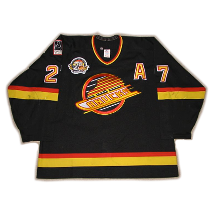
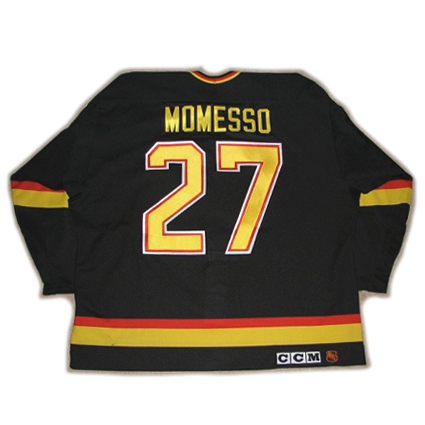
1994-95 Vancouver Canucks Sergio Momesso Jersey
Born on this date in 1965, Sergio Momesso was drafted 27th overall by the Montreal Canadiens in the 1983 NHL Entry Draft after scoring 69 points in 70 games with the Shawinigan Cataractes of the QMJHL.
He continued to play for Shawinigan the following season, raising his point totals to 42 goals and 130 points. The 6' 3" left winger also made ruggedness apparent with 235 penalty minutes. After scoring 8 points in 6 playoff games, Momesso gained more experience by joining the Nova Scotia Voyageurs of the AHL for the remainder of their playoffs. Additionally, he made his NHL debut with a single game with the Canadiens.
1984-85 saw Momesso gaining more confidence and experience with the Cataractes as he scored 56 goals and 146 points in 64 games, earning QMJHL Player of the Year recognition.
He made the Canadiens roster following an impressive training camp in 1985, but suffered a knee injury after 24 games, which included his first NHL goal. The injury prevented Momesso on opportunity to play for the Stanley Cup, which Montreal would go on to win at the conclusion of the season.
Momesso played for his hometown Canadiens for two more seasons before being traded to the St. Louis Blues after a 53 game season in 1988-89, he would set an NHL career high with 24 goals and 56 points, as well as 199 penalty minutes, while playing with the high scoring Brett Hull and Adam Oates for much of the 1989-90 season.
At the 1991 trade deadline, Momesso was one of four Blues sent to the Vancouver Canucks, a trade considered one of the best in Canucks history, as addition to Momesso, Vancouver also received Geoff Courtnall and Cliff Ronning as part of the deal.
The highlight of Momesso's four seasons in Vancouver was the team's run to the Stanley Cup Finals in 1994, where they took the New York Rangers to a decisive Game 7. Momesso contributed 3 goals and 7 points in the Canucks 24 playoff games, including the game winner in overtime in Game 4 of Round 2 against the Dallas Stars.
Following the 1994-95 season, he was dealt to the Toronto Maple Leafs where he played 54 games before being moved to the New York Rangers. He started the 1996-97 season with the Rangers, but after just nine games, he landed back in St. Louis for the final 31 games of his NHL career.
Unable to find work in the NHL for the following season, Momesso signed with the Cologne Sharks of the DEL in Germany for the 1997-98 season. The German game agreed with Momesso, as he scored 33 points in 42 games that season. He played for the Nuremberg Ice Tigers in 1998-99 where he set a professional high with 59 points which came in just 48 games.
A return to the Sharks came for 1999-00 followed by one final season with Cologne before Momesso retired following the 2000-01 season.
His final NHL career totals were 152 goals and 193 points in 345 games, plus an additional 63 goals and 151 points in Europe.
Today's featured jersey is a 1994-95 Vancouver Canucks Sergio Momesso jersey. This jersey style was first introduced in 1989-90. The NHL 75th Anniversary patch was worn in 1991-92, the Canuck Place patch arrived in 1992-93, along with the Stanley Cup Centennial patch worn that season.
1993-94 saw the 2 Pts. F. G. patch worn as a memorial to team owner Frank Griffiths, which was later joined by the 1994 Stanley Cup Finals patch.
Today's featured jersey sports the Vancouver Canucks 25th Anniversary patch, as worn in the 1994-95 season. There were no additional patches worn for the final two seasons of life for this highly decorated style, which saw six different patches worn in eight seasons, including a high of three at the same time during the 1994 cup finals.
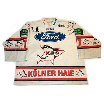
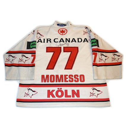
Bonus Jersey: Today's Bonus jersey is a 1997-98 Cologne Sharks Sergio Momesso jersey as worn during the final four seasons of Momesso's career following his move to the German DEL.
This jersey is typical of the European leagues with it's multiple sponsorship logos which are often given priority over even the club's own identity.
All of the available videos online of Sergio Momesso are fighting videos, and here is the best of the lot.
First up, Momesso gives as good as he gets when he and Mark Tinordi exchange blows in a great scrap called.
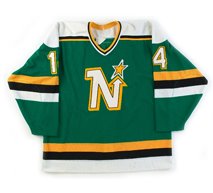
Momesso apparently has an issue with Minnesota North Stars, as here he has a go with Basil MacRae and gets in a clean shot that staggers MacRae, who to his credit gathers himself up and comes back for more. Take note of MacRae's doctored sleeves, which open up to free his arms for fighting, particularly his left sleeve at the :50 mark!
Labels:
Cologne Sharks,
Momesso Sergio,
Vancouver Canucks
Friday, September 3, 2010
2004 Czech Republic Jaromir Jagr Jersey
The Czech Republic played five games in the 2004 World Cup of Hockey, with their first three games taking place in the European Pool of the opening group stage of the tournament.
They opened with a 4-0 loss to Finland in Helsinki on August 30, 2004, followed by a narrow loss to Sweden 4-3 on September 1st in Stockholm, both times while wearing their white jerseys.
They returned home to Prague on this date in 2004 to face Germany and donned their red jerseys for the one and only time. Marek Zidlicky opened the scoring on the power play at 2:56 of the second period. Jiri Slegr scored a minute and a half later to increase the Czech lead to 2-0 at 4:27. Jaromir Jagr continued the scoring for the Czechs within another 90 seconds with a goal at 5:52.
Milan Hejduk added another power play goal five minutes later for a 4-0 lead to chase Germany goaltender Robert Muller from the net. Patrik Elias ended the second period barrage at 15:48 to put the game firmly in Czech control with their fifth goal of the period when he scored on relief goalie Oliver Jonas.
Tino Boos broke through for Germany at 3:55 of the third which was countered by Martin Havlat at 10:59.
Jochen Hecht scored a second goal for Germany at 17:19 and Vaclav Prospal made the final margin 7-2 with an assist from Jagr at the 18:36 mark. Tomas Vokoun got the win for the Czech Republic which allowed them to advance to the playoff round and a quarterfinal rematch with Sweden.
In a surprising turnaround, the Czechs blasted the Swedes 6-1 in Stockholm to reach the semifinals and a matchup with eventual champions Canada, who ended the Czech's tournament with a 4-3 win in overtime.
Havlat led the Czech Republic in scoring with 3 goals and 3 assists for 6 points in 5 games.
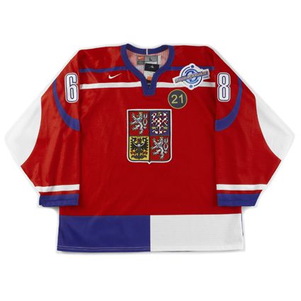
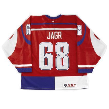
Today's featured jersey is a 2004 Czech Republic Jaromir Jagr jersey as worn on on this date in 2004 in the Czech Republic's 7-2 victory over Germany in Prague, the only time the Czechs would wear their red jerseys during the tournament.
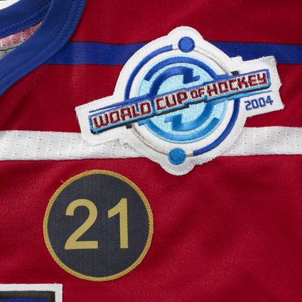
Aside from the 2004 World Cup of Hockey logo patch worn on all players jerseys during the tournament, the Czech Republic's jerseys also had a #21 memorial patch for Ivan Hlinka, the Czech hockey legend who was to have been the Czech Republic's coach during the tournament. Hlinka, who had once coached the Pittsburgh Penguins, was killed in a car accident just two weeks prior to the tournament. Czech Republic captain Robert Reichel, who normally wore #21, changed to #22 for the tournament out of respect for Hlinka.
Our video section today are highlights of the Czech Republic's game versus Germany where today's featured jersey was worn for the only time in the tournament.
Labels:
Czech Republic,
Jagr Jaromir
Wednesday, September 1, 2010
1909-10 Montreal Canadiens Didier Pitre Jersey
With the formation of the Montreal Canadiens of the National Hockey Association on December 4, 1909, player-coach Jack Laviolette was put in charge of assembling a roster of French-Canadian players.
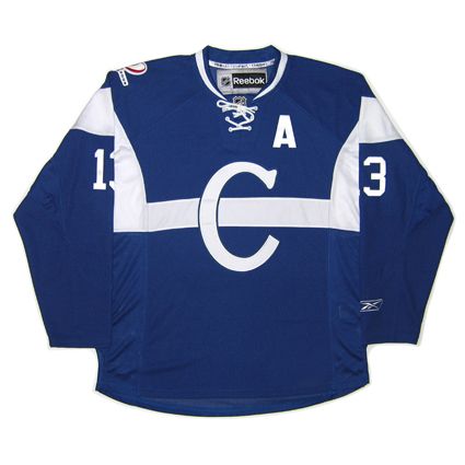
Today's featured jersey is a 1909-10 Montreal Canadiens Didier Pitre jersey. This blue jersey with a white horizontal chest stripe and large "C" on the chest was worn by Les Canadiens during their first ever season while members of the NHA.
This jersey style lasted only a single season, as was the norm for the Canadiens during their formative years. In their first 16 seasons, Montreal would use 11 different jersey styles, including five in their first four seasons, in stark contrast to their tradition of keeping their same iconic style with only minor detail alterations since 1925.
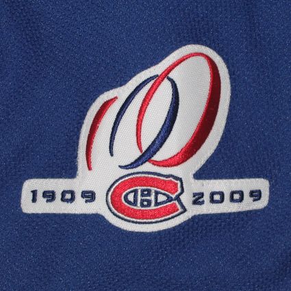
Bonus Jersey: The Canadiens revived their original 1909-10 jerseys as part of their centennial celebrations during the 2008-09 and 2009-10 seasons. This was one of six different styles worn as part of the centennial jersey program.
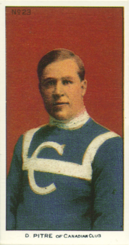
The first man he signed was former teammate Didier Pitre, with whom he had played on the American Soo Indians of the original International (Professional) Hockey League in Michigan from 1904 to 1907.
Renowned as a great skater and possessing the hardest shot in hockey, Pitre was an important acquisition for Laviolette and the upstart Les Canadiens as they sought to establish themselves as the team for the French speaking population of Montreal while in the same league with the Montreal Shamrocks and the Montreal Wanderers.
Laviolette paired himself and Pitre with Newsy Lalonde to form a line known as "The Flying Frenchmen" for 7 of the next 9 seasons. While the Canadiens finished last in their first season with a 2-10 record, Pitre managed to average just under a goal per game, with 11 in 12 contests. Pitre exceeded a goal per game average for the next three seasons with Montreal, who changed their name to the "Montreal Canadiens" for their third season, as he first put up 19 goals in 16 games to tie Lalonde for the team lead in scoring as the Canadiens finished second with an 8-8 record. Pitre then an impressive 27 goals in 18 contests, good for second place in the NHA, followed by 24 markers in the 17 games of the 1912-13 campaign to finish one behind Lalonde on the Canadiens and sixth overall.
Following the 1912-13 season, Pitre moved to the west for the 1913-14 season with the Vancouver Millionaires of the Pacific Coast Hockey League, where he scored 14 goals and 2 assists in 16 games in his only season with the Millionaires to tie for seventh in scoring.
Pitre returned to the Canadiens for the 1914-15 season in time to post the finest offensive season of his career when he scored 30 goals, plus 4 assists, in 20 games after moving from defense up to forward.
After scoring 24 goals in 24 games during the 1915-16 NHA season, fourth in the NHA, Pitre led the league champion Canadiens by contributing 4 more goals in 5 playoff games against the Portland Rosebuds as Montreal won the first Stanley Cup in franchise history. Pitre's share for winning the only Stanley Cup of his career amounted to $238.
Montreal again finished atop the NHA the following season to return to the Stanley Cup playoffs for the second consecutive year after Pitre recorded his fifth consecutive 20 goal season in the NHA. His 21 goals in 20 games placed him sixth in the final season of the NHA.
For the 1917-18 season, the Canadiens became charter members of the brand new National Hockey League and Pitre would continue to play with Montreal for six more seasons, averaging 15 goals a season for the first four years while in the NHL.
The Canadiens would return to the Stanley Cup Finals one more time during Pitre's career in 1919, but the series was cancelled after five games had been played with Pitre leading all playoff scorers at the time due to the flu epidemic which would claim the life of Pitre's teammate Joe Hall.
For the final two seasons of Pitre's career, he would move back to play defense in the spot vacated by the passing of Hall.
Pitre would eventually play 20 seasons of hockey, 13 of those with the Canadiens with whom he would score 220 goals and 59 assists for 279 points in 255 games and was elected to the Hockey Hall of Fame in 1962.
Today's featured jersey is a 1909-10 Montreal Canadiens Didier Pitre jersey. This blue jersey with a white horizontal chest stripe and large "C" on the chest was worn by Les Canadiens during their first ever season while members of the NHA.
This jersey style lasted only a single season, as was the norm for the Canadiens during their formative years. In their first 16 seasons, Montreal would use 11 different jersey styles, including five in their first four seasons, in stark contrast to their tradition of keeping their same iconic style with only minor detail alterations since 1925.
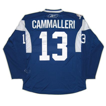
Bonus Jersey: The Canadiens revived their original 1909-10 jerseys as part of their centennial celebrations during the 2008-09 and 2009-10 seasons. This was one of six different styles worn as part of the centennial jersey program.
This particular style was worn on November 21, 2009 in a 3-2 shootout loss to the Detroit Red Wings. Mike Cammalleri scored both Canadiens goals during the game.
This jersey was scheduled to be worn one additional time on February 13, 2010, but the centennial jersey program was discontinued by the Canadiens new ownership with two games left on the schedule, with the other being on January 23, 2010 when their red and green 1910-11 jerseys were to have been worn, making these two styles the only ones to have been worn just once.
Our video selection today takes a look back at the formation of Les Canadiens in 1909.
Labels:
Montreal Canadiens,
Pitre Didier
Tuesday, August 31, 2010
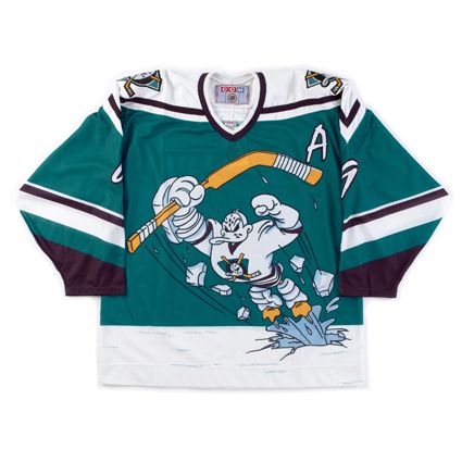
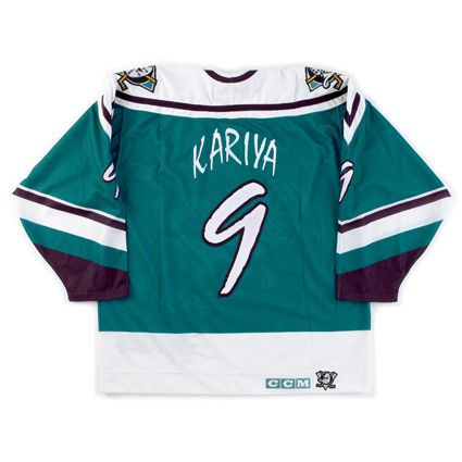
1995-96 Mighty Ducks of Anaheim Paul Kariya jersey
Todays Curious, Weird and Ugly™ Collection jersey is the single most embarrassing jersey to ever see the ice in an NHL game.
The 1995-96 Mighty Ducks of Anaheim alternate jersey was one of the original five alternate jerseys in the NHL. Doing away with the traditional main logo crest, the Mighty Ducks used the dye-sublimation process to create a unique design picturing not the team's logo, but an embarrassing cartoon of it's mascot, Wild Wing, bursting through the ice in a superhero pose.
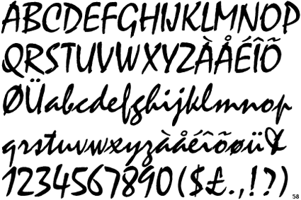
The team only made matters worse with its choice for the name and numbers, the cartoonish, unattractive and difficult to read font, Mistral.
The jersey, dubbed "The Wild Wing Jersey" almost always ranks first or second in "worst jersey" lists due to it's embarrassing cartoon "logo" design, horrible font and trendy non-hockey color for the jerseys. The players hated being seen wearing them and, as a result, the jersey only had a life span of six games before being shelved for good. The game dates were 1/27/96 vs. Los Angeles (who wore their Burger King jerseys, making for the single most visually appalling game in league history), 2/2/96 vs. the Hartford Whalers, 3/3/96 vs. the Tampa Bay Lightning, 3/8/96 vs. the Buffalo Sabres, 4/3/96 vs. the Edmonton Oilers and one final time on 4/12/96 vs. the Dallas Stars, going 3-2-1 in those games.
We've even read an account that the players said theydid not want to wear them for a second season and additionally did not want any pictures of them wearing the jersey in the following year's Mighty Ducks media guide!
Little is known about who was involved in the development of the Wild Wing and what their thought process was. Apparently no one wants to take credit for being responsible for the worst jersey in NHL history, but you can safely bet that non-hockey people at Disney had a large part in such an unconventional approach to hockey sweater design.
As a result of it's short period of use, there were no additional patches worn on this jersey, not that you would be able to pick one out among all the visual noise of the design anyway.
This jersey must be classified as "Weird" and "Ugly". If it weren't for then owner Disney's involvement with the jersey, we'd include "curious", but with Disney involved, there's no curiosity as to where this monstrosity came from. We will also allow ourselves a bit of leeway in the case of this especially horrid jersey and also classify it as "Stupid".
In all honesty, if you strip away the cartoon logo and font used, the jersey pattern of the pointed shoulder area, similar to the current Penguins home jerseys of the day, and sleeve striping is a good base from which to work from. But the accolades stop there.
The primary jade color of the jersey was just too trendy, too "California", to embrace. The font was thin and reedy and much too busy for it's own good. The secondary logos were hard enough to live with on the home and road jerseys for traditionalists, but the front of the jersey?
It's the stupidest thing we've ever seen on an NHL jersey, bar none.
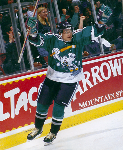
Here is the all-time greatest photo of the Wild Wing jersey, as Teemu Selanne imitates the design on the front of the jersey with his arms in the air and stick raised. The only thing missing is the hole in the ice below him!
Our video section begins with the Mighty Ducks of Anaheim debuting their new "Wild Wing" jerseys against the Los Angeles Kings, who were wearing their awful "Burger King" jerseys for the first time during same game.
Next, a goal by Paul Kariya while the Worst Dressed Game in NHL History™ continues.
That wraps up our trip through the "Curious, Weird and Ugly" Collection for this year. There are other jerseys that certainly qualify, most specifically the Atlanta Thrashers alternates of 2003-04, or the Todd McFarlane designed Edmonton Oilers alternates of 2001-02, the New York Islanders road construction workers vests of 2002-03, the Vancouver Canucks color fading alternates of 2001-02 or the Philadelphia Flyers alternates of 2002-03 as well as nearly anything and everything from the Reebok Edge Uniform System™ (9% less wind drag, 14% lighter and 50% more expensive!). Many also mention the Calgary Flames "Flaming Horse Head" alternates of 1998-99, but we happen to think those are pretty cool and refuse to add them to the discussion.
The most recent entry in the collection, confirmed by any search on the internet for "ugly hockey jerseys", is the Montreal Canadiens 1912-13 throwbacks worn last year to celebrate the Canadiens 100th anniversary which were most often compared to prison uniforms. They were scheduled to wear them twice, but then coach Bob Gainey opted to skip their second scheduled appearance due to the reaction to them after the first time and go with the more traditional 1916 jerseys instead.
There could also be a book written about some of the "Hideous, Stupid and Embarrassing" jerseys that have been forced on unsuspecting minor league hockey players over the years, but the vast majority of those are one time only jerseys that are outlandish on purpose in order to generate some publicity for the clubs, unlike the strange and weird NHL jerseys I've chronicled that were meant to be taken seriously only to suffer the unanticipated backlash from both the fans and the media.
If you have any nominees for inclusion in the "Curious, Weird and Ugly" Collection, feel free to add your thoughts in the comments section below.
Monday, August 30, 2010
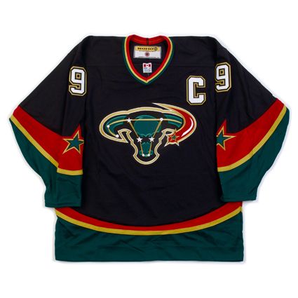
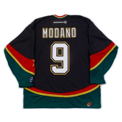
2003-04 Dallas Stars Alternate Mike Modano Jersey
Today's Curious, Weird and Ugly™ Collection jersey is one of the most unexpected designs in the history of NHL alternate jerseys.
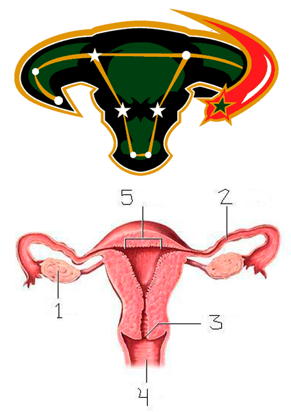
The Dallas Stars had been using the same two home and away jerseys since 1998 when the previous alternate jersey had been promoted to the primary. While many teams rotate the importance of the colors in their set, making a trim color the primary color of their alternate jersey, it's unusual for a team to add an entirely new color not used anywhere else in their identity package - which is exactly what the Stars did by adding red to their new alternate jersey.
While the addition of the color red to their jersey may have raised eyebrows, what really got people talking was the brand new logo created just for this new alternate featuring a constellation of stars mapping out a bull's head with a red-tailed shooting star sweeping around the head from the side. It was assumed that the constellation pictured was Taurus the Bull, but the constellation of Taurus has it's own unique shape that bears no relation to the Dallas Stars alternate logo.
At the time of it's introduction, the team described the logo this way;
"The new logo depicts a constellation of individual stars aligning to form an unstoppable force of nature, a charging bull. Get it? A constellation of stars aligning to form an unstoppable force? "
Only that's not how the critics saw it.
Oh no.
The bull's head immediately reminded many of a diagram of a woman's uterus, and was derisively nicknamed "The Mooterus" - a combination of a cow's "moo" and a woman's "uterus", elevating it instantaneously to the lofty status of the "named jersey", a sure sign of infamy.

The jersey, which was not very well received, was worn for two seasons, 2003-04 and 2005-06, taking a year off in the middle for the season lost to the lockout. Teams are required by the NHL to market their new alternate sweaters for a minimum of 15 games for their first season of use. The Stars reduced that number to just eight games for the 2005-06 season and refused to commit to the same amount for 2006-07, which would have been the final season for The Mooterus anyway, due to the league-wide redesign coming with the introduction of the Reebok Edge jerseys that limited teams to just home and away jerseys for 2007-08.
Dallas Stars owner Tom Hicks was quoted as saying on the occasion of The Mooterus' final game on April 3, 2006, "Good riddance. The funny thing is that you can't find anyone around here who will take credit for designing it. Nobody's left."
Jill Moore, the Stars Senior Director of Merchandising, said one of the problems with the bull's head logo was that it was designed undercover by an outside service during the days of the Southwest Sports Group's ownership of the Stars. The conglomerate had a plan - trying to mix the thought of a constellation, stars, with a Texas icon, the bull head.
The team did make $400,000 from sales of the jersey and went 13-7-3 while wearing it, but the mixture of too many ideas combined with a lack of testing led to the backlash against it.
There were no additional patches worn on the jersey in either season of it's use.
We classify this jersey as clearly "Ugly" due to the unexplained inclusion of red, which was not only never a Dallas Stars color, but the way the red looked combined with the predominately black jersey and the dark shades of green and gold used by the Stars. Overall it was a dark and depressing jersey even before the logo was applied to it.
As for the logo itself, as stated above, there was just too many ideas combined for it to ever work. Perhaps a simplified bull's head logo with a single star (which worked up the road in Houston quite nicely) rather than the constellation overlay might have been more effective, in the way that the Calgary Flames horse head logo paid homage to the Calgary Stampede rodeo and the city's western heritage, with just enough flames to tie it to the team's name.
As it was, the logo just didn't look enough like a bull's head and was overshadowed by the busyness of not only the stars placed on it, but the lines connecting them as well. The unnecessary shooting star on the logo only added to the visual confusion since there were already stars pictured inside the bull's head. The streak of red behind it only served to grab the viewer's eye away from the more muted tones of the black and green bull's head.
Then there was the logo's unfortunate resemblance to the female reproductive system, which reduced the entire thing to a laughingstock. In hindsight, they should have at least curved the bull's horns upwards to diminish the comparison to the medical diagram since the logo was not faithful to the actual constellation of Taurus in the first place.
Also odd was the decision to not use any red in the customization specifications. The colors used for the names and numbers, taken straight from the green home jerseys look out of place on the alternate since the gold color trim on the numbers does not match the gold color of the stripes on the jerseys. Perhaps changing the black trim of the names and numbers to red might have made them look like they were meant to be on the jersey from the beginning. This would have helped tie the entire package together and helped to justify the appearance of the red on the jersey in the first place. As it was done, the jersey and the customizing don't look like they were meant to be together on the same sweater.
Since these jerseys were only worn for a total of 23 games, let's see what kind of luck we can have looking for video of them in action, although you probably can predict by now that if we do find any game footage, it will most likely be fisticuffs...
Sure enough...
Here's some actual skating and passing featuring Stu Barnes.
Labels:
Curious Weird and Ugly,
Dallas Stars
Subscribe to:
Comments (Atom)

