History of Jersey 83-93 Banner sm photo History of Jersey 83-93 Banner sm.jpg

Saturday, August 22, 2009

1995-96 St. Louis Blues Wayne Gretzky Jersey

Today's Curious, Weird and Ugly™ Collection jersey is one of the earliest jerseys to qualify for the collection.

When the Mighty Ducks of Anaheim joined the NHL in the 1993-94 season their jerseys debuted a new look never before seen in an NHL jersey, the diagonal waist stripe. Up until that point 24 out of 24 teams had horizontal waist stripes and the most radical things seen on an NHL jersey were the Pittsburgh Penguins pointed shoulder areas and the San Jose Sharks teal colored jerseys.

With that precedent established, SME Design, who created the Florida Panthers logo in 1993 and has also done work for the Mighty Ducks of Anahiem, New York Rangers, Atlanta Thrashers, Columbus Blue Jackets, Tampa Bay Lightning, Los Angeles Kings, Boston Bruins, Phoenix Coyotes, Calgary Flames, New Jersey Devils, Toronto Maple Leafs, Washington Capitals, Minnesota Wild, the NHL and USA Hockey among others was chosen to design the new jerseys for the St. Louis Blues. Oddly, they seem to have swept their work on the New York Islanders "Fish Sticks" jerseys under the rug...

The Blues jerseys were surprising in that they promoted the former trim color red to a much more predominate position, now taking up roughly 40% of the road jersey. Also impossible to miss were the multiple stripes along the transition area from the main body color to the waist and sleeve ends, four small ones and one thicker one to represent the musical staff, running at the same diagonal direction as the Mighty Ducks jerseys. Also new was the secondary shoulder logo featuring a trumpet.

Aside from the increased use of red and the multiple "music staff" stripes running at a diagonal angle, the most unusual feature of the jerseys were the oddly proportioned numbers, particularly on the back of the jerseys, which ran along the line of the diagonal stripes, condensed on the left and growing larger as the waist stripe falls away on the right, while maintaining a consistent, level line across the top edge. The resulting looks is a number that grows larger as it moves from left to right, exaggerated by two digit numbers, especially numbers with wider first digits, such as those in the twenties, thirties and say, the upper nineties, opposed to those in the teens.

I classify this jersey as "Curious", as it's not so far out there to be "weird", when compared to something like the Coyotes Alternates, or earn one of the coveted nicknames reserved for the worst of the worst. While many did not like this jersey, I found it to be fine for it's era of experimentation. Even though they were a bit too much, I can understand what they were trying to accomplish with the multiple "music staff" stripes, and the numbers that grew in size were at least innovative, if they weren't necessarily attractive.

This jersey lasted from 1995-96 to 1997-98 and carried no additional patches during it's three year run, until replaced by the more traditional alternate jersey first used in 1997-98.

St Louis Blues R 95-96 F
St Louis Blues R 95-96 B

Here is Brett Hull scoring his 500th goal in this jersey.


Here is some great footage of the hard-fought seven game series between the Blues and Detroit Red Wings the year Gretzky played in St. Louis in today's featured jerseys.


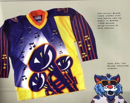
Bonus jersey: You just knew no review of Curious, Weird and Ugly™ jerseys would not be complete without a mention of the proposed St. Louis Blues unused Alternate jerseys which were supposed to join the initial five alternates which debuted in the 1995-96 season.

A step beyond anything seen before, these jerseys, which would have been considered loud and garish in a roller hockey league, were approved by both the NHL and the Blues and scheduled to debut in Gretzky's first game in St. Louis (which would have seen Gretzky wear two of the worst jerseys of all time in the same season), were rejected by then Blues coach Mike Keenan. While I am no fan of Keenan's, one has to give him credit for taking a stand against these monstrosities before they were allowed on the ice. Apparently one example of this jersey exists and I recall reading that it was, at one time, hanging in either the Blues or the NHL offices as a reminder of what not to do ever again. Perhaps someone has a link to this story or a better memory of it and can forward it to me.

Photobucket

This is the one and only photo of this jersey on the internet. I'd like to have the opportunity to see if the back was supposed to be a copy of the front, or if it were perhaps simplified to accommodate the player's name and number. I would have loved to have seen the proposed font for the numbers for use on this jersey and can only imagine the possible horrors in mind for the names on the back.

No doubt had this jersey made it onto the ice it would have been categorized as "Curious, Weird and Ugly" and given fans the blues after having to look at it in action.


Friday, August 21, 2009

1995-96 Mighty Ducks of Anaheim Alternate Paul Kariya Jersey

Todays Curious, Weird and Ugly™ Collection jersey is the single most embarrassing jersey to ever see the ice in an NHL game.

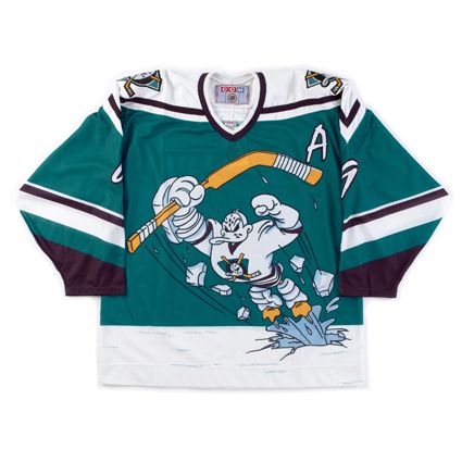
The 1995-96 Mighty Ducks of Anaheim alternate jersey was one of the original five alternate jerseys in the NHL. Doing away with the traditional main logo crest, the Mighty Ducks used the dye-sublimation process to create a unique design picturing not the team's logo, but an embarrassing cartoon of it's mascot, Wild Wing, bursting through the ice in a superhero pose.

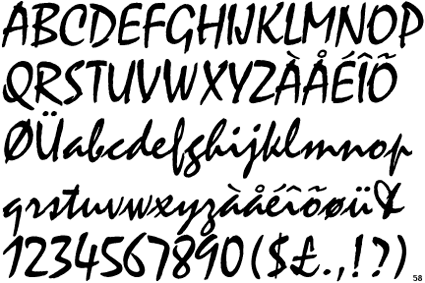
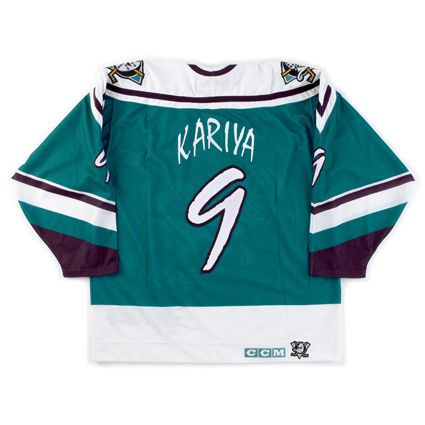
The team only made matters worse with its choice for the name and numbers, the cartoonish, unattractive and difficult to read font, Mistral.

Photobucket

The jersey, dubbed "The Wild Wing Jersey" almost always ranks first or second in "worst jersey" lists due to it's embarrassing cartoon "logo" design, horrible font and trendy non-hockey color for the jerseys. The players hated being seen wearing them and, as a result, the jersey only had a life span of six games before being shelved for good. The game dates were 1/27/96 vs. Los Angeles (who wore their Burger King jerseys, making for the single most visually appalling game in league history), 2/2/96 vs. the Hartford Whalers, 3/3/96 vs. the Tampa Bay Lightning, 3/8/96 vs. the Buffalo Sabres, 4/3/96 vs. the Edmonton Oilers and one final time on 4/12/96 vs. the Dallas Stars, going 3-2-1 in those games.

I've even read an account that the players said they did not want any pictures of them wearing the jersey in the next year's Mighty Ducks media guide or to have to wear them for a second season.

Little is known about who was involved in the development of the Wild Wing and what their thought process was. Apparently no one wants to take credit for being responsible for the worst jersey in NHL history, but you can safely bet that non-hockey people at Disney had a large part in such an unconventional approach to hockey sweater design.

As a result of it's short period of use, there were no additional patches worn on this jersey, not that you would be able to pick one out among all the visual noise of the design anyway.

This jersey must be classified as "Weird" and "Ugly". If it weren't for then owner Disney's involvement with the jersey, I'd include "curious", but with Disney involved, there's no curiosity as to where this monstrosity came from. Perhaps we'll allow ourselves a bit of leeway in the case of this jersey, and also classify this one as "Stupid".

In all honesty, if you strip away the cartoon logo and font used, the jersey pattern of the pointed shoulder area, similar to the current Penguins home jerseys of the day, and sleeve striping is a good base from which to work from. But the accolades stop there.

The primary jade color of the jersey was just too trendy, too "California", to embrace. The font was thin and reedy and much too busy for it's own good. The secondary logos were hard enough to live with on the home and road jerseys for traditionalists, but the front of the jersey?

It's the stupidest thing we've ever seen on an NHL jersey, bar none.

Anaheim Mighty Ducks 95-96 Alt jersey photo AnaheimMightyDucks95-96Alt9F.jpg
Anaheim Mighty Ducks 95-96 Alt jersey photo AnaheimMightyDucks95-96Alt9B.jpg

Here are the Mighty Ducks of Anaheim debuting their new "Wild Wing" jerseys against the Los Angeles Kings, who were wearing their awful "Burger King" jerseys for the first time during same game.


Next, a goal by Paul Kariya while the Worst Dressed Game in NHL History continues.


Thursday, August 20, 2009

2003-04 Dallas Stars Alternate Mike Modano Jersey

Today's Curious, Weird and Ugly™ Collection jersey is one of the most unexpected designs in the history of NHL alternate jerseys.

The Dallas Stars had been using the same two home and away jerseys since 1998 when the previous alternate jersey had been promoted to the primary, while continuing the use of the team's primary logo on the front. While many teams rotate the importance of the colors in their set, making a trim color the primary color of their alternate jersey, it's unusual for a team to add an entirely new color not used anywhere else in their identity package, which is exactly what the Stars did by adding red to their new alternate jersey.

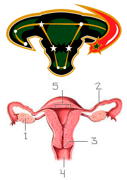
While the addition of red trim to their jersey may have raised eyebrows, what really got people talking was the new logo created just for the alternate featuring a constellation of stars that map out a bull's head with the addition of a shooting star with it's red tail sweeping around the head from the side. It was assumed that the constellation pictured was Taurus the Bull, but the constellation of Taurus has it's own unique shape that bears no relation to the Dallas Stars alternate logo.

The logo used on the jersey was described at the time this way;

"The new logo depicts a constellation of individual stars aligning to form an unstoppable force of nature, a charging bull. Get it? A constellation of stars aligning to form an unstoppable force? "

Only that's not how the critics saw it. Oh no. The bull's head immediately reminded many of a diagram of a woman's uterus, and was derisively nicknamed "The Mooterus" - a combination of a cow's "moo" and a woman's "uterus" for those of you who haven't heard the nickname before, elevating it to the lofty status of the "named jersey", a sure sign of infamy.
Photobucket

The jersey, which was not very well received, was worn for two seasons, 2003-04 and 2005-06. Teams are required by the NHL to market their new alternate sweaters for a minimum of 15 games for their first season of use. The Stars reduced that number to eight games for 2005-06 and refused to commit to the same amount for 2006-07, which would have been the final season for The Mooterus anyway because of the league-wide redesign coming in 2007-08.

Dallas Stars owner Tom Hicks was quoted as saying on the occasion of The Mooterus' final game on April 3rd, 2006, "Good riddance. The funny thing is that you can't find anyone around here who will take credit for designing it. Nobody's left."

Jill Moore, the Stars Senior Director of Merchandising, said one of the problems with the bull's head logo was that it was designed undercover by an outside service during the days of the Southwest Sports Group. The conglomerate had a plan - trying to mix the thought of a constellation, stars, with a Texas icon, the bull head.

The team did make $400,000 from sales of the jersey and went 13-7-3 while wearing it, but the mixture of too many ideas combined with a lack of testing led to the backlash against it.

There were no additional patches worn on the jersey in either season of it's use.

I classify this jersey as clearly "Ugly" due to the unexplained inclusion of red, which was not only not a Dallas Stars color, but the way it looked combined with the predominately black jersey and the dark shade of green used by the Stars. Overall it was a dark and depressing jersey even before the logo was applied to it.

As for the logo itself, as stated above, there was just too many ideas combined for it to ever work. Perhaps a simplified bull's head logo with a single star (which worked up the road in Houston quite nicely) rather than the constellation overlay might have been more effective, in the way that the Calgary Flames horse head logo paid homage to the Calgary Stampede and the city's western heritage, with just enough flames to tie it to the team's name.

As it was, the logo just didn't look enough like a bull's head, overshadowed by the busyness of not only the stars placed on it, but the lines connecting them as well. The unnecessary shooting star on the logo only added to the visual confusion since there were already stars pictured inside the bull's head. The streak of red behind it only served to grab the viewer's eye away from the more muted tones of the black and green bull's head.

Then there was the unfortunate resemblance to the female reproductive system which reduced the entire thing to a laughingstock. In hindsight, they should have at least curved the bull's horns upwards to diminish the comparison to the medical diagrams since they were not being faithful to the actual constellation of Taurus in the first place.

Also odd was the decision to not use any red in the customization specifications. The colors used for the names and numbers, taken straight from the green home jerseys look out of place on the alternate since the gold color trim on the numbers does not match the gold color of the stripes on the jerseys. Perhaps changing the black trim of the names and numbers to red might have made them look like they were meant to be on the jersey from the beginning and would have helped tie the entire package together justifying the appearance of the red on the jersey in the first place. As it was done, the jersey and the customizing don't look like they were meant to be together on the same sweater.

Dallas Stars Alt 03-06 F

Dallas Stars Alt 03-06 B

Since these jerseys were only worn for a total of 23 games, let's see what kind of luck I can have looking for video of them in action, although you probably can predict by now that if I do find any game footage, it will most likely be fisticuffs...

Sure enough...

Here's some actual skating and passing featuring Stu Barnes.


Wednesday, August 19, 2009

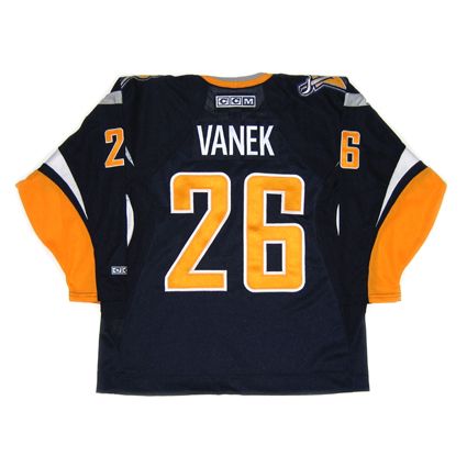
2006-07 Buffalo Sabres Thomas Vanek Jersey

The Curious, Weird and Ugly™ Collection now must examine, against our will, a 2006-07 Buffalo Sabres Thomas Vanek jersey.

Some feel that the Sabres have been wandering the hockey jersey wilderness since the team rebranded itself in the 1996-97 season, moving away from their original blue and yellow colors and circular logo jerseys worn since their inception in 1970, changing to a new red and black color scheme with a much more modernized Buffalo head logo and innovative new jersey template, which gave the impression of Buffalo horns running up the side of the jersey. Remember, this was back in 1996 when prior to that every jersey had horizontal waist stripes except the St. Louis Blues and Mighty Ducks of Anaheim diagonal stripes.

Designers started to take risks and start thinking outside the traditional box, as evidenced by the new Calgary Flames, Washington Capitals, the outlandish New York Islanders and unique Colorado Avalanche jerseys, not to mention the free thinking seen on the first batch of alternate jerseys chronicled here on this blog the last several days.

The Sabres new black and red look was, to me, a very well done modernization of the Sabres look and it's frankly somewhat amateurish original logo. Unfortunately the new look, instead of being introduced for an expansion team with no previous history to live up to, was saddled with the responsibility of having to compete with Buffalo's entire past and the fanbase's passion for their classic look. They derisively called the new logo "The Goat Head" and longed for a return to the Sabres original colors and logo.

And in a classic case of "Be Careful What You Ask For, You Just Might Get It™", in the 2006-07 season the Sabres went back to the old familiar blue and yellow colors - only this time with a new logo.

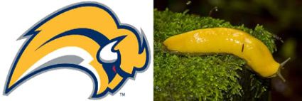
The reaction was swift and severe, with the logo becoming the most ridiculed logo in the history of professional sports and was given the nickname of "The Buffaslug", so named so for it's legless form, bright yellow color and undeniable resemblance to the lowly Banana Slug. There was even an online petition against the new logo which topped 30,000 signatures.

Photobucket

On September 16th, 2006, the complete jersey was unveiled at an open practice and quickly became a top seller, as the team was on a high from nearly making the Stanley Cup Finals the previous season, led by stars Daniel Briere and Chris Drury plus the emergence of goaltender Ryan Miller. Sales were also no doubt aided in the return of the blue and yellow colors, as the previous seasons black and red jerseys were now entirely out of date.


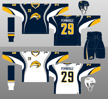
Aside from the logo, the jerseys were controversial in their own way, as they had wild, curving striping along with apparently random color blobs, which suggested neither horns nor sabre blades. Just what exactly is the silver striping that runs from the waist up to the shoulders and down the back, curving this way and that as it goes, supposed to suggest or represent? And the white armpit flares? They don't resemble the horns of the buffalo in the logo, which curve upwards. Are they there for a reason?

Photobucket

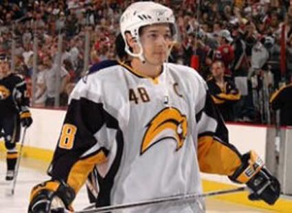
The appearance of these sweaters in action was even worse than the graphic representation of them shown above, where the shapes and lines could at least be made out, as the mishmash of colors all bunched up under the arm pits while being worn created a distracting traffic jam of color that served no purpose other than confusing the viewer as to what the designer meant for these shapes to convey.


Photobucket

I rate this jersey as "Ugly" with a big dose of "Weird". I find the logo to be ugly and weird due to it's giant head coupled with it's legless body, arcing in a path too short and tight. Also factor in the downward angle of the head of the Buffalo. He appears to be milliseconds away from a colossal face-plant, rather than charging forward to victory. He also seems very detached and oblivious to everything around him. There's no connection to the viewer, unlike the previous logo that stared right at you, daring you to challenge him. The Buffaslug is not looking at you as he speeds by to a rendezvous with a first round playoff exit. He's just a big head in a big hurry who wants nothing to do with anyone or anything, especially you.

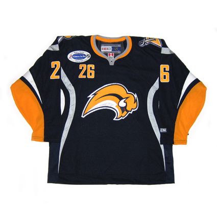
The jerseys on their own, separate from the logo are also ugly and weird. I'm just not a fan of the seemingly random color blobs and meandering striping that seems utterly without reason.

The logo appears to be falling out of favor with the Sabres management, as the updated version of the original charging buffalo now adorns center ice at the Sabres home rink and has taken a backseat on the Sabres own website.

Buffalo Sabres 06-07 jersey photo BuffaloSabres06-07F.jpg
Buffalo Sabres 06-07 jersey photo BuffaloSabres06-07B.jpg

Here is a highlight film of the Sabres first season under the watchful (red) eye of the Buffaslug. Be sure to take note of the retro alternate jerseys also worn that season in the style of the original Sabres uniforms.


Tuesday, August 18, 2009

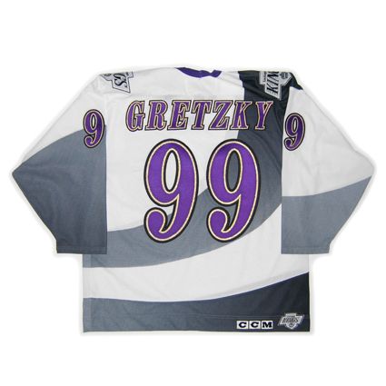
1995-96 Los Angeles Kings Alternate Wayne Gretzky Jersey

Curious, Weird and Ugly™ makes it's way out to the west coast today for one of the most notorious jerseys in the history of the NHL.

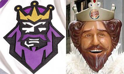
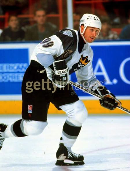
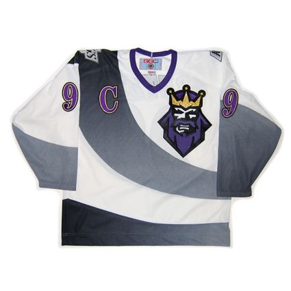
The dye-sublimation printing process rears it's ugly head once more with this 1995-96 Los Angeles Kings Alternate Wayne Gretzky jersey. The jersey features a large swooping stripe that crosses the jersey from the upper right shoulder to the lower left side, fading from dark grey (never quite black) to light while getting narrower in the process. The basic striping pattern of the jersey is unusual, if not odd, enough, but then the Kings got busy customizing it, first adding an angry stylized King's head logo, offset to the upper left chest, something no other jersey of the era, or perhaps in the history of the NHL, dared to do. But that was not all. While the Kings home and road jerseys were exclusively black, white and silver, the King's head logo was done in a garish purple and with a metallic gold crown, one of the earliest uses of metallics in the NHL.

Once the basic jersey was completed, the individual player's identity needed to be addressed. The font chosen for the back and sleeve numbers was a flamboyant, italicized font done in purple, trimmed in metallic gold and outlined in black. The same treatment was given to the names on the back, with the letters also italicized in the same three color combination.

While purple and gold might be associated with royalty, the net effect of the strange swooping stripes, grimacing King's head logo and flashy font executed in the royal purple and metallic gold was much more ridiculous than regal.

Fans dubbed the jersey "The Burger King Jersey", adding it to the list of jerseys so heinous that it earned a coveted nickname. The resemblance between the Los Angeles Kings logo and the fast food chain's creepy monarch is undeniable.

Photobucket

The Kings began wearing this jersey midway through the 1995-96 season, when the first NHL alternate jerseys debuted, beginning with a game against the Mighty Ducks of Anahiem, who also wore their new "Wild Wing" alternates for the first time, on January 27, 1996 in what has to be easily be The Worst Dressed Game in NHL History.

The Kings only wore their new alternates for a mere eight games before the negative reaction of the players and fans caused them to be retired permanently.

It's not known if being forced to wear this jersey caused Wayne Gretzky to ask for a trade out of Los Angeles so he wouldn't have to wear it any longer, but he was dealt to the St. Louis Blues for the last 18 games of the 1995-96 season.

Photobucket

This style jersey was never made in an authentic version for retail, so there are none available outside of game worn or team issued with fight straps. They are highly sought after by collectors and usually attract multiple bidders when they come up for auction, no doubt due to their scarcity, but more importantly the fact this style was worn by Gretzky, meaning not only collectors of ugly jerseys want the "Burger King" jersey, but also collectors of rare jerseys as well as people who specialize in Gretzky items are all after the same limited supply of one of the worst jerseys to ever see the ice in an NHL contest.

We classify this jersey as "Weird", due to the curving, radiating grey stripes that fade from dark to light, the newly introduced grimacing Burger King logo, the name and number font that would look more at home at Mardi Gras than on an NHL jersey, the addition of the color purple to a Kings jersey during the black and silver era, and finally the use of the flashy metallic gold for the number trim and King's crown.

Also weird is the fact Wayne Gretzky agreed to wear it at all. There's really not a single element of this jersey that isn't weird.

Let us reword that last sentence.

There's not a single element of this jersey that isn't really weird.

 photo LosAngelesKings1995-96AltF.jpg
 photo LosAngelesKings1995-96AltB.jpg

Here are the Los Angeles Kings debuting their new alternate "Burger King" jerseys against the Mighty Ducks of Anaheim, who were wearing their "Wild Wing" jerseys in what ranks as The Worst Dressed Game in NHL History.


Next Ugly Fest '96 between the Kings and Mighty Ducks continues as Wayne Gretzky sets up Jari Kurri for a power play goal.

Monday, August 17, 2009

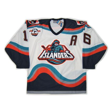
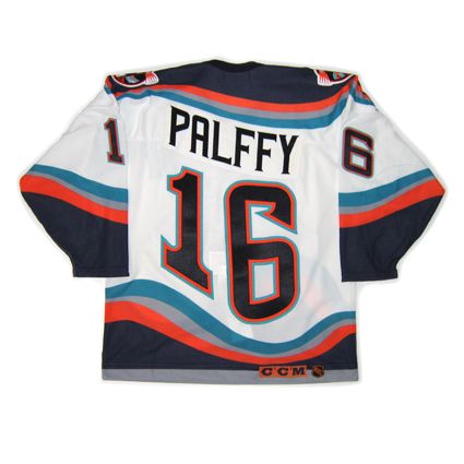
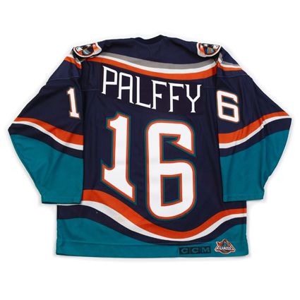
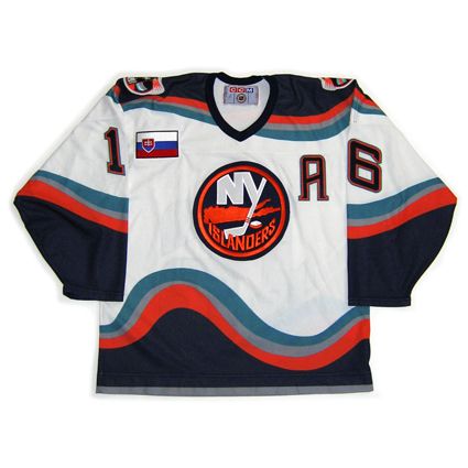
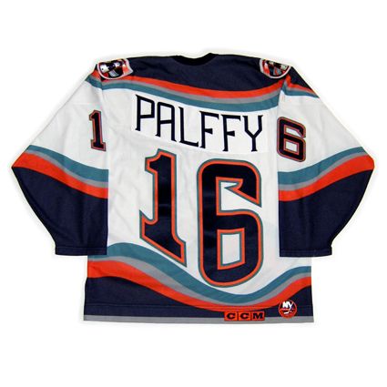
1996-97 New York Islanders Ziggy Palffy Jersey

The Curious, Weird and Ugly™ Collection now recalls a jersey so despised that opposing fans used it as a chant to taunt the team wearing it.

We give you the one, the only, 1996-97 New York Islanders "Fish Sticks" jersey.


Kirk Muller popped into the home dressing room at Nassau Coliseum on a sunny June afternoon during the Stanley Cup finals in 1995. This was the big debut of the Islanders' new uniforms, the first glimpse of what many fans and media members immediately crowed was a blasphemous move by management to make a final break from the team's storied past.

The public relations fiasco that would be known as the Islanders' 1995-96 hockey season actually started near the end of the previous campaign, when Don Maloney committed the signature sin of what would be a short tenure in the general manager's office. He traded his best player, Pierre Turgeon, in a five-player deal for Kirk Muller, a widely respected leader who simply wanted no part of leading the Islanders bak to the playoffs after they failed to qualify during the lockout-abridged 1994-05 season.

If Maloney's worst crime was his misguided belief that his first blockbuster move would benefit he Islanders on the ice, the four-pronged managment group's decision to alter the team's fashion sense only accelerated their transformation into league laughingstocks.

"We never intended to strip the team of it's tradition," Islanders co-chairman Bob Rosenthal said. "But we made a mistake. We did not read the signals correctly. We misunderstood the underlying passion of the fans."

The team's dwindling yet impassioned fan base never forgave (former Islanders General Manager Don) Maloney for the Turgeon trade, not even after Maloney and (Kirk) Muller were both mercifully expunged from the organization over the next nine months. But the logo fiasco served as a rallying point for a segment of fed-up paying customers who suddenly found themselves forming activist groups and oranizing protest rallies rather than worrying about the power play or Stanley Cup playoffs.

"We believed that many of the people who had followed the team in the late seventies and eighties had moved off the Island," Rosenthal said. "Their kids had grown, and maybe they moved away as well. The season ticket base, which had been 13,000 to 14,ooo at it's peak, had dropped to 5,000, so we not only were looking to improve our play on the ice, we started looking for ways to attract new fans."

In retrospect, the probably should've found another way.

For the first 23 years of their existence, the Islanders' uniforms were adorned with a simple logo, a circled crest of Long Island that also included an "NY" with the "y" appearing in the form of a hockey stick. It was designed on just three days' notice by John Alogna, who owned a Garden City ad agency, in 1971, and it quickly became synonymous with the Islanders as they ascended from expansion franchise to NHL champions.

Still, after the 1993-94 season ended in a disgraceful first-round playoff sweep by the Rangers, Islanders management "began to feel that younger fans were starting to think about the old logo in terms of the futility of the previous years, not the four Stanley Cups," according to Rosenthal.

The NHL, buoyed by the marketing and sales success of merchandise adorned with logos of new franchises such as the Mighty Ducks of Anaheim and the San Jose Sharks, encouraged the Islanders to consider making a change, more in line with other cutting-edge sports fashions. The league recommended SME Design in Manhattan, which had modernized the uniforms of the St. Louis Blues and also designed the logo of the expansion Florida Panthers and other pro and college teams.

Initially, Walsh and vice president of communications Pat Calabria served as the point men for ownership.

"The Islanders were living in the shadow of the Rangers," designer Ed O'Hara told Newsday's Steve Zipay in 1997. "We all agreed that a strengthened tie to Long Island was important, to keep the heritage of the Island and amplify it. Savvy marketers will tell you to think locally."

As New Coke and Pepsi Clear showed, sometimes it's better to leave well enough alone.

Walsh, who allowed his children's opinions to influence his decision, had a vision of a maritime theme. SME submitted a proposal to the Islanders with three to five concepts. In April, designs with various colors and logos of a lighthouse, a bearded grimacing mariner and the steering wheel of a fishing boat were offered.

"Everyone agreed that the bayman was the one, although the entire process was a huge concern. There was always self-doubt," O'Hara said. The NHL approved the entire concept in early fall of 1994 for implementation during the 1995-96 season.

Beat writer Colin Stephenson of the Daily News was the first to report the changes and updated colors, remarking how the chosen logo resembled the frozen-food advertising icon Gorton's fisherman. In a photograph accompanying the story, former captain Denis Potvin was pictured hoisting the Stanley Cup while wearing a computer-generated uniform adorned with the new logo and deeper color schemes. SportsChannel announcer Stan Fischler was cited as bearing a remarkable resemblance to the logo fisherman.

Barely one week after the official introduction on June 22, 1995, 78 percent of 1,006 respondents to a Newsday poll asking for responses panned the new logo. To prove there's no accounting for the taste of the consumer public, Team Licensing Business, a publication that tracks purchases of sports apparel, reported as of March 31, 1996 that the Islanders have moved up to No. 17 of the 26 clubs in jersey sales. According to the NHL, that was three or four slots higher than the previous season.

Still, the Islanders fans deplored the blasphemous changes, with many comparing it to the Gorton's fisherman. That comparison prompted Rangers fans to mockingly chant, "We want fish sticks!" when the Islanders visited Madison Square Garden for the first time that season.

Peitions were drawn up and signatures gathered. The Gang of Four was chided mercilessly at Nassau Coliseum, including an ugly incident in which Palleschi's teenaged daughter was booed while singing the National Anthem before one game. A small but vocal contingent of disgruntled fans even formed a group that initially was spawned in protest of the logo.

"With change comes risk; with change comes unhappy fans," Rosenthal said. "As the team continued to lose, fans needed something to cling to and homed in on the logo. We began to realize it was not dying down. In the final analysis, we didn't want our fans or players to be subjected to ridicule for something other than our play."

To be sure, there was plenty of room to mock all aspects of the operation. Ultimately, the one thing that all sides agreed on was that the fisherman logo became the lightning rod for all of the team's misfortunes and the focal point of fan frustration "There's no doubt it was the scapegoat. But winning would have helped," O'Hara said.

On April 11, 1996 - a few games before the end of another disastrous season - the Islanders announced plans to restore the old logo for 1997-98 while retaining the new colors and wavy designs.

"Good," Islanders defenseman Darius Kasparitits told reporters after he was informed of the reversal back to the original logo. "We looked like idiots."

First used in the 1995-96 season, the new Islanders home and away jerseys would immediately receive scorn and ridicule from both the media and fans alike. The comparison of the new logo to the Gorton's fisherman logo, from the well known brand of frozen fish sticks, would spawn chants by Rangers fans of "We want fish sticks! We want fish sticks!"

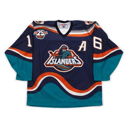
Aside from the logo, the jerseys too were such a radical departure from the classic look of the previous jerseys worn during the Islanders' Stanley Cup dynasty that they were doomed from the start. The basic Islanders color scheme of blue and orange was retained for the most part, but the addition of generous amounts of teal combined with the wavy waist stripes and rolling shoulder area, plus the addition of the rising and falling font for the names and numbers on the back, gave the whole look of the jersey the appearance of a seasickness generating permanent state of motion.

After two seasons on the ice, the Islanders began to phase out the fisherman logo, returning the classic "Long Island/NY" logo to the wavy jerseys as an alternate for the 1996-97 season and the exclusive jersey for the 1997-98 season. The season after that would see a wholesale return to an updated version of the four time Stanley Cup winning classic jersey, this time with three color numbers and four stripes on the shoulders to symbolize the team's four championships.

The fisherman jersey, while only used for two seasons, did sport a patch in 1996-97 for the Islanders 25th anniversary season, worn on both the fisherman and NY logo alternates.

We classify this jersey as "Curious". We can see the new Islanders owner's desire to rebrand their failing franchise at the time and actually find the blue road jerseys with the original "NY" logo to be quite striking and far from "ugly" in our book. We particularly like the secondary lighthouse logos and the attempt to break out of the mold of block numbers so commonly used at the time by creating a unique numbering font.

And this jersey is not nearly as "weird" as the Coyotes alternate since we can understand what they were trying to accomplish. If the Islanders had actually won a few playoff rounds while wearing these, perhaps the public would have given the jersey a fair chance on it's own merits, rather than making it "the lightning rod for all of the team's misfortunes".

The resemblance of the logo to the Gorton's fisherman is best qualified as "unfortunate", as having the rival New York Rangers fans mocking the Islanders because of the jersey meant it was never going to receive a fair shot at acceptability on Long Island.

New York Islanders 1996-97 H jersey photo NewYorkIslanders1996-97HF.jpg
New York Islanders 1996-97 H jersey photo NewYorkIslanders1996-97HB.jpg

In a special bonus today, we also present the road version of this jersey.

New York Islanders 1996-97 R jersey photo NewYorkIslanders1996-97RF.jpg
New York Islanders 1996-97 R jersey photo NewYorkIslanders1996-97RB.jpg

And for a super-special bonus today, I also own the 1997-98 "transition" jersey with the original "NY" logo as well.

New York Islanders 1997-98 H jersey photo NewYorkIslanders1997-98ASGF.jpg
New York Islanders 1997-98 H jersey photo NewYorkIslanders1997-98ASGB.jpg

Here's a quick video of ESPN introducing the Islanders' brand new uniforms and getting a stamp of approval from Gary Thorne.


We have a second video for you which quite nicely sums up the Fish Sticks era for the Islanders, as they are getting pasted by the Hartford Whalers in yet another classic jersey matchup.


For further reading, we recommend the Islander's longtime Media Relations Vice President Chris Botta's blog entry entitled, "The Tale of the Fisherman Jersey or Shame and Mutiny on the Bounty".


Sunday, August 16, 2009

1998-99 Boston Bruins Alternate Ray Bourque Jersey

The Curious, Weird and Ugly™ Collection continues with another jersey from the inaugural class of NHL alternate jerseys, a 1998-99 Boston Bruins Alternate Ray Bourque jersey.

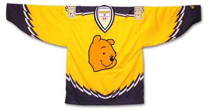
First introduced in 1995, this jersey was the longest surviving of the original alternate NHL jerseys, lasting until the 2005-06 season. Dubbed the "Winnie the Pooh" jersey, it features a primary logo with perhaps the most docile looking bear this side of
Gentle Ben. It's buttery gold color also does nothing to strike fear into the hearts of the Bruins opponents either.

Often overlooked because of the logo and color is the unusual broken striping pattern on the jersey. It's not claw marks. It's not teeth marks. It's not much of anything except all jagged and zig-zaggy for no apparent reason. If anything, when laid flat, it gives the impression of a bird with it's wings spread open. Which is fine if your team is called the Falcons, Eagles or Hawks, but if your mascot is a bear, perhaps it should be something that relates to, perhaps, a bear?

The Denver Grizzlies of the IHL understood this concept, but it was somehow lost on the Bruins.

Patches worn on this jersey were the Boston Bruins 75th Anniversary patch from 1998-99 and the black version of the NHL 2000 patch in 1999-00, which was also the season that the Bruins changed the font for the numbers on all three of their jerseys, going with a serifed font when up until then they used a cleaner sans-serif font. Of note, this jersey was in use during the 1995-96 season when Boston hosted the NHL All-Star Game, but only wore the All-Star Game patch on their home and road jerseys but not this alternate.

I classify this jersey as "Curious" with a dose of "Weird" thrown in for good measure. I find it curious that they chose such a docile, if not actually smiling, bear head for the logo and I find the jagged striping effect a curious decision since it really defies explanation - which is weird. It's also curious that this jersey was used for such a long period of time and weird that they actually made Ray Bourque wear it. I've never been a fan of gold or yellow jerseys personally, but understand that the Bruins are limited in their choices for a third jersey. So limited that their current alternate jersey is black, the same color as their home jersey.

Boston Bruins Alt 98-99 F
Boston Bruins Alt 98-99 B

Here is an early rumored prototype of this jersey which was apparently rejected due to licensing issues with Disney, the then current owners of the Mighty Ducks, who didn't want another team in the NHL with a logo more cartoonish and kid-friendly than theirs, but the Bruins managed to come up with one anyway.

Photobucket

Is it just me, or is it hard to look tough with Winnie the Pooh on your jersey?


Well, maybe it is possible if you are P. J. Stock...


hit counter for blogger