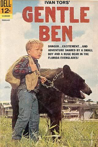
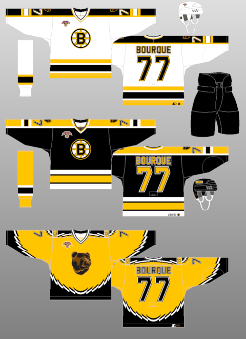
First introduced in 1995, this jersey was the longest surviving of the original alternate NHL jerseys, lasting until the 2005-06 season. Dubbed the "Winnie the Pooh" jersey, it features a primary logo with perhaps the most docile looking bear this side of Gentle Ben. It's buttery gold color also does nothing to strike fear into the hearts of the Bruins opponents either.
Often overlooked because of the logo and color is the unusual broken striping pattern on the jersey. It's not claw marks. It's not teeth marks. It's not much of anything except all jagged and zig-zaggy for no apparent reason. If anything, when laid flat, it gives the impression of a bird with it's wings spread open. Which is fine if your team is called the Falcons, Eagles or Hawks, but if your mascot is a bear, perhaps it should be something that relates to, perhaps, a bear?
Patches worn on this jersey were the Boston Bruins 75th Anniversary patch from 1998-99 and the black version of the NHL 2000 patch in 1999-00, which was also the season that the Bruins changed the font for the numbers on all three of their jerseys, going with a serifed font when up until then they used a cleaner sans-serif font. Of note, this jersey was in use during the 1995-96 season when Boston hosted the NHL All-Star Game, but only wore the All-Star Game patch on their home and road jerseys but not this alternate.
I classify this jersey as "Curious" with a dose of "Weird" thrown in for good measure. I find it curious that they chose such a docile, if not actually smiling, bear head for the logo and I find the jagged striping effect a curious decision since it really defies explanation - which is weird. It's also curious that this jersey was used for such a long period of time and weird that they actually made Ray Bourque wear it. I've never been a fan of gold or yellow jerseys personally, but understand that the Bruins are limited in their choices for a third jersey. So limited that their current alternate jersey is black, the same color as their home jersey.


Here is an early rumored prototype of this jersey which was apparently rejected due to licensing issues with Disney, the then current owners of the Mighty Ducks, who didn't want another team in the NHL with a logo more cartoonish and kid-friendly than theirs, but the Bruins managed to come up with one anyway.

Is it just me, or is it hard to look tough with Winnie the Pooh on your jersey?
Well, maybe it is possible if you are P. J. Stock...


I think the jagged striping was supposed to represent fur.
ReplyDeleteIt was good jersey
ReplyDeletehow is it bad? if it was a winnie the pooh jersey, the bears face would ve yellow and the jersey will be red! retards. but a good jersey!
ReplyDeleteAgreed.. and apparently a year and a half later than the last port. i think this jersey was great. Ithink the gold is striking compared to a white or black jersey and we arethe bruins, no? hence a bruin. Right on.
ReplyDelete