
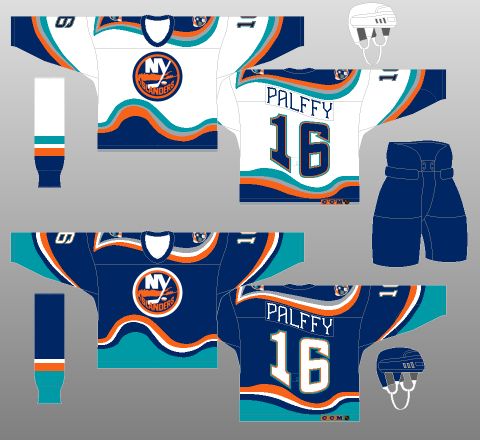
We give you the one, the only, 1996-97 New York Islanders "Fish Sticks" jersey.
Kirk Muller popped into the home dressing room at Nassau Coliseum on a sunny June afternoon during the Stanley Cup finals in 1995. This was the big debut of the Islanders' new uniforms, the first glimpse of what many fans and media members immediately crowed was a blasphemous move by management to make a final break from the team's storied past.The public relations fiasco that would be known as the Islanders' 1995-96 hockey season actually started near the end of the previous campaign, when Don Maloney committed the signature sin of what would be a short tenure in the general manager's office. He traded his best player, Pierre Turgeon, in a five-player deal for Kirk Muller, a widely respected leader who simply wanted no part of leading the Islanders bak to the playoffs after they failed to qualify during the lockout-abridged 1994-05 season.If Maloney's worst crime was his misguided belief that his first blockbuster move would benefit he Islanders on the ice, the four-pronged managment group's decision to alter the team's fashion sense only accelerated their transformation into league laughingstocks."We never intended to strip the team of it's tradition," Islanders co-chairman Bob Rosenthal said. "But we made a mistake. We did not read the signals correctly. We misunderstood the underlying passion of the fans."The team's dwindling yet impassioned fan base never forgave (former Islanders General Manager Don) Maloney for the Turgeon trade, not even after Maloney and (Kirk) Muller were both mercifully expunged from the organization over the next nine months. But the logo fiasco served as a rallying point for a segment of fed-up paying customers who suddenly found themselves forming activist groups and oranizing protest rallies rather than worrying about the power play or Stanley Cup playoffs."We believed that many of the people who had followed the team in the late seventies and eighties had moved off the Island," Rosenthal said. "Their kids had grown, and maybe they moved away as well. The season ticket base, which had been 13,000 to 14,ooo at it's peak, had dropped to 5,000, so we not only were looking to improve our play on the ice, we started looking for ways to attract new fans."In retrospect, the probably should've found another way.For the first 23 years of their existence, the Islanders' uniforms were adorned with a simple logo, a circled crest of Long Island that also included an "NY" with the "y" appearing in the form of a hockey stick. It was designed on just three days' notice by John Alogna, who owned a Garden City ad agency, in 1971, and it quickly became synonymous with the Islanders as they ascended from expansion franchise to NHL champions.Still, after the 1993-94 season ended in a disgraceful first-round playoff sweep by the Rangers, Islanders management "began to feel that younger fans were starting to think about the old logo in terms of the futility of the previous years, not the four Stanley Cups," according to Rosenthal.The NHL, buoyed by the marketing and sales success of merchandise adorned with logos of new franchises such as the Mighty Ducks of Anaheim and the San Jose Sharks, encouraged the Islanders to consider making a change, more in line with other cutting-edge sports fashions. The league recommended SME Design in Manhattan, which had modernized the uniforms of the St. Louis Blues and also designed the logo of the expansion Florida Panthers and other pro and college teams.Initially, Walsh and vice president of communications Pat Calabria served as the point men for ownership."The Islanders were living in the shadow of the Rangers," designer Ed O'Hara told Newsday's Steve Zipay in 1997. "We all agreed that a strengthened tie to Long Island was important, to keep the heritage of the Island and amplify it. Savvy marketers will tell you to think locally."As New Coke and Pepsi Clear showed, sometimes it's better to leave well enough alone.Walsh, who allowed his children's opinions to influence his decision, had a vision of a maritime theme. SME submitted a proposal to the Islanders with three to five concepts. In April, designs with various colors and logos of a lighthouse, a bearded grimacing mariner and the steering wheel of a fishing boat were offered."Everyone agreed that the bayman was the one, although the entire process was a huge concern. There was always self-doubt," O'Hara said. The NHL approved the entire concept in early fall of 1994 for implementation during the 1995-96 season.Beat writer Colin Stephenson of the Daily News was the first to report the changes and updated colors, remarking how the chosen logo resembled the frozen-food advertising icon Gorton's fisherman. In a photograph accompanying the story, former captain Denis Potvin was pictured hoisting the Stanley Cup while wearing a computer-generated uniform adorned with the new logo and deeper color schemes. SportsChannel announcer Stan Fischler was cited as bearing a remarkable resemblance to the logo fisherman.Barely one week after the official introduction on June 22, 1995, 78 percent of 1,006 respondents to a Newsday poll asking for responses panned the new logo. To prove there's no accounting for the taste of the consumer public, Team Licensing Business, a publication that tracks purchases of sports apparel, reported as of March 31, 1996 that the Islanders have moved up to No. 17 of the 26 clubs in jersey sales. According to the NHL, that was three or four slots higher than the previous season.Still, the Islanders fans deplored the blasphemous changes, with many comparing it to the Gorton's fisherman. That comparison prompted Rangers fans to mockingly chant, "We want fish sticks!" when the Islanders visited Madison Square Garden for the first time that season.Peitions were drawn up and signatures gathered. The Gang of Four was chided mercilessly at Nassau Coliseum, including an ugly incident in which Palleschi's teenaged daughter was booed while singing the National Anthem before one game. A small but vocal contingent of disgruntled fans even formed a group that initially was spawned in protest of the logo."With change comes risk; with change comes unhappy fans," Rosenthal said. "As the team continued to lose, fans needed something to cling to and homed in on the logo. We began to realize it was not dying down. In the final analysis, we didn't want our fans or players to be subjected to ridicule for something other than our play."To be sure, there was plenty of room to mock all aspects of the operation. Ultimately, the one thing that all sides agreed on was that the fisherman logo became the lightning rod for all of the team's misfortunes and the focal point of fan frustration "There's no doubt it was the scapegoat. But winning would have helped," O'Hara said.On April 11, 1996 - a few games before the end of another disastrous season - the Islanders announced plans to restore the old logo for 1997-98 while retaining the new colors and wavy designs."Good," Islanders defenseman Darius Kasparitits told reporters after he was informed of the reversal back to the original logo. "We looked like idiots."
First used in the 1995-96 season, the new Islanders home and away jerseys would immediately receive scorn and ridicule from both the media and fans alike. The comparison of the new logo to the Gorton's fisherman logo, from the well known brand of frozen fish sticks, would spawn chants by Rangers fans of "We want fish sticks! We want fish sticks!"
Aside from the logo, the jerseys too were such a radical departure from the classic look of the previous jerseys worn during the Islanders' Stanley Cup dynasty that they were doomed from the start. The basic Islanders color scheme of blue and orange was retained for the most part, but the addition of generous amounts of teal combined with the wavy waist stripes and rolling shoulder area, plus the addition of the rising and falling font for the names and numbers on the back, gave the whole look of the jersey the appearance of a seasickness generating permanent state of motion.
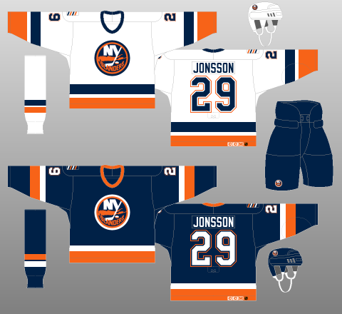
After two seasons on the ice, the Islanders began to phase out the fisherman logo, returning the classic "Long Island/NY" logo to the wavy jerseys as an alternate for the 1996-97 season and the exclusive jersey for the 1997-98 season. The season after that would see a wholesale return to an updated version of the four time Stanley Cup winning classic jersey, this time with three color numbers and four stripes on the shoulders to symbolize the team's four championships.
The fisherman jersey, while only used for two seasons, did sport a patch in 1996-97 for the Islanders 25th anniversary season, worn on both the fisherman and NY logo alternates.
We classify this jersey as "Curious". We can see the new Islanders owner's desire to rebrand their failing franchise at the time and actually find the blue road jerseys with the original "NY" logo to be quite striking and far from "ugly" in our book. We particularly like the secondary lighthouse logos and the attempt to break out of the mold of block numbers so commonly used at the time by creating a unique numbering font.
And this jersey is not nearly as "weird" as the Coyotes alternate since we can understand what they were trying to accomplish. If the Islanders had actually won a few playoff rounds while wearing these, perhaps the public would have given the jersey a fair chance on it's own merits, rather than making it "the lightning rod for all of the team's misfortunes".
The resemblance of the logo to the Gorton's fisherman is best qualified as "unfortunate", as having the rival New York Rangers fans mocking the Islanders because of the jersey meant it was never going to receive a fair shot at acceptability on Long Island.


In a special bonus today, we also present the road version of this jersey.


Here's a quick video of ESPN introducing the Islanders' brand new uniforms and getting a stamp of approval from Gary Thorne.
We have a second video for you which quite nicely sums up the Fish Sticks era for the Islanders, as they are getting pasted by the Hartford Whalers in yet another classic jersey matchup.
For further reading, we recommend the Islander's longtime Media Relations Vice President Chris Botta's blog entry entitled, "The Tale of the Fisherman Jersey or Shame and Mutiny on the Bounty".


I am probably one of the few, but minus the logo, I loved these jerseys! And when they put the old NY logo on the alternates, I thought they were even better. Call me crazy, but the whole wave motif and (like you mentioned) the secondary logo, I don't think they could have done any better. Mind you, I am not an Islanders fan, and thought their original jerseys were dull. I can understand the desire to go back to them, since I am a Red Wings fan and they have THE dullest jerseys in the business, yet I wouldn't want them to change.
ReplyDeleteI have a home authentic of these with Palffy, but number 68. I also have a white alternate game used, with the NY logo, worn by Tony Tuzzolino (Michigan St. alum), number 56 from the 97-98 season.
There is no substitute for the Fisherman. It really was light years ahead of its time, and my Kasparaitis #11 always gets lots of chatter when I wear it - good and bad.
ReplyDeleteIf the Islanders weren't so bad as a team during that time, the Fisherman might have been more accepted. But with the fury of the fans losing Turgeon, who was loved on the Island, this simply was part of the wildfire that was burning out of control.
Love the Fisherman. Commit to the Fisherman!
In that tale of the fisherman article, has anyone noticed that the sweaters in the picture of Kasparaitis and Green don't have waves, but an angled stripe like thew Blues and Ducks?
ReplyDeleteI think you might be right. They certainly don't appear to have the pronounced wave stripes as seen on my jerseys. Good catch.
ReplyDelete