
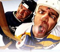
Steve Ott's Twitter Reveal
Following it's on ice debut, sample comments on Twitter were:
- "The Sabres third jersey should come with the 'May cause seizures' warning"
- "Someone thought this was a good idea. More than one person. I can't get over that."
- "It's really unfair to try and single out a 'worst part' with the Sabres new jersey."
- "They're relevant because they look like practice jerseys and they play like a practice squad"
- The Sabres creative team worked in collaboration with Reebok. Team ownership "challenged" the design team, which studied jerseys from across professional sports for "inspiration," to use gold as a primary color.
- The design concept - gold as the primary front color and navy on the back - is believed to be a first for the NHL
- The Sabres designed a new word mark for the pant leg, just below the neckline and right above the crest on the front.
- Reebok designed a "unique font" for the jersey numbers and names inspired by "tips of actual sabers"
- Captain and alternate captain insignia use crossed swords as design elements. The patches have been moved from the chest to the shoulder.

Is it gold, or is it blue?
The best feature of the jersey, the Sabre-specific Captain and Alternate Captains' patches, also proved to be one of the worst, as the sharp looking designs were placed on the player's right shoulders rather than their chest, making them all but impossible to see.

The Sabres unique Captain and Alternate patches

The unique placement of the Sabres captain's designations
That first season Buffalo wore the new alternates ten times for Sunday home games, unfortunately for the Sabres, half of those games were versus Original Six clubs Detroit, Montreal and New York while three more were against New Jersey and Philadelphia, whose timeless, classic jerseys only served to illustrate the absurdity of the Sabres jerseys in comparison.

The Sabres new alternates suffered in comparison
to Detroit's classic jerseys on their debut
Sabres president Ted Black initially declined comment when first asked about the reaction. It got so big and spread so far that Black finally did address it on his weekly appearance on WGR Radio the morning after the season opener. And he did it with remarkable candor:
For those of you who would like to hear the entire 25 minute interview with Black when he first used the phrase "Turd Burger", click the link below. The discussion of the new jersey begins at the 17:12 mark and runs for four minutes.“It’s received a ton of criticism and a lot of attention. I think it had over 4 million mentions on Twitter. I’ve seen it. It’s something that doesn’t offend me. I think people have had a lot of fun with the criticisms of it. Judge for yourself whenever you see it. If you come into the store and you look at it and say I don’t want to buy it or you do buy it, in terms of moving the needles on revenues, it won’t do anything.“If it doesn’t sell, it won’t really mean anything to our bottom line. It’s a third jersey. If it’s a turd burger I’ll have to put it on a bun and eat it. It’s the way it is.“We kept the logo the same. We wanted to do something that was a little bit more non-traditional, so it’s two-toned; it’s gold in the front and blue in the back; it has different colors for numbering; it has the Buffalo font in the front. Like I said, no one’s gonna twist your arm, put a gun to your head if you don’t wanna buy it you don’t have to.”
And with that, the jersey had it's nickname, which historically have been reserved for the worst of the worst jerseys, such as the "Wild Wing", the "Burger King", the "Mooterus" and the "Fishsticks" jerseys.
The team even skipped one of their scheduled games to wear the Turd Burger. After going 1-4-1 in the jersey's first six games, the team wore their regular blue home jerseys against Pittsburgh on February 5, 2014, causing some to speculate that maybe the jersey was on the way out after just one season. The team did wear the jersey for its final three scheduled appearances, finishing the season with a 2-6-1 record while wearing the controversial alternate.

A rare happy moment as the Sabres went 2-6-1 in their new alternate
The jersey was worn ten times throughout the 2014-15 season with somewhat improved results on the ice, going 4-4-2, but apparently without improved results in the sales or aesthetics departments, as the Sabres announced on March 13, 2015 that the Turd Burger Jerseys would not return for the 2015-16 season. From the Buffalo News:
Ted Black admitted the team did a poor job running the design past focus groups and also said, "We didn't anticipate the amount of 'third-jersey fatigue' " in the market in the wake of the team's 40th anniversary throwbacks.One would think that with the importance of retail sales ability to improve a modern sports team's bottom line that the Sabres would have been much more careful about the introduction of any new jersey coming not long after the debacle that was the "Buffaslug", the long hoped for return to the Sabres traditional blue and gold colors in 2006-07 after spending the previous nine seasons wearing black and red, which was completely undone by the legless slug-like logo, which was dropped after four seasons of derision.
To make matters worse for the Buffaslug, the team at the same time brought back the classic Gilbert Perreault-era Sabres jersey as an alternate, making the 'slug look even worse by comparison. That throwback alternate design lasted just one season, falling victim to the introduction of the Reebok Edge jerseys in 2007-08, which dictated teams could not have a third jersey that season.
They created a modern update to the classic Sabres jersey as an alternate in 2008-09 in a darker shade of blue and with additional trim on the stripes. Two seasons later that third jersey was promoted to the primary home jersey and a white version introduced for wear on the road.
That same season, the Sabres' 40th Anniversary season, yet another third jersey debuted, this one in the Sabres original blue and gold colors, which featured a retro "Buffalo" cresting in the style of the old Buffalo Bisons of the American Hockey League.

The 2010-11 Buffalo Sabres 40th Anniversary alternate jersey
It was these three alternate styles in the space of six seasons, none lasting more than two, which caused Black to theorize about the "third-jersey fatigue" factor.
Not to be overlooked as part of the problem greeting the Turd Burger was the Sabres performance on the ice. Terry Pegula purchased the Sabres in February of 2011, bring a feeling of great optimism to the Sabres fanbase, as the team was coming off a 100 point season and their first playoff appearance in tree seasons in 2009-10 and duplicated that effort in 2010-11 with 96 points and another playoff appearance.
The team slipped slightly in 2011-12 to 89 points but missed out on the postseason. In 2012-13 they parted with long time head coach Lindy Ruff and missed the playoffs again. The Turd Burger arrived for the 2013-14 season as the team plummeted to the bottom of the NHL with a 21-51-5-5 record for 52 points, last in the NHL. They then lost out on the first overall pick in the 2014 draft when the Florida Panthers won the draft lottery.
For the 2014-15 season, a 23-51-3-5 record and 54 points excited the fans with another last place finish and hopes of drafting the much-touted Connor McDavid, only to have the Edmonton Oilers swoop in and steal the first pick from the last place Sabres for a second year in a row. Both Ruff's replacement, the popular Ted Nolan, and team president Black were dismissed in the aftermath of the two last place finishes.

Sabres President Ted Black, author of the name "Turd Burger"
Perhaps similar to the New York Islanders "Fishsticks" jerseys of 1995-97, a jersey can become a symbol for a losing team, and the Sabres dismal performance over the two seasons the yellow and blue alternate was worn did nothing to endear the fans to the decidedly unconventional jersey.
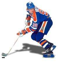
Today's featured jersey is a 2013-14 Buffalo Sabres Tyler Ennis jersey, a very poorly received Sabres alternate, which was unintentionally nicknamed the Turd Burger by the Sabres President Ted Black in an interview discussing the less than supportive response to the new third jersey.


Today's video section is the Sabres alternate jersey's debut against the Detroit Red Wings on this date in 2013.


What does that say on the "hanger effect" spot? Excellence? Ironic.
ReplyDeleteI got one of these on the cheap in 2015 just to add it to the collection. What a train wreck, the BK and fishsticks are better than these. It's not unconventionally weird or cool, its unconventionally boring.
ReplyDelete