
The Soviet Union joined the world of international hockey back in 1951 and made their world championship debut in 1954, winning gold their first time out, only wearing blue sweaters, not the red ones for which they would become famous for.
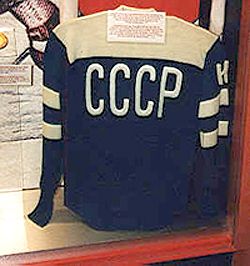
A 1954 Soviet Union National Team sweater
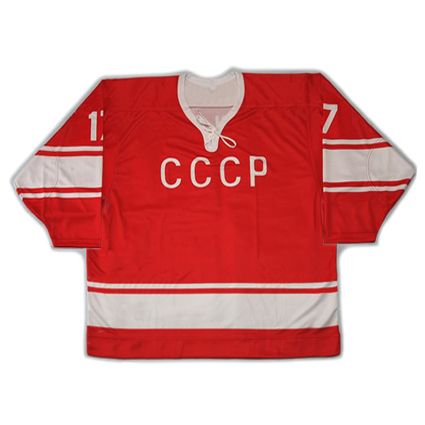
For the majority of their existence, the Soviets would wear red sweaters of a minimalist style with basic sleeve and waist striping adorned with a simple CCCP across the front. No fancy fonts, no italics, no additional colors. All very utilitarian and simple in nature, just enough to identify the team on the ice and nothing more.
As late as the Olympics in February of 1976 they were still wearing the same simple jersey style as they had used as far back as the 1964 Olympics.
In September of 1976, they debuted a new set of sweaters, still with the same basic striping pattern, only now decorated with repeating diamond shapes around the waist - a radical departure for the Soviets. This style would serve the Soviets well, including several tours of North America in the Super Series games against NHL clubs, the 1976 Canada Cup, the 1979 Challenge Cup, the 1980 Olympics, the 1981 Canada Cup and another tour of North America in 1983.

The Soviet Union's signature diamond stripe
jerseys of the late 70's and early 80's
They would revert to a very basic style with a pair of simple stripes in white and a nearly invisible dark red on their red sweaters for the 1984 Olympics and later the 1984 Canada Cup. The white home jerseys were more successful, with their pair of extremely similar in tone red stripes against white.

The more successful home white version of the 1984 Soviet Olympic jersey
photo courtesy of Classic Auctions
All that changed with the rise of sports marketing in 1985 when Adidas became the supplier to all the teams at the IIHF World Championships. While the jerseys employed the same basic sleeve and waist stripes of the 1976 Olympic jerseys, the iconic three stripe pattern signifying the Adidas brand now ran down the full length of the arms, while sponsorship patches from the Belgian film manufacturer AGFA signaled a new era of commercialism in international hockey.

Slava Fetisov wearing an Adidas jersey at the 1985 World Championships
The next and boldest step arrived in 1986 at the World Championships in Katowice, Poland in the form of today's featured jersey, a 1986 Soviet Union Sergei Starikov jersey, as the Soviets arrived with a striking new design unlike anything in the history of their national team, dating back now 35 years.
Attention getting enough was the prominent white stripe running down each arm, which served as a background to highlight the Adidas stripes to an even greater degree than the previous style, but what really made this a stunning departure from any prior Soviet jersey were the bold, asymmetrical white triangles which simply screamed "LOOK AT ME!" in a way no Soviet jersey had ever dared before.
The "double triangle" look was completed with CCCP in a bold, modern font, while similar to the previous style, now tightly spaced in a way that made it appear much more aggressive. A true high point in the history of international jerseys, and brought to you by a no more unexpected and shocking source than the normally staid Soviet Union!

photo courtesy of Classic Auctions
This exact jersey style had an all too brief lifespan, being worn only for the notorious 1987 World Junior Championships in December of 1986, stretching into January of 1987, when on January 4th, the Soviets and Canadians engaged in the bench clearing brawl in the final game of the tournament, now named the "Punch-up in Piestany".
Without warning, the Soviet Union, then returned one more time to the white and (nearly invisible) dark red striped style previously worn in the 1984 Olympics for Rendez-vous '87, the two game series between the Soviet Union and the NHL All-Stars, which replaced the customary NHL All-Star Game that year.

1987's surprise reprise of the 1984 Soviet Union Olympic jersey
photo courtesy of Classic Auctions
Two months later in April of 1987, a new version of the "double triangle" jersey had appeared for the 1987 World Championships which sadly had the white sleeve stripes now removed in the style of the first Adidas jerseys introduced at the 1985 Worlds, but with the asymmetrical, bold triangles still in place but with the magic of the 1986 World Championship style now gone.
After seeing the downright flashy debut of the "double triangle" style with it's white sleeve stripes, this return to a more spartan look for the stoic Big Red Machine was a let down, as it lacked the flash of previous version. This style would be used once again in September of 1987 during the 1987 Canada Cup.

The Soviet Union's 1987 Canada Cup jersey
reels in the flash of the previous style
photo courtesy of Classic Auctions
This would be the last hurrah for this family of jerseys, as the Finnish company Tackla would take over from Adidas from the 1988 World Juniors on, bringing in a whole new family of jerseys for the Soviet program as they remained their supplier through the rest of the history of the Soviet Union and beyond, into the earliest days of the Russian National Team in 1992.
Our video section today illustrates the "double triangle" style, first with footage from the 1985 World Championships, the first with Adidas stripes down the sleeves, but still the basic 1976 Olympic striping pattern.
Ironically, the low point in Soviet hockey history came while wearing the high point in their jersey design, the Punch-up in Piestany at the 1987 World Junior Tournament.
Finally, rare footage from the 1987 World Championships, where the Soviet jerseys took a step back from the bold jerseys of 1986, as the arms no longer had the full length white stripes.
The final appearance of the "double triangle" style at the memorable 1987 Canada Cup.


Is that a "K" or an "H" on the 1954 jersey? A "K" would make sense, but Ebbets Field Flannels insists it was an "H."
ReplyDeletehttp://www.ebbets.com/product/SovietUnion1954Jersey/HockeyJerseys
Also, the jersey in your photo looks like a lighter blue then the Ebbets version. Is that discrepancy just an artifact of the photos of the original jersey, or was it really a lighter blue?
I'd be willing to make a sizable bet that it's supposed to be a K on the arm to signify the team captain.
ReplyDeleteAs for the shade of blue, there are variables, such as the original jersey having faded from time and repeated washings and/or slight overexposure of the photo, but it's also entirely within reason to guess that Ebbets simply approved a darker shade of fabric for their jerseys as either an educated guess that was slightly off or a readily available source of fabric that was just slightly different, but much more economical than having fabric custom dyed to be two shades lighter.