A few are worn for a brief period of time, such as some of the unfortunate designs among the earliest of the third jerseys like the Mighty Ducks of Anaheim "Wild Wing" and the Los Angeles Kings "Burger King" jerseys, which were worn during the second half of the 1995-96 season for approximately six games each before being abandoned for good. But still, those designs live on, as they were produced in retail versions for fans to purchase and still to this day fetch big dollars on ebay, keeping them in the public eye.

The King lives on thanks to Burger King Jersey Appreciation Day
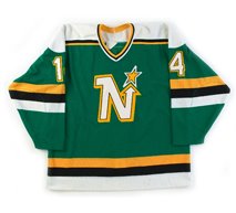
On the other hand, some jerseys have come and gone, sometimes for years, before making a comeback as a vintage jersey re-release, which can cause the finer details of the jersey to blur over the passage of time. A perfect case in point are the Minnesota North Stars jerseys of the late 1980's. When those were first remade by CCM, either someone did not pay attention to the details or there were gaffes in production that went unnoticed, such as the star above the "N" in the crest being sewn on backwards, which caused the star to lean to the left, while the italicized "N" was tilted properly to the right.

A CCM North Stars remake with the star sewn on backwards
Additionally, the specs for the customization of the numbers was also botched, as the "drop shadow" of the numbers went up and to the left, thanks to the top layer of white twill for the number being improperly sewn onto the bottom right of the yellow layer of twill, rather than the top left of the yellow layer, which would have created a proper drop shadow going down and to the right. It's hard to imagine how this was allowed to continue past the initial production run, as the biggest clue as to how the drop shadow was supposed to look was sitting there in plain sight on the other side of the jersey in the form of the main crest!
Another such case of an incorrect version of a jersey becoming considered gospel is the legendary 1996-97 Quebec Nordiques Unused Jersey, which never actually saw action in the NHL, owing to the franchise relocating to Denver, Colorado for the 1995-96 season before the Nordiques could debut their planned new design.
In this Wikipedia world we all live in, where anyone can post anything online, giving it a certain level of credibility regardless of it's often dubious, if any, source.

What has happened with the proposed Nordiques jersey was that a contributor to the Chris Creamer Sports Logo Community drew the image below of the proposed home and away jerseys based on a black and white photo scanned from a newspaper, knowing only the intended main color of the jerseys was to be navy blue, and was forced to take an educated guess on the other colors based solely on the tones of the shades of grey in the black and white image. Once completed, that artwork was publicly posted on the Sports Logo Community forum.
That one image, based on an educated, but ultimately incorrect, guess, then began to be discovered through image searches, copied and reposted other places online without any idea the original artist had no information on the actual colors to work with.
That one image, based on an educated, but ultimately incorrect, guess, then began to be discovered through image searches, copied and reposted other places online without any idea the original artist had no information on the actual colors to work with.

The widely accepted, incorrectly colored version of the Nordiques proposed
jerseys based on an educated guess from a black and white image
To demonstrate, perform a google image search for "Quebec Nordiques unused jersey" and see what the results look like.

Notice the five highlighted results on page one alone. All five of them are the incorrect version of the proposed Nordiques jerseys, lacking both the color teal as well as the black arm stripes, the first two from Creamer's excellent SportsLogos.net, the third is another fan created concept from "HockeyJerseyConcepts" based on the incorrect version, and the final two, the logo by itself and the pair of home and road jerseys in a single image, are both from the Nordiques entry on Wikipedia, as shown below.

A snapshot of the Quebec Nordiques Wikipedia entry on 4/21/12
But let's take a moment and revisit the google image search results. Notice the very first image returned by the search, which is the key that the accepted version online has the colors wrong.

Clicking on that image reveals a publicity photo of the proposed Nordiques home and road sweaters, reportedly being modeled by either Nordiques team executives or members of the media. We've seen the gentlemen in the photo attributed as being both.
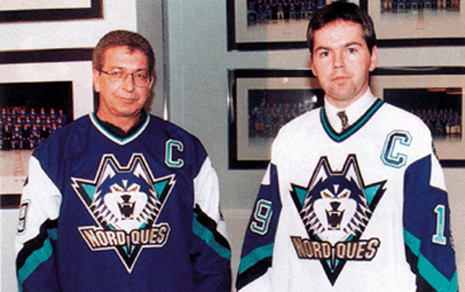
The only known photograph of the Nordiques new jerseys
This photo clearly shows the generous use of teal on both the home and road jerseys for:
- the trim on the collars
- the captain's C's
- the sleeve numbers
- the stripes on the arms
- the background triangle behind the Siberian Husky's head in the crest.
Yes, while we are setting the record straight, it is a husky and not a wolf!
Additionally, the photo shows both jerseys also have black stripes on the arms, which is lacking in the accepted version online.
Why this readily available photograph of the actual jerseys, and the only known photo of the proposed jerseys, easily found with a basic google image search, has been so thoroughly ignored for so long by so many sources is beyond us, and it's time to set the record straight.
The commonly accepted colorizing of the proposed Quebec Nordiques new jerseys is wrong, as it lacks the actual teal and black and instead uses silver and periwinkle chosen by someone working from only an early black and white photo which forced him to make an estimation of what the actual colors were going to be based on shades of grey. That image was then copied and repeated on several respected locations across the internet, eventually becoming the accepted version of what the club had planned.
Further evidence of our assertion can be found in a news brief from The Hockey News in April of 1995, which reads:
Nordiques will have new look in 1996-97Compiled by the THN StaffThe Quebec Nordiques don't have a new arena yet, but a new logo and colors are on the way.When the Journal de Quebec published the Nordiques' new colors March 30, the team had no choice but to confirm the makeover.The team's road jersey will be dark blue with a few lines of a teal-like green color, black, white, and silver. The crest has a large head of a husky dog with its teeth bared. They will sport their new colors in 1996-97 and not next season (1995-96) because they failed to meet the NHL's deadline for a logo change.
There's no mention of periwinkle, lavender or light purple. None, and the original creator of the accepted image did not have access to this more detailed information at the time of creating his work.
Again, here are the Nordiques colors from ColorWerx at SSUR.org, documenting the teal (PANTONE Coated 321) used by Quebec for their proposed jerseys, which also documents no periwinkle whatsoever.

The Nordiques color palette from ColorWerx
Using those colors, as well as the original photo of the actual jerseys, here is what the correct version of the Nordiques unused jerseys should actually look like - a much bolder, brighter and higher contrast look which uses the trendy colors of teal and black that were all the rage in the mid-1990's rather than the incorrectly colored, widely accepted version with it's dull, muted colors found so commonly online.

Please feel free to spread the word and save the above image, as well as using it wherever and whenever you find the need, especially when you can use it to replace the incorrect version so commonly found online. Email us, and we'll even send you the larger version we created or download it from this address. Now all we need is a tutorial on how to upload it to Wikipedia...
In addition, here is the correctly colored logo of the husky dog, of which the full size version is available by clicking here.
Today's featured jersey is a 1996-97 Quebec Nordiques Joe Sakic jersey, a jersey intended to be worn during the Nordiques 1995-96 season, but pushed back a year on the schedule due to the Nordiques missing the NHL deadline for approval of a new logo. The jersey was never actually worn on the ice by the club due to the sale and relocation of the franchise to Denver, Colorado for the 1995-96 season.
Some time ago an enterprising ebay seller accurately reproduced the Nordiques proposed road blue jerseys based on the photo shown above, and we were fortunate to be able to add one of them to our collection, as there are now even reproductions on ebay based on the incorrect periwinkle color scheme!


Today's video selection is a look back at the history of the Nordiques and the eventual announcement of their sale and relocation, which shelved the plan to change to today's featured jersey if they team had remained in Quebec City.


there were a few replicas sold to season ticket holders before the relocation was announced as well
ReplyDeleteThis is the first we've heard of this! We've never been aware of any of those ever coming up for sale either. Thanks for the information.
ReplyDeleteI uploaded your image to Wikipedia: http://en.wikipedia.org/wiki/File:Nordiques_proposed_-_accurate_colours.jpg
ReplyDeleteI also put it on the Nordiques article. I you have a bigger version, you can use the link "Upload a new version of this file".
Thank you so much for helping out with that. I have added links to the larger version of the jersey as well as the correctly colored logo on your talk page on wikipedia since we could not locate the "upload a new version" link which you mentioned.
ReplyDeletehttp://en.wikipedia.org/wiki/User_talk:Libertyernie2
It would be much appreciated if you were able to post the larger image of the jerseys as well as the correctly colored logo as well.
Thanks in advance!
hey guys. that nords jersey from hockeyjerseyconcepts was made by me!
ReplyDeleteHey Cody you better contact the University of Connecticut-they just stole your design for all their sports memorabilia!
DeleteThanks for setting the record straight. I was in Quebec in 1995, and you found the picture I saw in the newspaper with the two guys wearing it. By the way, the guy on the left is columnist Claude Cadorette, who died inthe summer of 95, and the guy on the right was a member of the Nordiques PR team.
ReplyDeleteThanks for identifying Claude Cadorette. We had heard, as we stated in our article, that the two men were either team executives or members of the media, but it's nice to know it was once of each. Perhaps things were different back then, but it seems odd that a member of the media would appear in a photo of a team's new jerseys. That wouldn't happen today. It would almost always be a closely orchestrated PR event with the team's star player modeling the jersey now days. Claude doesn't appear to happy to be wearing the jersey though, so perhaps that was unusual back then too, and he was less than thrilled to be doing so!
ReplyDeleteClaude wasn't that happy because the relocation rumors already started. We were kidding around saying this could be the "Denver Huskies" jersey...
DeleteThe guy on the right is Pierre Kirouac, PR employee back then. The picture was taken on march 30th 1995. I'll send you another picture, the front page of the Journal de Québec.
ReplyDeleteI represent MDF who have been producing the Husky jersey you see on Ebay. With a a lot of help from fans and some research we have found that the jersey you see in the picture unfortunately is still not correct. It seems that the FLUER DE LIS on the shoulders has a triangle in the back ground. I have already made changes and hope to have the revised version soon.
ReplyDeleteThanks for writing. We would certainly love to see any photos you may have of the actual jerseys, especially any showing the details of the shoulder logos you mentioned. We have seen one photo of the jersey a reader sent us which does show the triangle behind the shoulder Fluer-de-lis, but we never noticed that detail until you mentioned it since it was failry subtle detail and not the finest picture, being out of a newspaper. Thanks for bringing this to our attention and we hope to hear from you again with any more pictures or info.
ReplyDeleteI'm Richard Hamel, the guy who posted on october 19th and february 9th. I must be the reader that spyboy talks about in his may 22nd post, and maybe one of the fans that the MDF representative talks about in his may 20th post.
ReplyDeleteNot to make any publicity, but here's the updated jersey from MDF:
http://www.cafr.ebay.ca/itm/Extrememely-Rare-Quebec-Nordiques-Joe-Sakic-jersey-56-/161442576225
Check all the pictures... The Fleur-de-Lys on the shoulders have be changed accordingly to the picture I sent. I've been looking around for a jersey like that for at least 10 years, and it's the most accurate I've ever seen.
Thanks to MDF, I'll buy a jersey very soon!
Thanks Richard. Yes we have now finished the updates on the jersey and even had produced the proper color CCM logo for the jersey hem. As we try to stay out of the legality of using trade marks, there was enough requests for the patch that we thought, we wont advertising them, but offer them free of charge with the jersey.
DeleteDo you sell these jerseys outside of ebay? The American dollar exchange makes them too much at that price.
DeleteWe at ThirdStringGoalie are not the sellers of these jerseys. I would highly recommend going to this link and contacting the seller directly through ebay.
ReplyDeletehttp://www.ebay.com/itm/Extrememely-Rare-Quebec-Nordiques-Joe-Sakic-jersey-52-/141626611660?pt=LH_DefaultDomain_2&hash=item20f99a97cc
Hi, i am a Quebec City resident and was a Nordiques fan. I remember the unveilling of the husky jersey and I am quite sure that what you refer to as triangle under the fleur de lys were in fact two hockey sticks forming a X with the blades of the sticks up of i remember right. Unfortunately, I can't find any picture of this. Sorry.
ReplyDeleteNope, sorry. I still have the front page of the newspaper that got the scoop. The link that spyboy posted on april 5 shows the right jersey.
DeleteDoes anyone have a current link to purchase the updated correct jersey? They don't seem to be on ebay anymore.
ReplyDeleteI believe they're not sold anymore. It's been a while since I saw them. Which makes mine even more special ;)
Delete