Some feel that the Sabres have been wandering the hockey jersey wilderness since the team rebranded itself in the 1996-97 season, moving away from their original blue and yellow colors and circular logo jerseys worn since their inception in 1970, changing to a new red and black color scheme with a modernized Buffalo head logo and innovative new jersey template, which gave the impression of Buffalo horns running up the side of the jersey. Remember, this was back in 1996 when prior to that every jersey had horizontal waist stripes except the St. Louis Blues and Mighty Ducks of Anaheim diagonal stripes.
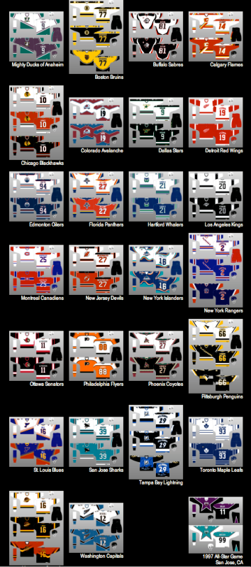
Designers started to take risks and start thinking outside the traditional box, as evidenced by the new Calgary Flames, Washington Capitals, the outlandish New York Islanders and unique Colorado Avalanche jerseys, not to mention the free thinking seen on the first batch of alternate jerseys chronicled here on this blog the last several days.
The Sabres new black and red look was a very well done modernization of the Sabres look and it's frankly somewhat amateurish original logo. Unfortunately the new look, instead of being introduced for an expansion team with no previous history to live up to, was saddled with the responsibility of having to compete with Buffalo's entire past and the fanbase's passion for their classic look. They derisively called the new logo "The Goat Head" and longed for a return to the Sabres original colors and logo.
And in a classic case of "Be Careful What You Ask For, You Just Might Get It™", in the 2006-07 season the Sabres went back to the old familiar blue and yellow colors - only this time with a new logo.
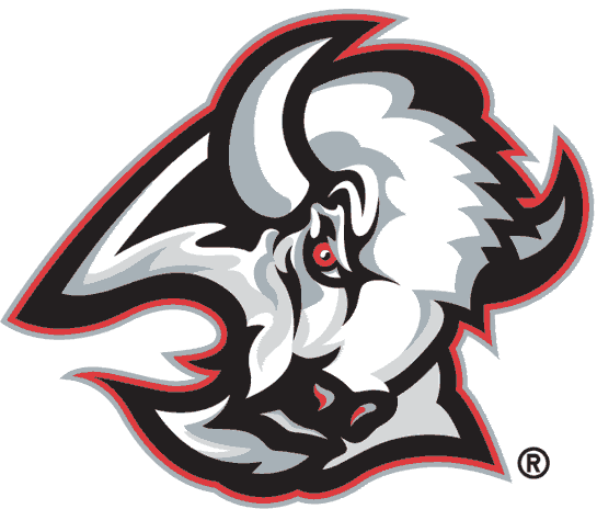
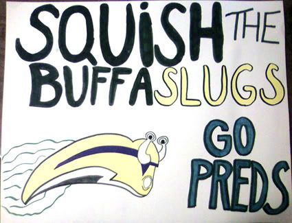
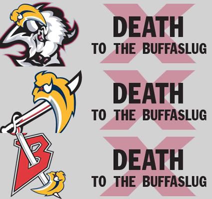
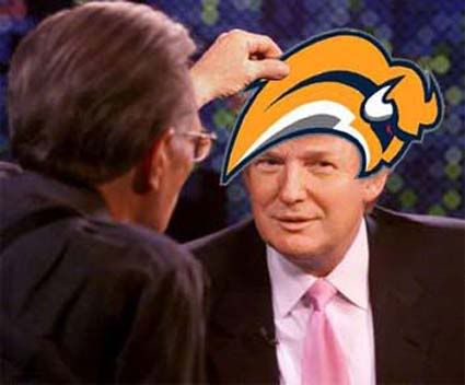
The reaction was swift and severe, with the logo becoming the most ridiculed logo in the history of professional sports and was given the nickname of "The Buffaslug", so named for it's legless form, bright yellow color and undeniable resemblance to the lowly Banana Slug. There was even an online petition against the new logo which topped 30,000 signatures!

On September 16th, 2006, the complete jersey was unveiled at an open practice and quickly became a top seller, as the team was on a high from nearly making the Stanley Cup Finals the previous season, led by stars Daniel Briere and Chris Drury plus the emergence of goaltender Ryan Miller. Sales were also no doubt aided in the return of the blue and yellow colors, as the previous seasons black and red jerseys were now entirely out of date.
Aside from the logo, the jerseys were controversial in their own way, as they had wild, curving striping along with apparently random color blobs, which suggested neither horns nor sabre blades. Just what exactly is the silver striping that runs from the waist up to the shoulders and down the back, curving this way and that as it goes, supposed to suggest or represent? And the white armpit flares? They don't resemble the horns of the buffalo in the logo, which curve upwards. Are they there for a reason?

The appearance of these sweaters in action was even worse than the graphic representation of them shown above, where the shapes and lines could at least be made out, as the mishmash of colors all bunched up under the arm pits while being worn created a distracting traffic jam of color that served no purpose other than confusing the viewer as to what the designer meant for these shapes to convey.

We rate this jersey as "Ugly" with a big dose of "Weird". We find the logo to be ugly and weird due to it's giant head coupled with it's legless body, arcing in a path too short and tight. Also factor in the downward angle of the head of the Buffalo. He appears to be milliseconds away from a colossal face-plant, rather than charging forward to victory.
He's also very detached and oblivious to everything around him. There's no connection to the viewer, unlike the previous logo that stared right at you, daring you to challenge him. The Buffaslug is not looking at you as he speeds by to a rendezvous with a first round playoff exit. He's just a big head in a big hurry who wants nothing to do with anyone or anything, especially you.
The jerseys on their own, separate from the logo are also ugly and weird. We're just not a fan of the seemingly random color blobs and meandering striping that are utterly without reason.
The logo appears to be falling out of favor with the Sabres management, as the updated version of the original charging buffalo now adorns center ice at the Sabres home rink and has taken a backseat on the Sabres own website.


Here is a highlight film of the Sabres first season under the watchful (red) eye of the Buffaslug. Be sure to take note of the retro alternate jerseys also worn that season in the style of the original Sabres uniforms.


This blog is awesome. I am so happy this exists. Keep it up
ReplyDeleteThanks for the comment and encouragement. It's nice to hear, especially in August when we're not sure how many people have hockey on their minds these days!
ReplyDeleteHey there, I just randomly found your blog but I happened to have worked on the goat head redesign and I would like it to be known we fought the red, black and silver all the way! We never thought that was a good idea, it was just a trend at the time. Clearly, we lost that battle. Our hope was the new logo and uniform, but in slightly updated colors: navy blue and metallic or "old" gold.
ReplyDeleteNice retrospective of the history, good on ya'.