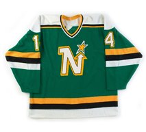
The Dallas Stars had been using the same two home and away jerseys since 1998 when the previous alternate jersey had been promoted to the primary. While many teams rotate the importance of the colors in their set, making a trim color the primary color of their alternate jersey, it's unusual for a team to add an entirely new color not used anywhere else in their identity package - which is exactly what the Stars did by adding red to their new alternate jersey.
While the addition of the color red to their jersey may have raised eyebrows, what really got people talking was the brand new logo created just for this new alternate featuring a constellation of stars mapping out a bull's head with a red-tailed shooting star sweeping around the head from the side. It was assumed that the constellation pictured was Taurus the Bull, but the constellation of Taurus has it's own unique shape that bears no relation to the Dallas Stars alternate logo.
At the time of it's introduction, the team described the logo this way;
"The new logo depicts a constellation of individual stars aligning to form an unstoppable force of nature, a charging bull. Get it? A constellation of stars aligning to form an unstoppable force? "
Only that's not how the critics saw it.
Oh no.
The bull's head immediately reminded many of a diagram of a woman's uterus, and was derisively nicknamed "The Mooterus" - a combination of a cow's "moo" and a woman's "uterus", elevating it instantaneously to the lofty status of the "named jersey", a sure sign of infamy.

The jersey, which was not very well received, was worn for two seasons, 2003-04 and 2005-06, taking a year off in the middle for the season lost to the lockout. Teams are required by the NHL to market their new alternate sweaters for a minimum of 15 games for their first season of use. The Stars reduced that number to just eight games for the 2005-06 season and refused to commit to the same amount for 2006-07, which would have been the final season for The Mooterus anyway, due to the league-wide redesign coming with the introduction of the Reebok Edge jerseys that limited teams to just home and away jerseys for 2007-08.
Dallas Stars owner Tom Hicks was quoted as saying on the occasion of The Mooterus' final game on April 3, 2006, "Good riddance. The funny thing is that you can't find anyone around here who will take credit for designing it. Nobody's left."
Jill Moore, the Stars Senior Director of Merchandising, said one of the problems with the bull's head logo was that it was designed undercover by an outside service during the days of the Southwest Sports Group's ownership of the Stars. The conglomerate had a plan - trying to mix the thought of a constellation, stars, with a Texas icon, the bull head.
The team did make $400,000 from sales of the jersey and went 13-7-3 while wearing it, but the mixture of too many ideas combined with a lack of testing led to the backlash against it.
There were no additional patches worn on the jersey in either season of it's use.
We classify this jersey as clearly "Ugly" due to the unexplained inclusion of red, which was not only never a Dallas Stars color, but the way the red looked combined with the predominately black jersey and the dark shades of green and gold used by the Stars. Overall it was a dark and depressing jersey even before the logo was applied to it.
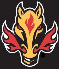
As for the logo itself, as stated above, there was just too many ideas combined for it to ever work. Perhaps a simplified bull's head logo with a single star (which worked up the road in Houston quite nicely) rather than the constellation overlay might have been more effective, in the way that the Calgary Flames horse head logo paid homage to the Calgary Stampede rodeo and the city's western heritage, with just enough flames to tie it to the team's name.
As it was, the logo just didn't look enough like a bull's head and was overshadowed by the busyness of not only the stars placed on it, but the lines connecting them as well. The unnecessary shooting star on the logo only added to the visual confusion since there were already stars pictured inside the bull's head. The streak of red behind it only served to grab the viewer's eye away from the more muted tones of the black and green bull's head.
Then there was the logo's unfortunate resemblance to the female reproductive system, which reduced the entire thing to a laughingstock. In hindsight, they should have at least curved the bull's horns upwards to diminish the comparison to the medical diagram since the logo was not faithful to the actual constellation of Taurus in the first place.
Also odd was the decision to not use any red in the customization specifications. The colors used for the names and numbers, taken straight from the green home jerseys look out of place on the alternate since the gold color trim on the numbers does not match the gold color of the stripes on the jerseys. Perhaps changing the black trim of the names and numbers to red might have made them look like they were meant to be on the jersey from the beginning. This would have helped tie the entire package together and helped to justify the appearance of the red on the jersey in the first place. As it was done, the jersey and the customizing don't look like they were meant to be together on the same sweater.


Since these jerseys were only worn for a total of 23 games, let's see what kind of luck we can have looking for video of them in action, although you probably can predict by now that if we do find any game footage, it will most likely be fisticuffs...
Sure enough...
Here's some actual skating and passing featuring Stu Barnes.


I know that I must be the only one on the planet, but I liked the Mooterus jerseys. I liked the added red. I liked the bulls head (I have always liked the southwest look and used to have my living room like that with a steer skull). I like the added star on the sleeve. I just really like it.
ReplyDeleteI'm weird. What can I tell you?
I will forever remember this jersey because of this amazing Datysuk deke. Marty was embarrassed.
ReplyDeleteIt makes the jersey look worse. Way to go Turco.
http://www.youtube.com/watch?v=xH08Kvwu9Og