When the Mighty Ducks of Anaheim joined the NHL in the 1993-94 season their jerseys debuted a new look never before seen in an NHL jersey, the diagonal waist stripe. Up until that point 24 out of 24 teams had horizontal waist stripes and the most radical things seen on an NHL jersey were the Pittsburgh Penguins pointed shoulder areas and the San Jose Sharks teal colored jerseys.
With that precedent established, SME Design, who created the Florida Panthers logo in 1993 and has also done work for the Mighty Ducks of Anahiem, New York Rangers, Atlanta Thrashers, Columbus Blue Jackets, Tampa Bay Lightning, Los Angeles Kings, Boston Bruins, Phoenix Coyotes, Calgary Flames, New Jersey Devils, Toronto Maple Leafs, Washington Capitals, Minnesota Wild, the NHL and USA Hockey among others was chosen to design the new jerseys for the St. Louis Blues. Oddly, they seem to have swept their work on the New York Islanders "Fish Sticks" jerseys under the rug...
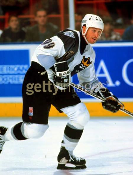
The Blues jerseys were surprising in that they promoted the former trim color red to a much more predominate position, now taking up roughly 40% of the road jersey. Also impossible to miss were the multiple stripes along the transition area from the main body color to the waist and sleeve ends, four small ones and one thicker one to represent the musical staff, running at the same diagonal direction as the Mighty Ducks jerseys. Also new was the secondary shoulder logo featuring a trumpet.
Aside from the increased use of red and the multiple "music staff" stripes running at a diagonal angle, the most unusual feature of the jerseys were the oddly proportioned numbers, particularly on the back of the jerseys, which ran along the line of the diagonal stripes, condensed on the left and growing larger as the waist stripe falls away on the right, while maintaining a consistent, level line across the top edge. The resulting looks is a number that grows larger as it moves from left to right, exaggerated by two digit numbers, especially numbers with wider first digits, such as those in the twenties, thirties and say, the upper nineties, opposed to those in the teens.
I classify this jersey as "Curious", as it's not so far out there to be "weird", when compared to something like the Coyotes Alternates, or earn one of the coveted nicknames reserved for the worst of the worst. While many did not like this jersey, I found it to be fine for it's era of experimentation. Even though they were a bit too much, I can understand what they were trying to accomplish with the multiple "music staff" stripes, and the numbers that grew in size were at least innovative, if they weren't necessarily attractive.
This jersey lasted from 1995-96 to 1997-98 and carried no additional patches during it's three year run, until replaced by the more traditional alternate jersey first used in 1997-98.


Here is Brett Hull scoring his 500th goal in this jersey.
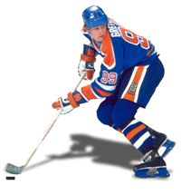
Here is some great footage of the hard-fought seven game series between the Blues and Detroit Red Wings the year Gretzky played in St. Louis in today's featured jerseys.
Bonus jersey: You just knew no review of Curious, Weird and Ugly™ jerseys would not be complete without a mention of the proposed St. Louis Blues unused Alternate jerseys which were supposed to join the initial five alternates which debuted in the 1995-96 season.
A step beyond anything seen before, these jerseys, which would have been considered loud and garish in a roller hockey league, were approved by both the NHL and the Blues and scheduled to debut in Gretzky's first game in St. Louis (which would have seen Gretzky wear two of the worst jerseys of all time in the same season), were rejected by then Blues coach Mike Keenan. While I am no fan of Keenan's, one has to give him credit for taking a stand against these monstrosities before they were allowed on the ice. Apparently one example of this jersey exists and I recall reading that it was, at one time, hanging in either the Blues or the NHL offices as a reminder of what not to do ever again. Perhaps someone has a link to this story or a better memory of it and can forward it to me.

This is the one and only photo of this jersey on the internet. I'd like to have the opportunity to see if the back was supposed to be a copy of the front, or if it were perhaps simplified to accommodate the player's name and number. I would have loved to have seen the proposed font for the numbers for use on this jersey and can only imagine the possible horrors in mind for the names on the back.
No doubt had this jersey made it onto the ice it would have been categorized as "Curious, Weird and Ugly" and given fans the blues after having to look at it in action.


These were another one that I liked. Had a hard time with the numbers though. If would have been better if they gave the number more room, because like you pointed out, that first nine on Gretzky's jersey looks awful.
ReplyDeleteAnd thanks for the memories. I was at the Joe for Game 2 of that 1996 series with the Wings.
I truly wish there were a way to get my hands on those jerseys. My understanding was they were hanging in the locker rooms ready to wear when they said HELLZ NO.
ReplyDeleteSo, what happened to those 25 jerseys? Somewhere out there, someone has one.