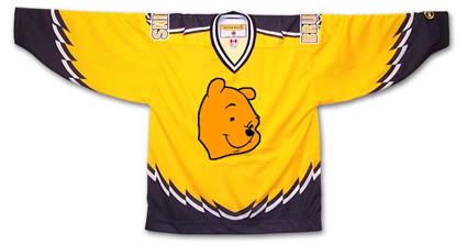
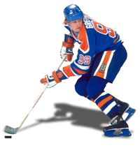
First introduced in 1995, this jersey was the longest surviving of the original alternate NHL jerseys, lasting until the 2005-06 season. Dubbed the "Winnie the Pooh" jersey, it features a primary logo with perhaps the most docile looking bear this side of Gentle Ben. It's buttery gold color also does nothing to strike fear into the hearts of the Bruins opponents either.
Friday, August 13, 2010
1998-99 Boston Bruins Ray Bourque Jersey
The Curious, Weird and Ugly™ Collection continues with another jersey from the inaugural class of NHL alternate jerseys, a 1998-99 Boston Bruins Alternate Ray Bourque jersey.
First introduced in 1995, this jersey was the longest surviving of the original alternate NHL jerseys, lasting until the 2005-06 season. Dubbed the "Winnie the Pooh" jersey, it features a primary logo with perhaps the most docile looking bear this side of Gentle Ben. It's buttery gold color also does nothing to strike fear into the hearts of the Bruins opponents either.
First introduced in 1995, this jersey was the longest surviving of the original alternate NHL jerseys, lasting until the 2005-06 season. Dubbed the "Winnie the Pooh" jersey, it features a primary logo with perhaps the most docile looking bear this side of Gentle Ben. It's buttery gold color also does nothing to strike fear into the hearts of the Bruins opponents either.
Often overlooked because of the logo and color is the unusual broken striping pattern on the jersey. It's not claw marks. It's not teeth marks. It's not much of anything except all jagged and zig-zaggy for no apparent reason. If anything, when laid flat, it gives the impression of a bird with it's wings spread open. Which is fine if your team is called the Falcons, Eagles or Hawks, but if your mascot is a bear, perhaps it should be something that relates to, perhaps, a bear?
Patches worn on this jersey were the Boston Bruins 75th Anniversary patch from 1998-99 and the black version of the NHL 2000 patch in 1999-00, which was also the season that the Bruins changed the font for the numbers on all three of their jerseys, going with a serifed font when up until then they used a cleaner sans-serif font. Of note, this jersey was in use during the 1995-96 season when Boston hosted the NHL All-Star Game, but only wore the All-Star Game patch on their home and road jerseys but not this alternate.
We classify this jersey as "Curious" with a dose of "Weird" thrown in for good measure. We find it curious that they chose such a docile, if not actually smiling, bear head for the logo and we find the jagged striping effect a curious decision since it really defies explanation - which is weird. It's also curious that this jersey was used for such a long period of time and weird that they actually made Ray Bourque wear it. We've never been a fan of gold or yellow jerseys personally, but understand that the Bruins are limited in their choices for a third jersey. So limited that their current alternate jersey is black, the same color as their home jersey.
Here is an early rumored prototype of this jersey which was apparently rejected due to licensing issues with Disney, the then current owners of the Mighty Ducks, who didn't want another team in the NHL with a logo more cartoonish and kid-friendly than theirs, but the Bruins managed to come up with one anyway.
Is it just us, or is it hard to look tough with Winnie the Pooh on your jersey?
Well, maybe it is possible if you are P. J. Stock...
Labels:
Boston Bruins,
Curious Weird and Ugly
Thursday, August 12, 2010
1997-98 Tampa Bay Lightning Darcy Tucker Jersey
Today the Curious, Weird and Ugly™ Collection hits the high seas with the Tampa Bay Lightning's first alternate jersey.
This 1997-98 Tampa Bay Lighting Darcy Tucker jersey is also known as "The Seasickness Jersey". While the Vancouver Canucks and Pittsburgh Penguins jerseys that kicked off the Curious, Weird and Ugly™ Collection did not have nicknames, this Tampa Bay Alternate has risen to the level of the named jersey. Once a jersey receives a nickname, it's a sure sign that it has risen to a new level of notoriety among both fans and collectors alike.
This alternate jersey was first introduced for the 1996-97 season and depicts a raging storm at sea, with angry, tossing waves across the bottom and streaks of subtle black and grey pelting rain across the main body of the jersey. The black sleeves are adorned with violent streaks of lightning down each arm, creating a scene so well executed you can almost hear the crashing of the thunder and feel the sting of the spray against your face. This jersey was only made possible by the use of dye-sublimation to create the rain, waves and the lighting bolts on the sleeves.
The jersey is completed with it's fantastic "electric" numbers and bold, vertically arched names on the back, which are both highly visible and only add to the visual excitement of the complete package. A very clever and unique jersey that was well executed and whose life span was all too short. Yes, as you may have sensed by now, we really love this jersey here at Third String Goalie.
During it's first year of use, this jersey was worn without any additional patching, but the 1997-98 season would see them wear the #12 shamrock patch as a tribute to teammate John Cullen, who was diagnosed with non-Hodgkin's lymphoma in 1997 and would miss the season fighting the disease before returning to the ice briefly the following season. Tampa Bay wore the 1999 All-Star Game patch on all their jerseys as hosts of the 1999 NHL All-Star Game during the 1998-99 season, the last for this jersey style.
For some unexplained reason, the Lighting would begin the season wearing their "paintbrush" font from their standard home and away jerseys on the "Stormy Weather" jersey, a font that adds nothing to the theme of the jersey and looks very out of place when compared to the "electric" numbers. The team did change back to the jerseys original "electric" numbers after the first two months of the season, making the "paintbrush" numbered alternates a rarity.
While this jersey style only lasted three seasons, it is still quite sought after by collectors and never fails to attract a lot of attention when they become available.
Since we don't find it weird nor ugly we must classify this one as "Curious". Curious that it only lasted three seasons and the odd choice of the "paintbrush" font for the start of the 1998-99 season.
W couldn't come up with any video clips of this jersey in action , so feel free to send any youtube links via the comments function and we'll post the best ones.
Wednesday, August 11, 2010
1999-00 Phoenix Coyotes Jeremy Roenick Jersey
Today's Curious, Weird and Ugly™ Collection jersey is a 1999-00 Phoenix Coyotes Jeremy Roenick jersey, one of the strangest jerseys to ever see the ice in an NHL contest.
With hockey fans already thinking the basic Coyotes home and away jerseys of the day were odd enough, this eerie "Midnight in the Desert", or as we prefer, "Peyote Ugly", alternate jersey really has to make one wonder what the designers were smoking at the time they created it!
It's dark hunter green, black and sienna colors, accented with purple(!) landscape of cacti against the mountains of the desert southwest under a crescent moon create a dark, spooky feeling, only added to by the unyielding stare of the main crest, a coyote head wearing just half a goalie mask and an unblinking eyeball staring at the viewer.
The package is completed by using a strange font for the name and numbers that I feel safe in predicting won't be seeing the back of any new NHL jerseys anytime in the near future. It's occasional rounded corners keep the viewer off-balance, as you never can predict which letters will get them and which won't. The thin, and occasionally oddly proportioned numbers such as the 2 and the 5, are also visually jarring to those more used to traditional block numbers.
This alternate jersey was first introduced in 1998 and tweaked for the 1999-00 season, as the main crest would receive a bold sand colored outline that it would retain for the remainder of it's run until the 2002-03 season before the Coyotes identity package would receive a complete overhaul, including all new logos and a greatly simplified color scheme.
The only patch worn on this alternate jersey was the green version of the NHL 2000 patch in 1999-00, as shown on today's featured jersey below.
Not only do we classify this jersey as "Weird", we think it's the single weirdest jersey ever as far as the NHL goes. There's really never been anything like it in terms of having a landscape depicted on a jersey before or since, especially one in the dark of night with a creepy floating animal head staring at you in such a dark and unusual color palette.
Here is some game action of he Coyotes alternates in action, including the uncommon sight of a team wearing it's alternate jersey during the playoffs, along with a Jeremy Roenick highlight package of his time with the Coyotes.
Labels:
Curious Weird and Ugly,
Phoenix Coyotes
Tuesday, August 10, 2010
1995-96 Pittsburgh Penguins Alternate Mario Lemieux Jersey
The Curious, Weird and Ugly™ Collection continues with another jersey from the initial batch of NHL alternate jerseys, a 1995-96 Pittsburgh Penguins Alternate Mario Lemieux jersey.
This jersey, similar to the Vancouver Canucks jersey profiled yesterday, is one of the original dye-sublimated jerseys, a process which now allowed for gradients to be incorporated into the designs, and the Penguins wasted no time in taking advantage of the opportunity.
This jersey, similar to the Vancouver Canucks jersey profiled yesterday, is one of the original dye-sublimated jerseys, a process which now allowed for gradients to be incorporated into the designs, and the Penguins wasted no time in taking advantage of the opportunity.
The horizontal stripe around the chest begins as a yellow color on the right side of the jersey, fading to grey as it approaches the center of the jersey and it's main crest, creating a very unappealing, muddy shade of yellow in the process. On the opposite side of the crest the process is repeated, as the darker grey lightens in tone as it reaches the left side of the jersey.
Oddly, the sleeves are not symmetrical in the least, with bold yellow and white stripes at an angle midway down the right arm with a grey cuff that darkens in tone from the outer side of the sleeve to the inner, while the left sleeve has three grey stripes running around the cuff that mimmic the chest stripes on the same side of the jersey.
The shoulders are the same triangular shape as the ones on the home white jersey of the era, only these are grey with horizontal yellow pinstripes running from side to side.
Overall, we have always found this jersey to be very dark and morose and have never been a fan of it. While we find many jerseys exciting to look at because of their bright colors and dynamic stripes, this one always created a feeling of depression with it's dark body, dismal grey color and muted yellow tones of the chest stripe. It's got a rather futuristic apocalyptic feel to it. Hardly what draws us to jerseys in the first place.
Even worse, it became the Penguins road jersey for the 1997-98 season, replacing it's old school diagonally crested predecessor which we were always big fans of. This moody jersey lasted until the 2001-02 until being retired in favor of the then current alternate jersey, which featured the return of the original "Skating Penguin" logo.
It's seven season life span ranks it #2 for longevity among the original 1995-96 class of alternate jerseys, second only to the Boston Bruins Winnie the Pooh Alternate, which was used for 10 seasons.
Patches worn on this jersey were few, with only the black version of the NHL 2000 patch and the Game ONe Japan 2000 patch, worn on this jersey for just one game versus the Nashville Predators on October 8th, 2000 for the second of their opening pair of games of the 2000-01 NHL season played in Tokyo, Japan.
Patches worn on this jersey were few, with only the black version of the NHL 2000 patch and the Game ONe Japan 2000 patch, worn on this jersey for just one game versus the Nashville Predators on October 8th, 2000 for the second of their opening pair of games of the 2000-01 NHL season played in Tokyo, Japan.
We classify this jersey as "Weird" due to the dark colors, asymmetrical design and poor use of the gradients, especially on the chest stripes, the yellow side in particular.
Here is a video of this jersey in action in a memorable four overtime game between Pittsburgh and the Washington Capitals from the 1996 Stanley Cup Playoffs.
Monday, August 9, 2010
1995-96 Vancouver Canucks Trevor Linden Jersey
Today kicks off a new theme to fill the dog days of the hockey off season where the historical events in hockey history are few and far between.
Without further delay, we give you The Curious, Weird and Ugly™ Collection. we don't actually dislike all of the jerseys that we will be featuring, in fact we like a few of them very much, but there are others that are so bad, so horrible, that they make us downright angry that they ever saw the light of day in the first place. Seriously, it was bad enough that some dummy came up with the concept in the first place, but then a whole series of people in authority had to approve them before they ever saw the light of day!
Without further delay, a 1995-96 Vancouver Canucks Trevor Linden jersey.
Now, there had been diagonal elements in jerseys prior to the introduction of this Vancouver Canucks red (or is it black?) first-ever alternate jersey, such as the Mighty Ducks of Anaheim jerseys of 1993-94, but gradients were a new development in 1995-96. To the best of our knowledge the dye-sublimation printing process, which allowed for the gradients to be incorporated into jersey designs had never been used for NHL jerseys before, but the process made it's presence known with the first NHL alternates introduced in early 1996 with gradients incorporated into the designs from the Los Angeles Kings, Pittsburgh Penguins and Vancouver Canucks.
While the diagonally striped jerseys from the Mighty Duck of Anaheim and the St. Louis Blues had a different color below the lower stripe, the Canucks was really the first genuine two color affair, with the amount of black and red being much closer to 50-50 than the Mighty Ducks mainly eggplant jerseys and the Blues predominately blue road sweaters.
The main design element of the Canucks jersey is the rather clever extension of the coloring of the Canucks logo across the body of the jersey. The black background of the logo, as was the yellow lettering of the word "Canucks" that made up the skate blade, were both extended outward from the diagonally oriented logo, with the striping on the left side of the jersey fading away to nothing. An odd decision was the upward angle the stripes took on the right side of the jersey, giving the stripes a "checkmark" look instead of having them continue uninterrupted to the side of the jersey, as the Mighty Ducks and Blues jerseys did.
Yet another curious choice was that the upward tick to the chest stripes were not in alignment with the arm stripes. You would think as long as they decided to make the chest stripes change direction in midstream, they would have continued those stripes at a matching angle across the arm instead of orienting the arm stripes at their own unique angle independent of the chest stripes.
Unlike some of the contemporary alternates introduced by other clubs that same season, which were quickly rejected failures, the Canucks new alternate jerseys lasted two full seasons, worn with solid black socks their first season and with red socks with stripes similar to the jerseys the second. No additional patches were worn on this alternate jersey during it's brief existence.
This Canucks jersey does have a few things in it's favor though. The list of players who wore it is rather impressive, as the Canucks were filled with recognizable names like Alexander Mogilny, captain Trevor Linden, Cliff Ronning, Martin Gelinas, Esa Tikkanen, Bret Hedican, Adrian Aucoin, Markus Naslund, goaltender Kirk McLean and superstar Pavel Bure, who was temporarily wearing sweater #96 at the time.
Another thing it has going for it is the way it fits in with the home and road jerseys, as it uses the same main crest and uses what is normally a trim color, red, as a primary color. The names and numbers are all very legible, with the yellow standing out nicely from the red background, and are done in the same fonts as the home and road jerseys for a consistency across the entire set.
Overall, we classify this jersey as "Curious" due to mainly the "checkmark" chest stripe and the introduction of the gradient stripes.
Here's a lucky find, the Vancouver Canucks red alternates in game action versus the Hartford Whalers (for a truly excellent jersey matchup), although it's more fist throwing action than puck shooting action, but sometimes you take what you can get. Don't forget to take notice of future Italian National Team goaltender Jason Muzzati in net for the Whalers.
Labels:
Curious Weird and Ugly,
Vancouver Canucks
Thursday, August 5, 2010
Will it blend?
Nothing says "summer" like a nice smoothie, which according to Wikipedia is a "blended, chilled, sometimes sweetened beverage made from fresh fruit or vegetables. In addition to fruit, many smoothies include crushed ice, frozen fruit, honey or frozen yogurt, although some smoothies are 100% fruit."
They fail, however, to mention hockey puck smoothies.
Speaking of summer, we here at Third String Goalie are taking a brief break in order to enjoy some summer, which lasts for roughly 27 minutes in Minnesota, research some future story ideas, do some much needed catching up on some time consuming photography of our collection and devote some time to a baseball related project we've wanted to do for some time now.
Rest assured we are not going away and will be back on Monday the 9th with some of our favorite posts from the past which will run on weekdays for the remainder of August as we continue to work behind the scenes in order to prepare for the up coming season.
See you on Monday. Now, on to our vacation!
Labels:
humor
Saturday, July 31, 2010
1996-97 Milwaukee Admirals Danny Lorenz Jersey
July by the Numbers concludes with a stop on the shores of Lake Michigan for jerseys #31.
The Milwaukee Admirals were founded as an amateur club in 1970 known as the Milwaukee Wings. The next season the team was sold to a group of investors, one of whom owned an appliance store and renamed the team the "Admirals" after a brand of appliances sold in his store. Thankfully the club adopted the naval aspect of the Admirals name and did not use a washing machine for their logo!
For the 1973-74 season the team joined the United States Hockey League (USHL), which at the time was a senior league. They won the USHL championship in 1976 and continued to play in the league for one more season prior to the league evolving into an amateur junior hockey league.
For the 1977-78 season, the Admirals joined the International Hockey League where they would play for 24 seasons. It would take five seasons for the Admirals to post a winning record and six for them to win their first division title in 1982-83.
While they would finish second in 1983-84, they would set a new team record with their first 100 point season with 101 with a 46-30-6 record. After a last place finish in the then nine team IHL in 1984-85, the Admirals would rebound immediately with a team record 102 point season. Their roller coaster ride up and down the standings continued with a 32 point drop in the standings and a further 19 less in 1987-88, leaving the club with a mere 49 points from 82 games and a distant last place in the IHL. The Admirals again rocketed up the standings with a 64 point increase in 1988-89 to set another new club record of 113 points, which still stands today.
During the remainder of their time in the IHL, which rapidly grew from 10 teams in 1991-92 to 19 teams in 1995-96, the Admirals won division titles in 1993, 1995 and 1996. Playoff success eluded Milwaukee though, as, while they qualified for the playoffs in 22 out of 24 seasons, they only made it past the first round of the playoffs just five times and won only two of those series. Their second round playoff victory in 1983 propelled them into their only appearance in the Turner Cup Finals, where they fell in six games to Toledo.
With the IHL now falling on hard times, having shrunk from 19 teams in 1996-97 down to just 11 four seasons later, the league eventually ceased operations altogether, and the Admirals were one of six clubs to join the American Hockey League in 2001.
After two seasons of finding their way in the AHL (which already had a member club named the Admirals!), Milwaukee reached 100 points for the first time in 11 seasons during 2003-04 with 102 to gain their first AHL division title. In the Calder Cup playoffs, they outlasted Cincinnati in seven games, downed Chicago in six, ousted Rochester in five and continued their string of playing one less game each round by sweeping Wilkes-Barre/Scranton in four to capture the franchise's first Calder Cup and their first championship of any kind since 1976, a 28 year wait.
A 103 point season preceded a 108 point campaign in 2005-06, the Admirals best so far while in the AHL, and a second trip to the Calder Cup Finals in 2006, although Milwaukee fell in six games to Hershey. The Admirals are currently riding a eight season playoff streak through 2009-10 and have three division titles in their nine AHL seasons.
The Admirals have retired five numbers throughout their history, those of #9 for Phil Wittliff, #14 for both Mike McNeill and Fred Berry (the Admirals all-time assists leader with 379), #26 for Tony Hrkac, #27 of Danny Lecours (whose nine seasons are a club record, as are his 360 goals and 642 points) and #44 for Gino Cavallini and Kevin Willison.
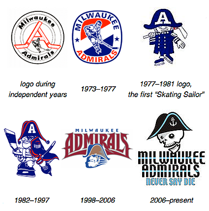
Today's featured jerseys show the evolution of the Milwaukee Admirals from the early 1980's to their modernization in the late 90's and move to the AHL and finally their recent redesign in the early 2000's.
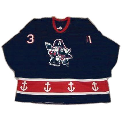
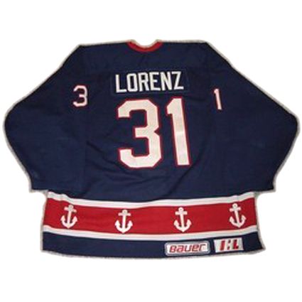
First up is a 1996-97 Milwaukee Admirals Danny Lorenz jersey. This simple style is a solid blue jersey with a single red waist stripe trimmed in white with white anchors repeating around the waist. It's decorated with the cartoonish skating Admiral logo and has no secondary logos and just a basic block font for the name and numbers. This classic Admirals jersey can be traced back to the 1970's and remained in use until 1998.
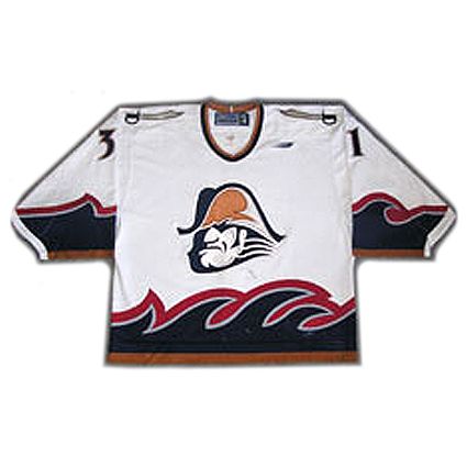
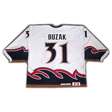
While still members of the IHL, the Admirals jerseys underwent a much needed modernization in 1998, which led to our second featured style, a 1999-00 Milwaukee Admirals Mike Buzak jersey. This jersey was much more in-your-face, with it's overly dramatic wave treatment of the waist striping and more tempered sleeve waves. The new main logo was an iron-jawed, very stern looking Admiral head with a giant chin and an enormous drop shadow on the left. The overall effect was a quite mean looking character who was difficult to embrace. The jerseys received secondary logos in the form of a saber appearing on each shoulder and a new stylized number font which was reminiscent of the sabers on the shoulders.
All of this was rendered in a new color scheme, with the basic blue and red evolving into a classier navy blue and dark red with copper and silver accents.
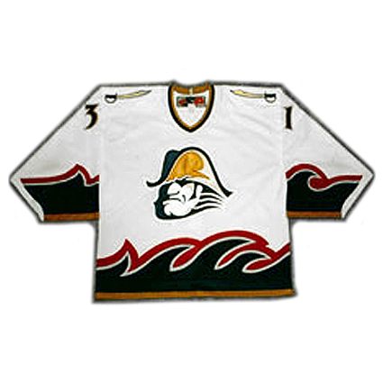
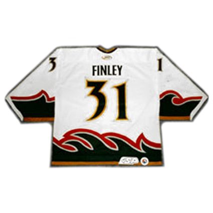
The jersey remained the same through the Admiral's move to the AHL, save for the league logo on the rear hem, as seen on this 2002-03 Milwaukee Admirals Brian Finley jersey.
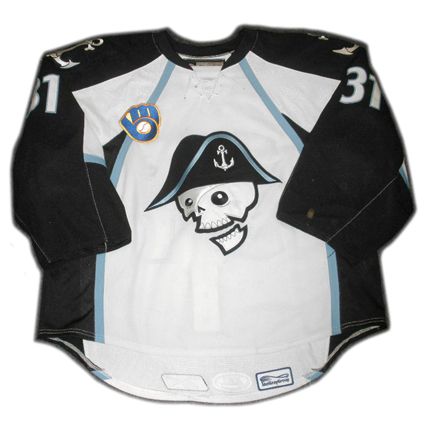
This jersey style lasted until 2006, when the Admirals underwent a complete redesign, changing their team colors once again and introducing an all new, more juvenile skeleton pirate theme clearly aimed at moving more merchandise to younger fans.
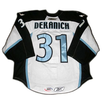
This jersey introduced a new light blue, grey and black color scheme and all new, modern fonts for the names and numbers. After one season with a standard jersey cut, the AHL changed over to the new Reebok Edge System of jerseys, resulting in a slightly new jersey with the "apron strings" piping cutting across the chest of the jersey as shown in this 2008-09 Milwaukee Admirals Mark Dekanich jersey.
The Admirals also went against convention with their unconventional grey road jersey, a choice perhaps influenced by their recent ownership change, led by the owner of the Milwaukee Brewers baseball club, Mark Attanasio, as baseball teams historically wear grey on the road, a color seldom, if ever, used for hockey jerseys, especially in the professional ranks.
Today's video segment begins with the Milwaukee Admirals winning the 2004 Calder Cup while wearing their "second generation" jerseys.
Here, Brewers announcer Bob Uecker shows his love for the Admirals.
Finally, a look at the Admirals light blue alternate jerseys in some typical minor league fisticuffs.
Labels:
IHL,
Milwaukee Admirals
Friday, July 30, 2010
1994 NHLPA Martin Brodeur Jersey
July by the Numbers shows it's solidarity with jersey #30.
Back in 1994 the National Hockey League Players Association (NHLPA) was locked out by the club owners due to labor issues regarding the implementation of a salary cap, which the players opposed. The lockout began on October 1, 1994 and lasted until January 11, 1995.
As the lockout continued, the NHLPA organized a tournament called the "4-on-4 Challenge" over three days from November 10th to 12th, 1994 at the Copps Coliseum in Hamilton, Ontario.
Four teams took part in the event, Team Ontario, Team USA, Team Western Canada and Team Quebec with the tournament won by Team Ontario. The tournament had many NHL stars in attendance, with Patrick Roy, Luc Robitaille, Brett Hull, Joe Sakic, Doug Gilmour, Rob Blake and John Vanbiesbrouck among those competing. In total, over a half a million dollars was raised in support of the Ronald McDonald Children's Charities of Canada and minor hockey associations throughout North America.
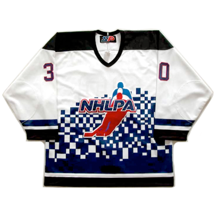
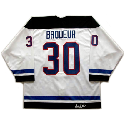
Today's featured jersey is a 1994 NHLPA Team Ontario Martin Brodeur jersey. During the tournament players born in Western Canada wore yellow jerseys, players born in the United States wore red jerseys, players born in the Quebec wore blue jerseys and the players born in the Ontario wore white jerseys.
About now we can hear you saying "But Martin Brodeur was born in Quebec. Why is his name on a white Ontario jersey?"
That's because the owner of this jersey did not do his proper research before committing Brodeur's name to this jersey.
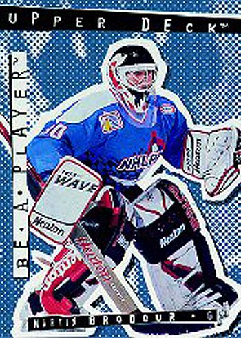
Martin Broduer 94-95 Be A Player #R58 trading card
showing Brodeur in a blue Quebec jersey
Things brings up a point we'd like to stress. One of the things we enjoy the most about collecting jerseys is doing our research. It's often a challenge, particularly when collecting international jerseys when trying to determine:
- In what years was a particular style worn?
- Can any additional patches be added to the jersey based on when it was used?
- Who wore the jersey during those years?
- What numbers did the players wear?
- Did he wear a "C" or an "A"?
- What fonts were used for the names and numbers?
Additionally,
- Is any additional patch even available?
- Where can I obtain the patch?
- What was accomplished while wearing the jersey? A championship or personal milestone?
- Is the brand of jersey correct for the year I'd like to replicate?
- Where on Earth can I find an illustration or photo of the player I've chosen wearing the jersey to confirm any of the above questions?
One place to start is right over there to your right on this page, "Our Favorite Hockey Links", which contain links to some of the most critical, informative and dependable sources for our research.
There's probably not a day that goes by that we don't find ourselves at the essential NHLUniforms.com. Every NHL jersey illustrated, with additional patches, since the dawn of the league in 1917. What more can you ask for? Speaking of patches, NHLPatches.info is another excellent resource for all things NHL patch related.
The Internet Hockey Database is where you will find rosters for nearly every team ever, and what you can't find there usually be found at EuroHockey.net. We also rely on the past tournaments section of the IIHF website.
When it comes time for photos, other than a basic Google Image Search, Getty Images is the place to go. Sure the images are all watermarked, but for our purposes you simply cannot beat the wealth of visual information contained there.
And if you can't find what you need on your own, check out one of the forums we have linked to and conduct a search of their archives, Gameworn.net in particular, or join one of the communities and ask.
It's one thing to buy a jersey already customized, as long as you are comfortable that it's been done correctly, or at least close enough to make you happy, but there's a real pride in ownership we get from buying a blank jersey and conducting our own research into all the factors listed above, choosing a customizer to letter it for us and finally getting the completed jersey back done precisely to our specifications that buying a fully completed jersey just can't touch.
Today's video section features some of the action from the NHLPA 4-on-4 Challenge from November of 1994 when the players were locked out by the owners and staged a charity tournament which raised over a half a million dollars for charity.
Labels:
Brodeur Martin,
NHLPA 4-on-4 Challenge
Thursday, July 29, 2010
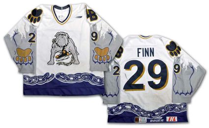
1997-98 Long Beach Ice Dogs Steve Finn Jersey
July by the Numbers once more crosses the continent, this time to California for jersey #29.
The Long Beach Ice Dogs came to be when the San Diego Gulls of the International Hockey League moved to Los Angeles for the 1995-96 IHL season and changed their name to the Ice Dogs after five years in San Diego where they made the Turner Cup Finals once following a stellar 62-12-8 regular season record.
After one season playing at the Los Angeles Memorial Sports Arena, the club moved 22 miles south to the Long Beach Sports Arena and altered their name to the Long Beach Ice Dogs. After missing the playoffs their previous season up the road in Los Angeles, the 1996-97 Ice Dogs had a great debut season in Long Beach, going 54-19-9 in the regular season led by Patrik Augusta's 87 points in 82 games and Stephane Morin's 82 points in 65 games after arriving from the Manitoba Moose.
In the playoffs the Ice Dogs defeated Milwaukee in three straight and sweeping the Utah Grizzlies in four. After knocking out the Houston Aeros in five, the Ice Dogs advanced to the finals where they faced the Detroit Vipers, who downed Long Beach in six games.
Their next regular season was a near carbon copy of the previous one when they posted a 53-20 -9 record to again win their division. Augusta again led the club with 41 goals and 81 points followed by Dan Lambert's 78 points. Their quest for the Turner Cup started out well with a defeat of Las Vegas 3-1 before outlasting Kansas City by winning in overtime of Game 7 as the teams alternated victories throughout the series. The Ice Dogs run came to an end when they lost out to the eventual champion Chicago Wolves in six games.
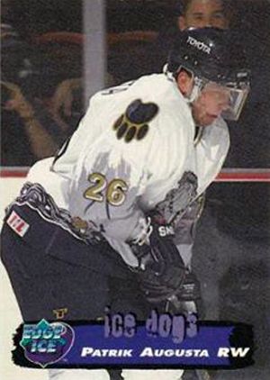
Patrik Augusta
Augusta once more led the team in scoring in 1998-99 with 59 points, his drop in points due to being limited to 68 games that season. Long Beach advance past the first round of the playoffs by knocking out Kansas City once again 2-1 but had their season ended by division champion Houston Aeros in five games.
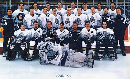
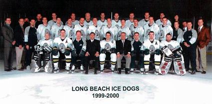
The 1999-00 Long Beach Ice Dogs, their final season in the IHL
The Ice Dogs final season in the IHL saw them led in scoring by Pavel Rosa with 53 points with future Stanley Cup winner Nikolai Khabibulin getting the majority of starts in goal. In 33 starts he went 21-11-1 with an excellent goals against average of 1.83. In the playoffs Long Beach quickly eliminated Manitoba 2-0 but were swept by Chicago in four to end their time in the IHL.
It was at this point that the team owner withdrew the club from the IHL and dropped the club down to the West Coast Hockey League for the 2000-01 season, where they played three seasons before entering the East Coast Hockey League following the demise of the WCHL.
The Ice Dogs completed in the ECHL for another four seasons before ownership shut down the club due to ongoing financial losses due to poor attendance after 17 seasons, three cities and three different leagues, somewhat representative of life in the often unsettled and unstable minor leagues.
Notable players to have skated for the Ice Dogs include goalies Manny Legace, Khabibulin and Jaroslav Halak and defenseman Jaroslav Modry.
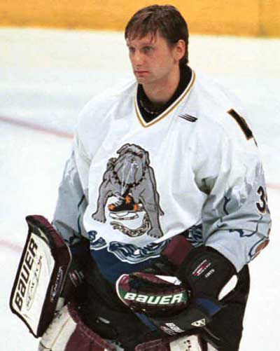
Today's featured jersey is a 1997-98 Long Beach Ice Dogs Steve Finn jersey. This jersey is a prime example of the humor found in some minor league jerseys allowed by the dye-sublimation process. The clever dog chain across the bottom in place of a traditional stripe is a fun and effective way to gain attention and establish the team's visual identity on the ice.
The sleeves are less successful though, with the intent being that the white of the jersey has been torn away to reveal not the players arms, but the front legs of a bulldog, which just comes across as silly and not very well executed, as the legs on the front and the paws on the back of the arms are rendered so flatly and without much detail.
A wraparound "3-D" effort may have been more effective, but would have been better executed if the legs would have had a printed fur pattern and the sleeve color outside the arms being black or dark blue in order to be a different, more contrasting color than the dogs legs themselves.
We can see what they were trying to attempt, but it's execution was not very effective in action and they may have just been better off repeating the chain motif around the wrists for a less silly, more dignified look.
While this video isn't admittedly the greatest quality, you can see the torn sleeves effect, but just try to find the rendering of the legs and paws on the jerseys.
Labels:
IHL,
Long Beach Ice Dogs
Wednesday, July 28, 2010
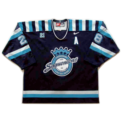
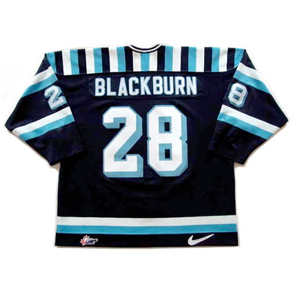
2001-02 Chicoutimi Saguenéens Alexandre Blackburn Jersey
Juillet par les Numéros retour à Québec pour de maillot n ° 28.
The Chicoutimi Saguenéens (pronounced Sheh ku ta me Sa gwa nay ens) were founded in 1973 and their name means "the people from Saguenay, a region in central Quebec.
The "Sags" have twice won the President's Cup as the QMJHL's playoff championship, first in 1991 and again in 1994. By winning the league's playoff title, they advanced to the Memorial Cup playoffs. They also participated in the Memorial Cup in 1997 as runners up in the QMJHL when the winners from Hull were hosts of the tournament, but the ultimate prize in Canadian junior hockey has so far eluded Chicoutimi.
Four times in their history the Saguenéens have won division titles, those coming in 1988, 1991, 1994 and 2002. Their record for most points in a season came in 2005-06 when they racked up 51 wins and 106 points, made possible by a strong team defense which allowed a team record low 185 goals against.
Many former Saguenéens have gone onto play in the NHL, with Marc Bergevin, Marc Bureau, Guy Carbonneau, Gord Donnelly, Gilles Hamel, Alan Haworth, Stephane Richer and Andre Roy have all played over 500 NHL games in addition to goaltenders Marc Denis and Felix Potvin to continue the tradition of goaltenders from Chicoutimi, started by legendary native Georges Vezina.
Numbers retired by Chicoutimi include Alain Cote's #14, Normand Leveille's #16, Sylvain Locas' #18, Marc Fortier's #20 and #21 for Carbonneau and #29 for Potvin.
Guy Carbonneau 1979-80
Today's featured jersey is a 2001-02 Chicoutimi Saguenéens Alexandre Blackburn jersey. We have always found jerseys done in sky blue and navy blue with white trim to be among some of the most attractive jerseys and this one is no exception. It's unique striped shoulder yoke gives the jersey an shot of adrenaline even when not in use. It's also a hint of a classic turn of the century barberpole style without the dizzying full body effect. The choice of drop shadowed numbers also add to the classic appeal of this very attractive jersey with is classy main crest topped with a regal crown.
The jersey also has a tiny #21 on the upper right chest that many will assume is a memorial to a fallen player, but it is in fact a tribute to the very much alive and well Guy Carbonneau, whose jersey #21 was retired by the club that season. In a departure from the expected, the #21 is not sewn on with twill, but embroidered directly into the team's jerseys.
Labels:
Chicoutimi Sagueneens,
QMJHL
Subscribe to:
Posts (Atom)


