
From the Canucks inception in 1970-71 to 1977-78 the Canucks wore blue and green jerseys, another one of those lame "blue for water, green for trees" jerseys where a professional sports team feels they must be the leading voice for the local board of tourism. Well, in 1978 all that came to an abrupt end.
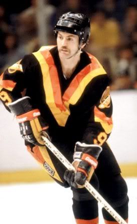
Before the 1978-79 season the Canucks hired a professional psychologist to redesign the uniforms. The old colors were determined to be "too bland, too tranquil and did not inspire emotion." The result was the "V" design, suggesting "victory" according to the designer. The bright orange was said to "evoke passion and aggression" while the black road jersey would instill fear in the opposition.
The jerseys featured no main team logo on the front, but instead a giant "V" shape done in bright orange and yellow on a black jersey. The sleeves also featured smaller "V" shapes midway down the arm with a new "Flying Skate" logo for the shoulders and the very unusual placement of the sleeve numbers at the very bottom of the arms on the wrists!
The "V" shape was not limited to just the jerseys either, as the breezers had giant multi-colored "V's" as well. During the first year these jerseys were worn, they even had "V" shaped stripes on the socks.

The Canucks introduced the jerseys, which none of the players had seen prior to the game, at the season opener in Minnesota. As Stan Smyl said, "I've never been ashamed to wear the Canuck's uniform, but that night none of us wanted to leave the dressing room."
They were met with much derision around the NHL and were often referred to as "those Halloween suits". Vancouver nearly got the last laugh however, as they made it all the way to the Stanley Cup Finals in 1982 before running smack into the New York Islanders dynasty, which was in full stride. Time has settled on the nickname of "The Flying V" for these jerseys.
The basic jersey produced in 1978 remained in use until the 1984-85 season, but with a few adjustments along the way, such as a change in color for the names on the back, relocating the very unconventional sleeve numbers from the wrists to the shoulders and eventually evolving from one color names and numbers to two colors for both.
Some feel that the Canucks have never gotten it right, as the original logo was too simplistic, the Flying V was too hideous, the Flying Skate was too busy and the Orca logo too corporate, as the Canucks were owned by Orca Bay Entertainment when the Orca/Killer Whale logo was adopted.
This online exchange seems to sum up the Canucks jersey history quite succinctly.
Q: "Why are the Vancouver Canucks jersey's always ugly?Seriously, there [sic] always horrible. Do the designers for Vancouver really think they look good? I always get a headache watching them play.Vancouver fans, please answer! Please explain why you have idiots as designers?"A: "I thought it was a league rule. Vancouver must always have the ugliest sweaters."
Maxim magazine, which I only read for the articles, rated the Flying V jerseys as "The Worst Sports Uniform" in any sport.
The only patch the Canucks wore on the Flying V jerseys was a "JCM" memorial patch to honor former GM Jake Milford in 1984-85.
We classify this jersey as "Curious" and "Weird". Many consider it ugly, but we're actually quite a fan of the whole idea of trying to design a jersey in an effort to aid your team in victory. It took some bold thinking and a lot of guts for the designer to create it, and then even more for the club to support the concept and stick with it for seven seasons. I can't see anyone in the NHL being bold enough to risk the large amounts of income clubs rely on from the marketing of jerseys by trying something so far outside the norm these days.
Yes, they are weird, when compared to the jerseys of the day, quite weird. One almost wonders why they even bothered to include the tiny sleeve numbers on the cuffs since they are so small and out of the way. The "Flying V" jerseys are also certainly a curiosity, as no other team followed them down the same path, leaving the "Flying V" as a truly unique chapter in NHL history.
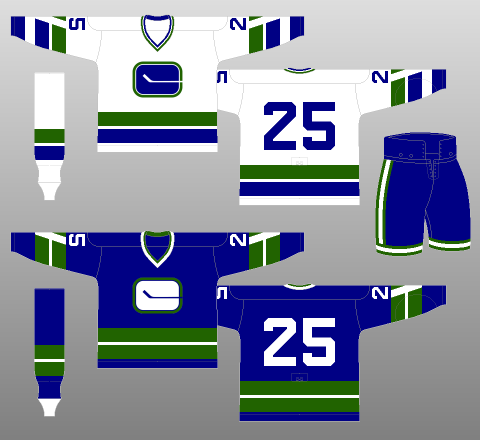
This first example is a 1980-81 Vancouver Canucks Richard Brodeur jersey with the one color names and numbers with the sleeve numbers on the cuffs as worn during their second season of use.


This second example is a 1982-83 Vancouver Canucks Dave "Tiger" Williams jersey showing the evolution of the design, now with two color names and numbers and now having the sleeve numbers relocated to a more traditional shoulder location.


Here are some highlights of the Flying V jerseys in action, particularly from the Canucks 1982 Stanley Cup run.


Looking at this and past entries, I can see you're glad the Hockey News' Uniform special came out last year or you wouldn't have much material.
ReplyDeleteReally, you should at least give it a credit if you're going to copy so much from it.
Thanks for looking out for the author of that article - which happens to be us!
ReplyDeleteWe are rerunning them from last year when we first wrote them for this blog to give ourselves a bit of a breather in August. We were later asked to submit them as an article for The Hockey News Greatest Jerseys of All Time Special Edition, which we promoted in this entry when it first came out.
http://thirdstringgoalie.blogspot.com/2009/10/hockey-news-greatest-jerseys-of-all.html
Thanks for your support!