History of Jersey 83-93 Banner sm photo History of Jersey 83-93 Banner sm.jpg

Saturday, August 29, 2009

1991-92 New York Islanders Pierre Turgeon Jersey

Born on this date in 1969, Pierre Turgeon played 19 NHL seasons, including three and a half with the New York Islanders from 1991 to 1995 before being traded to the Montreal Canadiens.

Turgeon was involved in some notable trades during his career, the first of which brought him to Long Island when, along with Benoit Houge, Uwe Krupp and Dave McLlwain, Turgeon was traded by his original club, the Buffalo Sabres, for Pat LaFontaine, Randy Wood and Randy Hiller plus future considerations.

He was a fan favorite on Long Island and would lead the Islanders in scoring, by margins of 7, 45 and 19 points, during his three full seasons with the club and finish tied for second the year he was traded away, despite playing in only 34 games, such was the state of the lowly Islanders in 1994-95.

His best season with the Islanders was the 1992-93 season when he would net 58 goals and add 74 assists for a 132 points, placing 5th overall in the league in what would prove to be his highest scoring season as a pro.

Turgeon would also add 13 more points in 11 playoff games in 1993, but would suffer a separated shoulder after being checked from behind well after scoring a goal by Dale Hunter, who would be suspended a record 21 games for the cheap shot.

When Islanders General Manager Don Maloney traded Turgeon to the Canadiens in 1994-95, concerned that Turgeon would never be the same player after the Dale Hunter incident, it turned into a nightmare for the Islanders on several levels. Montreal Canadiens captain Kirk Muller was the main player the Islanders received in return for Turgeon, and Muller was clearly at a point in his career where he wanted to compete for another Stanley Cup, and not lead the downtrodden Islanders back to respectability.

In the end, Muller would play just 27 games for the Islanders before being traded once more when first year coach Mike Milbury thought Muller had become too much of a distraction. Maloney would eventually be fired for being unable to get Muller on board with life on Long Island.

The fans would never forgive Maloney for trading Turgeon, even after Maloney and Muller were both out of Long Island within nine months of the trade. It was during this time period that the Islanders new owners also chose to ditch their traditional jerseys and the logo they wore while winning four consecutive Stanley Cups in favor of the new "Fish Sticks" jerseys, which the fans immediately adopted as the symbol for all that was wrong with the club at the time.

Today's featured jersey is a 1991-92 New York Islanders Pierre Turgeon jersey. It features the NHL 75th Anniversary patch worn by all the teams to celebrate the founding of the league in 1917. It also has the New York Islanders 20th anniversary patch on the left shoulder, which commemorates not only the anniversary of the club, but it's four Stanley Cup championships as well, making for a very nice two patch jersey, something we here at Third String Goalie highly approve of.

Photobucket
Photobucket
Here is Turgeon scoring his 50th goal during the 1992-93 season. The video is pretty bad, but at least the audio manages to not make up for it...


This next clip is the notorious hit on Turgeon by Dale Hunter that separated Turgeon's shoulder in the 1992 playoffs and earned Hunter the longest suspension ever at the time.


Friday, August 28, 2009

2004 Team Canada Practice Wayne Gretzky Jersey

When Wayne Gretzky played his last game on April 18, 1999 most fans probably thought that would be the final time he would lace up his skates and take to the ice in a jersey, but old habits die hard, and there have been occasions where Wayne has donned a jersey and spent some time back on the ice.

Once such occasion was on this date in 2004, when, as Executive Director of Team Canada, Gretzky took part in a Team Canada practice at the Corel Centre, in Ottawa, Ontario prior to their exhibition game that evening versus Slovakia in preparation for the 2004 World Cup of Hockey.

Photobucket

Photobucket

Photobucket

The jersey is a Nike practice jersey that has a rubberized, screened on Hockey Canada logo on the front, while the Nike swoosh is embroidered.

The back has Gretzky's name and number sewn on and features the additions of the International Ice Hockey Federation patch on the bottom and a custom printed "RESPECT" stop sign patch worn to help prevent checking from behind. I'm hopeful that someday I will find an actual embroidered version, but I usually see orange and black stop sign patches that read "STOP" instead.

Canada P 2004 WCOH F
Canada P 2004 WCOH B
Canada P 2004 WCOH P1 Canada P 2004 WCOH P2


Thursday, August 27, 2009

A tribute to Mike Sillinger and his many jerseys

Mike Sillinger announced his retirement yesterday after a 17 year NHL career. He played for a record 12 teams during his 17 seasons and had 240 goals and 308 assists for 548 points in 1,049 games.

There must be a future for Sillinger as a relator after what must have been a nearly full-time job buying and selling homes with all the relocating he had to do throughout his career.

We can only hope that he was able to keep his jerseys from the record 12 teams he was on. The clubs he played for, with the number of seasons in parenthesis, were the Detroit Red Wings (4), Mighty Ducks of Anahiem (2), Vancouver Canucks (3), Philadelphia Flyers (2), Tampa Bay Lightning (2), Florida Panthers (2), Ottawa Senators (1), Columbus Blue Jackets (2), Phoenix Coyotes (1), St. Louis Blues (2), Nashville Predators (1) and New York Islanders (3). During eight of his 17 seasons Sillinger would play for more than one NHL franchise, 13 seasons if you factor in junior and minor league hockey clubs. Only five times after reaching the NHL did he finish a season where he started, something that certainly must have been difficult for his family.

Here is what Mike's closet would look like had he just one of each jersey style he wore, 40 in all, spanning the classic era of 1990-91, the crazy alternates of the mid to late 90's, a return to the throwbacks in the early 2000's to the change to the Reebok Edge jerseys in the mid 2000's. They include 14 different home jerseys, 14 road styles, 9 alternates and 3 throwbacks. I'm uncertain if any player has ever worn as many different jerseys in his NHL career, so until we're shown to be wrong, we are going to declare Mike Sillinger's career total of 40 different jerseys in a career The Official World Record as recognized by Third String Goalie until proven otherwise.

Sillinger 6


1998-99 Washington Capitals Adam Oates Jersey

Born on this date in 1962, Adam Oates, a Canadian, took the less travelled route to the NHL, playing college hockey in the United States for Rensselaer Polytechnic Institute, more commonly known as RPI, where he helped win the 1985 NCAA Championship. He graduated with school records for most assists (60) and points (91) in a season and career points with 150.

After RPI's championship season, Oates signed as an undrafted free agent with the Detroit Red Wings. He would play four seasons in Detroit before being traded to the St. Louis Blues and begin his journey around the league. Upon his arrival in St. Louis, he would be paired with Brett Hull, a move that enabled him score over 100 points for the first of four times in his career. During his second season in St. Louis, 1990-91, he would accumulate 90 assists in only 61 games.

Following a contract hold out the following year, he would continue his trek, this time being traded to the Boston Bruins. He would show St. Louis the error of their ways with 45 goals and 97 assists for 145 points to finish third in league scoring, a position he would repeat the next season with 32 goals and 80 assists for 112 points. The relationship with the Bruins soured and Oates would once more be on the move three seasons later, this time to the Washington Capitals, where he would change his jersey number from #12 to #77 in honor of Ray Bourque, who remained in Boston.

In Oates first full season in Washington, the Capitals would make it all the way to the 1998 Stanley Cup Finals before falling to the Red Wings. Oates would play six seasons for the Capitals, including leading the league in assists 2000-01. He would repeat that feat in 2001-02, becoming the oldest player to ever do so at age 39. That season would also see him score his 1,000th assist, becoming only the eighth player in NHL history to reach that milestone. However, Oates would once again be traded, finishing the season by playing 14 games with the Philadelphia Flyers.

2002-03 would see Oates return to the Stanley Cup Finals for the second time, now with the Mighty Ducks of Anahiem, before falling in seven games to the New Jersey Devils.

2003-04 would see him add one last opportunity to add to his sweater collection, as he would dress for his seventh and final club, the Edmonton Oilers. His final career totals would stand at 341 goals and 1079 assists for 1420 points in 1337 games and Oates would play in five NHL All-Star Games. His playmaking ability would see him total more assists in the 1990's than any other player, save for Wayne Gretzky. He currently has the most points of any eligible player who is not in the Hockey Hall of Fame.

Today's featured jersey is a 1998-99 Washington Capitals Alternate Adam Oates jersey. This jersey features the rare Washington Capitals 25th Anniversary patch, worn only on the Capitals black alternate jerseys for only four games early in the season before the NHL made the Capitals remove the patch since Washington did not receive prior approval to place it on their jerseys.

1998-99 NHL Washington Capitals Alternate Adam Oates jersey

Here is Oates talking about his favorite memories of playing in St. Louis.


Uh, yea...


And a few less speaking lines this time around...


That's really about it for Adam Oates on YouTube. Adam Oates has over 1,000 NHL assists, isn't in the Hall of Fame and can't get on YouTube, so here's your homework assignment - someone needs to make a career highlight video of Adam Oates and his undeniable playmaking abilities.

Wednesday, August 26, 2009

1974-75 California Golden Seals Marv Edwards Jersey

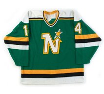
The ever name changing California Seals were founded as part of the great NHL expansion of 1967-68. The San Francisco area was not considered a particularly lucrative market for hockey, but the terms of a new television agreement with CBS call for two of the six new expansion teams to be located in California, with the other being the Los Angeles Kings.

The team was supposed to have been located in San Francisco, but the arena was never built and instead, the team was based across the bay in Oakland. First called the California Seals to appeal to fans in San Francisco and address complaints from other NHL teams that complained that Oakland was not considered a major league city, as it's only other professional sports team at the time was the Oakland Raiders of the American Football League. On November 6, 1967, owner Barry Van Gerbig announced that the team's name was being changed to the Oakland Seals.

Poor attendance led to Van Gerbig threatening to move the club and a poor record on the ice led to only seven of the original 20 players remaining on the team in it's second season. While they did finish with records below .500, they would make the playoffs for the next two seasons, the only times the club would qualify for the post season in their history.

Van Gerbig sold the team to a group called Trans National Communications in time for the 1969-70 season, but when the group filed for bankruptcy, ownership reverted to Van Gerbig, who put the club up for sale again.

The Oakland Seals were then purchased by Charlie O. Finley, owner of the Oakland Athletics baseball club, who had moved to the bay area in 1968. Never one to sit still, Finley renamed the team the California Golden Seals and altered the team's green and blue colors to green and gold, matching those worn by his baseball club, as well as having the team wear flashy white skates!

Photobucket

Unfortunately the the Golden Seals finished dead last in the NHL during their first season under Finley's ownership with just 45 points from 78 games. Even worse,their first overall pick in the 1971 NHL Entry Draft, along with Francois Lacombe, had already been traded to the Montreal Canadiens for their first round pick in 1970, used by he Golden Seals to take Chris Oddleifson, Ernie Hicke and the always useful cash. The Canadiens used the draft choice obtained from the Golden Seals to select future Hall of Famer Guy Lafleur.

The team improved by 15 points the following season, but suffered from the emergence of the World Hockey Association, as the frugal Finley refused to match the WHA's contract offers to his players resulting in five of the team's top ten scorers leaving and the Golden Seals once again sank to the bottom of the standings with 48 points in 1972-73 and followed that up with just 36 points in 1973-74.

Matters were made worse, if that's possible, by a divisional restructuring which somehow found the Golden Seals placed in the newly created Adams Division with the Boston Bruins, Buffalo Sabres and Toronto Maple Leafs, in an apparent effort by the league to kill off the franchise, as each of the other clubs were a minimum of 2300 miles to the east!

Having grown tired of owning the hockey team, especially in direct comparison to his World Champion baseball team, Finley tried unsuccessfully to sell the Golden Seals, which were eventually eventually taken over by the NHL.

Melvin Swig then purchased the team in 1975 with plans to have the team play in a new arena in San Francisco. Those plans never came to pass following the election of a new mayor opposed to the plan, so after nine money-losing seasons, low attendance and few victories, minority owners George and Gordon Gund convinced Swig to relocate the team to their hometown of Cleveland, Ohio, a move that was announced on this date in 1976, making the club the first NHL team to relocate since 1934 and bringing to and end the Golden Seals ordeal in California, where the team had more names than playoff appearances!


Politically, Swig and the Gunds were relying on Swig's political connections with San Francisco Mayor Joseph L. Alioto to get a new hockey arena built downtown. "Alioto was very helpful, " Gund remembered. "He had hoped to put the team where the Moscone Center is now. It was very close to public transportation."

Regrettably for the Seals, Swig's timing was off. Alioto was leaving office and Swig supported the wrong man in the 1975 election. When George Moscone took office, the new arena died. "The new mayor put the building on hold." Len Shapiro said. "He ran an investigation into the report and then said the survey had to be resurveyed , so basically, it went nowhere. Then there were plans to remodel the Cow Palace but that never happened either." Once those two plans fell through, the Seals were finished in the Bay Area.

"After the new arena in San Francisco fell through, the league gave us the go-ahead to move the team." Gund remembered. "We looked at a lot of other places. We looked at Denver and Seattle-Tacoma. We ended up picking Cleveland because hockey was very popular there."

Rumors that the Seals would leave the Bay Area were almost as old as the team itself. The owners were quietly but aggressively looking over other locations. The NHL had planned expansion franchises for both Seattle and Denver, which were supposed to begin play in 1976-77. The new entires, though, were experiencing problems so moving the Seals to those cities was still a possibility.

Shapiro recalled when he first got an inkling the team might be leaving. "On February 1, 1976, I realized something might be up. I was in the office with Loretta Marcus [the team's secretary] and nobody else was there. I had no idea where anybody was. I looked at Munson Campbell's schedule and it said he was booked at the Cleveland Hilton. Then I knew something must be up."

George and Gordon Gund owned the Richfield Coliseum in Richfield, Ohio, where the NBA's Cleveland Cavaliers played. It was halfway between Akron and Cleveland, a location that would cause the franchise more problems in the future. In typical Seals fashion, even it's exit was not smooth. The club participated in the July 1976 entry draft as the Seals and even started selling tickets for the upcoming season in Oakland.

At the 1976 entry draft, the Seals made history by becoming the first NHL team to use its frist-round draft pick on a European player by drafting Swedish defenseman Bjorn Johansson. The team didn't make it's intention to move officially known until August 26, 1976. It was announced that the team would move to Cleveland and take the name of the AHL franchise that played there for so many years, the Barons. Because of the late move, the Barons had a mere six weeks to sell tickets in their new home. Once again, the franchise started its new life behind the proverbial eight ball.

Under the Gunds ownership, the Barons played in Ohio for two seasons, merged with the Minnesota North Stars, who were then sold to another group while the Gunds received an NHL expansion franchise, the San Jose Sharks, at the south end of San Francisco Bay, 40 miles from where it all started.

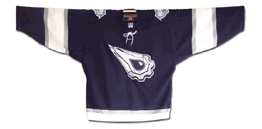
Today's featured jersey is a 1974-75 California Golden Seals Marv Edwards jersey. After the departure of owner Charlie O. Finley, the Golden Seals colors were changed from his signature green and gold to the even less intimidating "Pacific Blue" (teal) and "California Gold" (yellow), quite probably the worst colors for an NHL team ever, and also giving the team more color schemes in the end than playoff appearances as well.

Another odd characteristic of these jerseys were the decidedly "football jersey" vertical stripes where the arms meet the body of the jersey, something we don't believe has ever appeared on an NHL jersey before.

We actually had not planned on including these jerseys in the "Curious, Weird and Ugly" Collection of the past couple of weeks, originally planning on simply a look at the Seals history on the anniversary of their move to Cleveland, but the more we looked at their final teal and yellow set of jerseys, the worse they looked and the more we knew we had to add one more to the collection. We rate this jersey as "Curious", "Weird" and "Ugly", for a rare trifecta.

Curious are the football stripes on the upper arms, while weird is the choice of pastel colors for a team in a full-contact sport. Honestly, I've seen more intimidating Easter eggs. While the gold and purple of the Los Angeles Kings was unorthodox, it was at least explainable as relating to the colors of royalty and the purple dark enough to offer some contrast to the gold while the choice of teal and yellow leaves me repeating "Only in California" as the whole package of odd striping, inappropriate colors and bland logo can only add up to ugly without a doubt.

California Golden Seals Jersey

Not even the addition of goaltender Gary Simmons' black goalie mask with a frightening green cobra was enough to offset the "only in California" colors of the Golden Seals final jersey set.

Photobucket

Here are some fantastic old videos of the Seals in action. Check out those rinkside seats for $5.50 and playoff tickets for $12. Sign me up!


We don't care how hard you punch, there's just no dignity in wearing those teal jerseys.


That wraps up our trip through the "Curious, Weird and Ugly" Collection. There are other jerseys that certainly qualify, most specifically the Atlanta Thrashers alternates of 2003-04, or the Todd McFarlane designed Edmonton Oilers alternates of 2001-02, the New York Islanders road construction workers vests of 2002-03, the Vancouver Canucks color fading alternates of 2001-02 or the Philadelphia Flyers alternates of 2002-03 as well as nearly anything and everything from the Reebok Edge Uniform System™ (9% less wind drag, 14% lighter and 50% more expensive!). Many also mention the Calgary Flames "Flaming Horse Head" alternates of 1998-99, but we happen to think those are a work of art and refuse to add them to the discussion.

The most recent entry in the collection, confirmed by any search on the internet for "ugly hockey jerseys", is the Montreal Canadiens 1912-13 throwbacks worn last year to celebrate the Canadiens 100th anniversary which were most often compared to prison uniforms. They were scheduled to wear them twice, but then coach Bob Gainey opted to skip their second scheduled appearance due to the reaction to them after the first time and go with the more traditional 1916 jerseys instead.

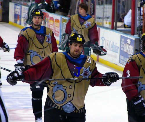
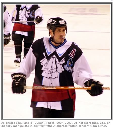
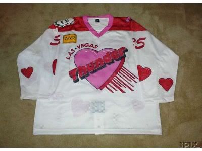
There could also be a book written about some of the "Hideous, Stupid and Embarrassing" jerseys that have been forced on unsuspecting minor league hockey players over the years, but the vast majority of those are one time only jerseys that are outlandish on purpose in order to generate some publicity for the clubs, unlike the strange and weird NHL jerseys I've chronicled that were meant to be taken seriously only to suffer the unanticipated backlash from both the fans and the media.

If you have any nominees for inclusion in the "Curious, Weird and Ugly" Collection, feel free to add your thoughts in the comments section below.

Tuesday, August 25, 2009

1997-98 University of Minnesota Golden Gophers Alternate Erik Rasmussen Jersey

The Curious, Weird and Ugly™ Collection now features a college jersey from the WCHA.

This hideous nightmare of a jersey is a 1997-98 University of Minnesota Alternate Erik Rassmussen jersey.

Designed by then Golden Gophers player Casey Hankinson, and crafted entirely out of "dazzle cloth" by Gemini Athletic Wear, this jersey features the traditional "M" logo, but the similarities between it and the regular Gophers home and away jerseys ends there.

The torso has diagonal black, a very purplish shade of maroon, bright gold and black bands of color, of unequal widths of course. Even weirder is the black extension of the left arm coloring into the upper left chest area. What is the reason for that? It looks like a crude patch sewn to repair some imaginary game worn tear.

The maroon shoulder coloring runs down the top of the sleeves until wrapping around the arms just above the bright yellow cuffs and over the black coloring on the lower part of the arms. It's a grotesque patchwork quilt of lines running this way and that in dark and depressing colors only broken up by jarring flashes of gold - all with a glitzy shine that makes the entire package all the more tacky.

But that's only the front of the jersey. Taking a look at the shoulders gives us the bizarre sight of the severed head of Goldy Gopher smiling away, completely oblivious to the ghastly scene unfolding beneath him.

The tacky, bloated font for the names are italicized for no apparent reason other than to contradict the direction of the diagonal lines leaning the opposite direction on the back of the jersey, and are placed on an ill-advised, italicized(!) dazzle cloth name plate that overlaps into the purple maroon area of the jersey if the name is of sufficient length.

Topping off the whole package is the just plain ridiculous font for the numbers, done in three colors to mimic the "M" on the front. The numbers are an unexplainable combination of calligraphy and the Flintstones, appearing hand-drawn, yet crude at the same time.

The Gophers wore this jersey for only a few games, perhaps even only just once as we have also heard, because the players rightfully thought they were dreadful and no longer wanted to wear them. Replica versions do periodically show up on ebay, but you better have an expert customizer on your side to recreate the name and numbers worn on this one.

We classify this jersey to be "Curious", as in we're curious what the approval process for this trainwreck was really like, "Weird" due to the appalling pattern of the diagonally striped construction of the body and simply terrible font for the numbers, and "Ugly" because it is, without hesitation, the worst looking jersey in the Third String Goalie collection.

It's truly "the perfect storm" of bad ideas poorly executed.

Minnesota Gophers 1997-98 jersey photo Minnesota Gophers 1997-98 F.jpg
Minnesota Gophers 1997-98 jersey photo Minnesota Gophers 1997-98 B.jpg

But if you think that the jersey worn on the ice was bad, check out this ad for Gemini that shows an unused prototype variation featruing a giant Goldy Gopher head as the main logo, which takes the entire package to an entirely new farcical level!

Photobucket

If the "Gopher Head" version actually been worn, we can only imagine that they would have been the second ever jersey to be rejected during a game.

Monday, August 24, 2009

1980-81 Vancouver Canucks Richard Brodeur Jersey

Today's Curious, Weird and Ugly™ Collection jersey sees us return to Vancouver once more with one of the strangest, yet most unforgettable jerseys to ever see the ice in an NHL contest.

From the Canucks inception in 1970-71 to 1977-78 the Canucks wore blue and green jerseys, another one of those lame "blue for water, green for trees" circumstances where a professional sports team feels they must be the leading voice for the local board of tourism. Well, in 1978, all that came to an abrupt end.

Before the 1978-79 season the Canucks hired a professional psychologist to redesign the uniforms. The old colors were determined to be "too bland, too tranquil and did not inspire emotion." The result was the "V" design, suggesting "victory" according to the designer. The bright orange was said to "evoke passion and aggression" while the black road jersey would instill fear in the opposition.

The jerseys featured no main team logo on the front, but instead a giant "V" shape done in bright orange and yellow on a black jersey. The sleeves also featured smaller "V" shapes midway down the arm with a new "Flying Skate" logo for the shoulders and the very unusual placement of the sleeve numbers at the very bottom of the arms on the wrists!

The "V" shape was not limited to just the jerseys either, as the breezers had giant multi-colored "V's" as well. During the first year these jerseys were worn, they even had "V" shaped stripes on the socks.

Photobucket

The Canucks introduced the jerseys, which none of the players had seen prior to the game, at the season opener in Minnesota. As Stan Smyl said, "I've never been ashamed to wear the Canuck's uniform, but that night none of us wanted to leave the dressing room."

They were met with much derision around the NHL and were often referred to as "those Halloween suits". Vancouver nearly got the last laugh however, as they made it all the way to the Stanley Cup Finals in 1982 before running into the New York Islanders dynasty which was in full stride. Time has settled on the nickname of "The Flying V" for these jerseys.

The basic jersey produced in 1978 remained in use until the 1984-85 season, but with a few adjustments along the way, such as a change in color for the names on the back, relocating the very unconventional sleeve numbers from the wrists to the shoulders and eventually evolving from one color names and numbers to two colors for both.

Some feel that the Canucks have never gotten it right, as the original logo was too simplistic, the Flying V was too hideous, the Flying Skate was too busy and the Orca logo too corporate, as the Canucks were owned by Orca Bay Entertainment when the Orca/Killer Whale logo was adopted.

This online exchange seems to sum up the Canucks jersey history quite succinctly.
Q: "Why are the Vancouver Canucks jersey's always ugly?

Seriously, there [sic] always horrible. Do the designers for Vancouver really think they look good? I always get a headache watching them play.

Vancouver fans, please answer! Please explain why you have idiots as designers?"

A: "I thought it was a league rule. Vancouver must always have the ugliest sweaters."
Maxim magazine, which I only read for the articles, rated the Flying V jerseys as "The Worst Sports Uniform" in any sport.

The only patch the Canucks wore on the Flying V jerseys was a "JCM" memorial patch to honor former GM Jake Milford in 1984-85.

I classify this jersey as "Curious" and "Weird". Many consider it ugly, but I'm actually quite a fan of the whole idea of trying to design a jersey in an effort to aid your team in victory. It took some bold thinking and a lot of guts for the designer to create it and then even more for the club to support the concept and stick with it for seven seasons. I can't see anyone in the NHL being bold enough to risk the large amounts of income clubs rely on from the marketing of jerseys by trying something so far outside the norm these days.

Yes, they are weird, when compared to the jerseys of the day, quite weird. One almost wonders why they even bothered to include the tiny sleeve numbers on the cuffs since they are so small and out of the way. The "Flying V" jerseys are also certainly a curiosity, as no other team followed them down the same path, leaving the "Flying V" as a truly unique chapter in NHL history.

This first example is a 1980-81 Vancouver Canucks home Richard Brodeur jersey with the one color names and numbers with the sleeve numbers on the cuffs as worn during their second season of use.

Vancouver Canucks 80-81 F
Vancouver Canucks 80-81 B

This second example is a 1982-83 Vancouver Canucks road Dave "Tiger" Williams jersey showing the evolution of the design, now with two color names and numbers and now having the sleeve numbers relocated to a more traditional shoulder location.

Vancouver Canucks 82-83 F
Vancouver Canucks 82-83 B

Here are some highlights of the Flying V jerseys in action, particularly from the Canucks 1982 Stanley Cup run.


No wonder they banned bench clearing brawls. What a load of nonsense.


Dasherboard: We reached a milestone here at Third String Goalie on Friday, as we received a hit from our 50th different country. This list of countries that have now visited this blog are;

  1. Albania
  2. Australia
  3. Austria
  4. Azerbaijan
  5. Belarus
  6. Belgium
  7. Brazil
  8. Canada
  9. Chile
  10. Columbia
  11. Costa Rica
  12. Czech Republic
  13. Denmark
  14. England
  15. Finland
  16. France
  17. Germany
  18. Greece
  19. Holland
  20. Hong Kong
  21. Hungary
  22. India
  23. Ireland
  24. Israel
  25. Italy
  26. Japan
  27. Kazakhstan
  28. Latvia
  29. Lithuania
  30. Malaysia
  31. Mexico
  32. New Zealand
  33. Phillipines
  34. Poland
  35. Portugal
  36. Russia
  37. Saudi Arabia
  38. Serbia
  39. Singapore
  40. Scotland
  41. Slovakia
  42. South Korea
  43. Spain
  44. Sweden
  45. Switzerland
  46. Taiwan
  47. Turkey
  48. Ukraine
  49. United States
  50. Venezuela
Heaven only knows what the poor guys from South America and Saudia Arabia were actually looking for when they stumbled across this blog...

Thanks to everyone who has become a regular reader, especially you in Helsinki, Finland, in Lower Hutt, New Zealand and Taipei, Taiwan. I see your regular visits on my tracking map and appreciate your regular visits. I must also mention the tremendous amounts of hits I've received from the United Kingdom. There's more puckheads there than I ever anticipated. Cheers!

Also thanks to anyone who has added Third String Goalie to your Google or Yahoo home page, signed up to follow us on Twitter, retweeted any of our posts on Twitter, is one of our followers on blogspot, posted about us on a message board you frequent, mentioned us to your friends or clicked on any of the links to the advertisements on this site. Those help more than you know.

Special thanks to those of you who have linked to this blog from your own blog. I can only hope that the traffic I've sent your way is near as much as you have sent to me.

Also many thanks to anyone who has left any comments to any of my entries. Getting a reaction from what I have written is always fun and keeps my batteries charged.

A big, big thanks to those of you who help me acquire any of the jerseys that were previously listed on my wantlist. Finally getting a maroon Latvian jersey and a blue French National Team jersey were highlights of the last several months of working to make this a worthwhile stop in the vast sea of the internet.

Sunday, August 23, 2009

2004 Team Canada Alternate Mario Lemieux Jersey

Today's Curious, Weird and Ugly™ Collection moves outside of the NHL and into the international hockey realm.

In 1920, the Winnipeg Falcons won the the Allan Cup as the top senior amateur team in Canada and, as a result, were chosen to represent Canada at the inaugural Winter Olympics in Antwerp Belguim, where they became the first ever winners of the gold medal in ice hockey.

The Toronto Star reported on March 26, 1920;

"The team which represents Canada at the Olympic games in Belgium will wear jerseys instead of sweaters, as the weather will be too warm for the latter. The jerseys are now being manufactured. The colors will be old gold and black. Across the breast the name "Canada" will be woven and on the back there will be a large maple leaf."
Why old gold and black were chosen remains a mystery, since apparently the Falcons normally wore blue and green, and when the 2004 World Cup of Hockey was planned, Hockey Canada chose to recreate the Winnipeg Falcons old gold jerseys for use in the tournament.

As we have seen before with the Nashville Predators, "mustard" is never a good color for a jersey you are attempting to market to the buying public, regardless of it's historical significance.

For the 2004 World Cup, the jerseys were "old gold" with a black stripe across the chest with a black waist stripe and black cuffs on the sleeves. In addition, one color numbers were used on the back and sleeves, while all jerseys had "CANADA" in place of individual player names on the back, perhaps as a sign of unity and a team first attitude as first seen on the 1972 Summit Series jerseys.

The jerseys were worn on August 31st, 2004 in a 2-1 win over the United States.

I classify this jersey as "Curious" in an effort to be nice. I can understand that Hockey Canada and Nike chose, in an effort to fill their coffers through sales of replicas to the hockey mad fanbase in The Great White North, to select a historically significant team to pay tribute to. The problem is that the jerseys they wore just happened to be a putrid color with a boring lettering choice that did not go over well with the current tastes of the fans in the early part of the 21st century.

While the red 1924 based jerseys worn in the 2002 Salt Lake Olympics were a treat to look at, Team Canada proceeded to lay an egg in their opening game vs. Sweden and the jerseys were immediately abandoned as "bad luck", never to be worn again, which was a real shame.

I'm uncertain if the plan was for the 1920 Falcons jerseys to be worn just the one and only time, but they were never worn again by Team Canada in the World Cup or subsequent World Championships, despite their "lucky" 1-0 record. It's possible that they were only intended for use once or perhaps abandoned due to their being not very well received due to their appearance, despite their historical significance.

The only other appearance for the Winnipeg Falcons jerseys was in a exhibition game on December 20th, 2004 in Winnipeg as Team Canada's World Junior Team, which included Sidney Crosby, defeated Finland 6-0 in preparation for the 2005 World Junior Tournament.

Canada 2004 WCOH Alt jersey photo Canada2004WCOHAltF.jpg
Canada 2004 WCOH Alt jersey photo Canada2004WCOHAltB.jpg
Canada 2004 WCOH Alt jersey photo Canada2004WCOHAltP.jpg

Here is some footage of these jerseys in action.


hit counter for blogger