Monday, April 4, 2011
The 2011 Third String Goalie Jersey Bracket - Round 2
With college basketball's, "March Madness" concluding tonight and college hockey's Frozen Four taking place this week, brackets are currently all the rage to determine the best of the best, hence we bring you the 2nd Round of the 2011 Third String Goalie Jersey Bracket to determine which NHL jersey we feel stands alone above all others.
To follow along with the tournament as it develops, please visit our bracket online.
As a reminder, some very basic rules we used were to use an online bracket creator to randomly seed all 86 NHL jerseys used this season as documented by NHLUniforms.com, leaving out any one time only jerseys such as those worn in the Winter Classic, giving the top 16 seeds in random order to the Original 6. Beyond that, we let the chips fall where they may. Now, on to Round 2!
Matchup #1 of Round 2, is #1 the Chicago Blackhawks Alternate against #65 the Pittsburgh Penguins Alternate. Both jerseys were born out of the Winter Classic, but Chicago's gorgeous jerseys based on their 1935 sweaters are no match for the Penguins powder blues.
Matchup #2 has #32 the Washington Capitals Road jersey up against #33 the San Jose Sharks Alternate. While we like the Capitals road jersey well enough, the Sharks sinister alternate gets the nod for it's menacing look.
Matchup #3 has #16 the Toronto Maple Leafs Home jersey up against the #49 New York Islanders Home jersey. In a tough, tough call the Maple Leafs advance over the Islanders due to the improvements made with this new jersey over it's predecessor. Reverting back to the single color numbers, adding a white collar with laces and a return of the waist stripes and vintage Maple Leaf shoulder patches make this once again everything a classic hockey jersey should be. Costing the Islanders points is the annoying shirt tail look being enhanced by the lower white portion of the Islanders striping pattern.
Matchup #4 is #17 Nashville Predators Home jersey taking on #81 the Phoenix Coyotes Road. The Coyotes stay alive for no other reason that the fact the sleeves on the Predators turn white halfway down the arm for absolutely no fathomable reason whatsoever. The apron strings don't help either.
Matchup #5 gives us #8 the Chicago Blackhawks Road jersey against #72 the San Jose Sharks Road jersey. Chicago easily advances with it's iconic logo and solid color scheme easily handling any jersey containing teal and orange.
Matchup #6 has #25 the Vancouver Canucks Vintage jersey taking on #40 the Calgary Flames Road jersey. Surprisingly, the Flames win over the Canucks, as their vintage jersey is just too similar to both their white road jersey and their blue alternate, which also uses the stick in rink logo, albeit the modernized version. We know it was based on their original jerseys, but it just didn't stand out from the rest of their set in the least.
Matchup #7 is #9 the Toronto Maple Leafs Alternate up against the #73 Vancouver Canucks Home jersey. Vancouver doesn't stand a chance against the finest alternate jersey in league history. The simple striping, colored shoulders and vintage logo make this jersey more than Vancouver's cluttered home jersey can handle.
Matchup #8 has #24 the Ottawa Senators Home jersey up against #41 the Buffalo Sabres Road jersey. While Buffalo's home jersey has a modernized look when compared to the original, the Sabres white road jersey visually adheres more closely to the original Sabres sweaters of the 1970's since the silver does not stand out as much against the white background. Meanwhile the Senators home jersey, while sharing the better of Reebok's limited number of 2007 templates, it pales in comparison to the previous generation of Sens jerseys, particularly due to it's lack of waist stripes. Decision Sabres.
Matchup #9 brings #4 the Detroit Red Wings Home jersey up against #61 the San Jose Sharks Home jersey. Any jersey that evokes memories of Gordie Howe puts a headlock on a teal jersey and day of the week.
Matchup #10 has #29 the Anaheim Ducks Road jersey and #36 the Ottawa Senators Alternate jersey paired up. Despite popular opinion regularly trashing the Senators alternates, we like every aspect of the jersey, save for the cresting on the front, as we personally favor red and black. If only they would have put a proper crest on the front this would have been a blowout. The Ducks reedy wordmark and overly thick numbers score no points with us. Sens advance.
Matchup #11 sees #13 the Chicago Blackhawks Home jersey taking on long time rivals #52 the St. Louis Blues Road jersey. In past times this would have been a knock down, drag out contest, but the Edge version of the Blues jersey pales in comparison to the Blues jerseys of the past, giving Chicago an easy win.
Matchup #12 has #20 the Ottawa Senators Road jersey versus #84 the Philadelphia Flyers Road jersey. The Senators white jersey is the weakest of their three, while the Flyers Winter Classic-bred road jersey is lightyears ahead of their first Edge jerseys making for an easy time for the Flyers.
Matchup #13 sees #5 the Boston Bruins Alternate jersey enter the competition against #69 the Pittsburgh Penguins Road jersey. The Bruins alternate logo, a modernization of it's original logo from the 1920's rules from the highest mountain. Thankfully they did not put it on a gold sweater. We have to take it down a notch for not having waist stripes, but it still easily wins over the white Penguins jersey, which is not as strong as it's home counterpart.
Matchup #14 is #28 the Los Angeles Kings Vintage jersey up against #37 the Phoenix Coyotes Home jersey. Phoenix deserves better, but they exit the competition when faced with the revival of the Kings original sweaters, which were a thrill to see in action. Phoenix isn't bad at all, it's just not as exciting as the Kings.
Matchup #15 has #12 the New York Rangers Home jersey in a tough pairing with #53 the New Jersey Devils Road jersey. The Devils road jersey is a darn fine jersey, but when compared with the diagonally lettered pioneer and the jersey which gave the team it's nickname "The Broadway Blueshirts", the Devils come up short.
Matchup #16 sees #21 the St. Louis Blues Home jersey taking on #85 the Florida Panthers Alternate. While the Panthers alternate is a respectable jersey in many ways, St. Louis' blue jerseys with their yellow numbers have been an NHL staple since 1967, even with the apron strings. St. Louis moves on.
Matchup #17 begins the bottom half of the bracket, paring #2 the Boston Bruins Home jersey against #66 the Edmonton Oilers Home jersey. A close battle which goes into overtime, minor details determine the Oilers dynasty revival jerseys move into Round 3, as the Bruins overly busy three color names on the back prove to be the difference between these two fine jerseys.
Matchup #18 is frankly a stinker as #31 the Florida Panthers Road jersey meets the #34 Dallas Stars Alternate jersey. Since both of Dallas' white jerseys are less interesting than a wet paper towel, somehow Florida's mediocre jerseys with needless piping and arm stripes that don't go all the way around the arm manages to survive. For now.
Matchup #19 gets back to the serious contenders, with #15 the Montreal Canadiens Road jersey meeting #50 the Pittsburgh Penguins Home jersey. The classic Montreal white jerseys with their colored shoulders date back to 1941 and take a closer than expected win over the Penguins black home jerseys. The revival of the original skating penguin logo was solid move, but the pale "old gold" color makes us long for the return to the black and yellow colors of the Penguins of old.
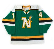
Matchup #20 has #18 the Dallas Stars Road jersey against the #82 Minnesota Wild Home sweaters. As bad as the Stars jerseys are, that's how good the Wild's are. Minnesota gets it, Dallas simply does not.
Matchup #21 is #7 the Boston Bruins Road jerseys against #71 the Washington Capitals Home jerseys. Boston has probably changed jerseys more than any other Original 6 club. Had they only stuck with their 1974-1990 jerseys, they likely would have won, but the Captials advance with one of the better jerseys of the Edge era as the Bruins are one and done.
Matchup #22 unfortunately paired #26 the Los Angeles Kings Road jersey with the #39 Los Angeles Kings Home jersey. The black homes advance for making the Kings look more intimidating than their road white brothers.
Matchup #23 sees #10 the New York Rangers Road facing off against the #74 New Jersey Devils Home jerseys. New York and New Jersey once again meet in Round 2. Another tough contest goes to the Rangers in overtime for their unique shoulder striping treatment, something we are amazed has not been appropriated by other clubs.
Matchup #24 is #23 the Dallas Stars Home jerseys against #42 the Edmonton Oilers Road jerseys. Two terrible sweaters, but someone has to win, and the game goes to Dallas for having stripes that go all the way around the arms and no senseless apron string piping.
Matchup #25 pairs #3 the Detroit Red Wings Road jersey against the #52 Buffalo Sabres Alternate. While the Sabres alternate is a fine effort, what it's trying to say is "What if we were around a long time and kept our sweaters as long as the Red Wings have kept theirs?" Detroit moves on.
Matchup #26 sees #30 the Philadelphia Flyers Home jerseys taking on the #35 Colorado Avalanche Home jerseys. Philadelphia's return to the basics with the addition of the early 1970's contrasting color nameplate easily defeats Colorado's Reebok template done up this time in Colorado's colors.
Matchup #27 has #14 the Montreal Canadiens Home jerseys schooling the #78 Phoenix Coyotes Alternate jerseys. Montreal's iconic red sweaters with the blue band easily dispatch the Coyotes modern jerseys.
Matchup #28 is the #19 Vancouver Canucks Road jersey facing the #46 St. Louis Blues Alternate jersey. The Blues gorgeous navy blue alternate bounces the Canucks white sweaters from the competition in a walkover.
Matchup #29 sees #6 the Toronto Maple Leafs Road jersey taking on #59 the Minnesota Wild Alternate jersey. A big upset in overtime, Minnesota advances in a shootout with their highly effective faux-back jersey, lucky to have not faced Toronto's blue or throwback.
Matchup #30 features #27 the Carolina Hurricanes Home jerseys and #38 the Florida Panthers Home jersey. Carolina's home jerseys have it all going for them, clever waist striping, one of the too few italicized number fonts in the NHL and a red and black color scheme. Now nearly 15 years old, it's showing no signs of going anywhere. Florida just can't compete when saddled with a Reebok template they would do themselves a favor by dumping yesterday.
Matchup #31 has #11 the New York Rangers Alternate jersey taking on #75 the Calgary Flames Alternate jersey. A tough contest which goes the way of the Rangers, as their tribute to their early days is a simple, effective jersey that shows that less is more.
Matchup #32 brings Round 2 to a close, as #22 the Tampa Bay Lightning Road jersey faces off against #43 the Atlanta Thrashers Road. What a down note to end this round on. Tampa's white jersey only exists because it has to. Still, we give it the nod over the Thrashers road white, which is so inferior to it's predecessor it's not funny.
Following Round 2, 13 of the 16 Original 6 jerseys continue on to tomorrow's Round 3.
Labels:
humor,
Jersey Bracket,
March Madness
Sunday, April 3, 2011
The 2011 Third String Goalie Jersey Bracket - Round 1
As is popular every year around this time, "March Madness" takes hold and brackets of all sorts are created to determine the best of the best, hence we bring you the 2011 Third String Goalie Jersey Bracket to determine which NHL jersey we feel stands alone above all others.
Some very basic rules we used were to use an online bracket creator to randomly seed all 86 NHL jerseys used this season as documented by NHLUniforms.com, leaving out any one time only jerseys such as those worn in the Winter Classic, giving the top 16 seeds in random order to the Original 6. Beyond that, we let the chips fall where they may. Lace up your skates and tie-neck collars, we're on to Round 1!
To follow along with the tournament as it develops, please visit our bracket online!
The tournament begins with matchup #1 with #64 the Anaheim Ducks Alternate against #65 the Pittsburgh Penguins Alternate with the victory going to the Penguins Alternate. Although we hate powder blue as a color for a professional sports franchise, feeling it's best suited to a baby's room, it's popularity and vintage looks far out weigh anything crested with a duck's footprint.
Matchup #2 is #49 the New York Islanders Home jersey against #80 the Minnesota Wild Road jersey. No matter how many times the Islanders keep trying to kill this jersey, it being the symbol of the Islanders Stanley Cup dynasty of the 1980's dictates that it keeps coming back, again and again. The while Wild jersey gets points for it's unique "fuzzy bear" number font, even if it is a bit cartoonish, but the jersey did suffer a bit when it was turned into an Reebok Edge jersey, the narrowing of the gold and red stripes down the arms, it loses out to the latest version of the classic Islanders jersey.
Matchup #3 is #48 the Los Angeles Kings Alternate against #81 the Phoenix Coyotes Road jersey. The white Coyotes jersey was such an improvement over it's bizarre predecessor that it easily defeats the Kings colorless alternate.
Matchup #4 sees #57 the Nashville Predators Road jersey taking on #72 the San Jose Sharks Road jersey. Nashville loses all kinds of points for having low contrast silver on the shoulders and down the arms instead of blue, as well as Reebok's "apron strings" piping on the front. Going up against San Jose's classic striping and colored shoulders doesn't help at all, giving San Jose the easy win.
Matchup #5 has #56 the Columbus Blue Jackets Alternate against #73 the Vancouver Canucks Home jersey. While we are not fans of the Canucks unattractive number font and the odd negative look to their recolored main logo, which used to be blue on both the home and away jerseys when it was originally introduced back in 1997, or the fact the crest is made smaller by the obtrusive "Vancouver" above it, the Blue Jackets horrid new alternate defies belief with it's utterly boring clip art cannon logo and rancid, futuristic number font paired with a vintage looking jersey that makes generous use of antique white. Vancouver in a breeze.
Matchup #6 is #61 the San Jose Sharks Home jersey against #68 the Atlanta Thrashers Home jersey. With the controversial Thrashers asymmetrical navy blue left arm with a garish "Atlanta" running down the sleeve paired with the less than intimidating powder blue body color and white numbers outlined in yellow being on the leading edge of ugly and stupid, they push the whole package over the edge by choosing a lace up collar, cramming an old school element onto an otherwise completely modern design. The Sharks advance by virtue of being paired against the worst jersey in the league.
Matchup #7 is #52 the St. Louis Blues Road jersey taking on #77 the Tampa Bay Lightning Home jersey. We've never liked the fact Tampa Bay wore black instead of blue, and the choice of going with a standard block font several seasons ago instead of the old paintbrush style numbers they used to use means Tampa Bay has no chance against the simple but effective Blues white road jersey, despite Reebok's apron strings. St. Louis moves on.
Matchup #8 is #45 the Nashville Predators Alternate taking on #84 the Philadelphia Flyers Road jersey. Nashville's alternate is part of a recent trend in alternate jerseys, which we are not fans of. Rather than promoting a club's secondary color to first line status on the alternate jersey as in the past, the new trend is to compliment a team's primary colored jersey with...
a primary colored alternate that also dumps a team's contrasting third trim color, in this case yellow, which creates another dark, essentially monochromatic jersey that looks like the yellow inkjet cartridge on the Predator's printer just ran out. The Flyers white road jersey, retained from it's debut in the Winter Classic, advances easily.
Matchup #9 sees #63 the New York Islanders Road jersey up against #69 the Pittsburgh Penguins Road jersey. While the Penguins white road jersey is not as strong as their home black, it gets the nod over the Islanders road jersey, which is also not as strong as it's blue home counterpart. Penguins in a shootout.
Matchup #10 has the #53 New Jersey Devils Road jersey battling the #76 Colorado Avalanche Alternate jersey. The Devils high contrast white jerseys with black and red accents easily trounces the Av's horrible steel blue alternates. If you just have to combine that shade of blue with burgundy, it should never, ever be the predominate color.
Matchup #11, which completes the top half of the bracket in Round 1, has #44 the Anaheim Ducks Home jersey up against #85 the Florida Panthers Alternate. The Panthers advance with their two shades of blue and classic hockey striping in a jersey somewhat reminiscent of the classic University of Maine jerseys, while the Ducks use of a wordmark better suited to being a secondary logo, over inflated number font and swoopy stripes cost it any chance to move on.
Moving on to the bottom half of the bracket, matchup #12 has #63 the Colorado Avalanche Road jersey facing #66 the Edmonton Oilers Home jersey. Edmonton's modern take on their Gretzky era jerseys wins over the Avalanche's road whites, a jersey which suffered more at the hands of the change to the Edge jerseys as much as any, losing it's distinctive mountain range striping pattern along the waist in the transition. Edmonton takes this one without a struggle.
Matchup #13 has #50 the Pittsburgh Penguins Home jersey up against #79 the Atlanta Thrashers Alternate. While we have seen the Thrashers burgundy alternate near the top of more than one "worst jersey" list, often comparing it's styling to that of a football jersey, we don't really have the same animosity for it. However, it doesn't have a chance against the Penguins striking black home jersey done in by far the best of the Reebok templates used for the conversion to Edge jerseys in 2007.
Matchup #14 is #47 the Carolina Hurricanes Road jersey up against #82 the Minnesota Wild Home jersey. What if the Minnesota Wild were an Original 6 team? They would have worn this sweater some time in the 1940's. Some cannot get past the "Christmas" aspect of the color combination, but the vintage perfection of this "sweater", including the felt logo, makes it a winner over Carolina's nice road jersey, highlighted by he use of the hurricane warning flags as the waist stripe and one of the best secondary logos going. Minnesota in overtime.
Matchup #15 is #58 the Tampa Bay Alternate up against #71 the Washington Capitals Home jersey. While we heartily approve of the Lightning's choice of blue as the primary color for their alternate jersey, using "Bolts" diagonally splashed across the front dooms the jersey to a quick Round 1 exit when facing Washington's well received modern take on their original jerseys.
Matchup #16 has #55 the Columbus Blue Jackets Home jersey facing #74 the New Jersey Devils Home jersey. We'd like the Blue Jackets jersey more if the area above the white and red arm stripes were white, giving the all-navy blue jersey contrasting shoulders instead. Meanwhile New Jersey's red home jersey looks set to join the Original 6 as a classic, unchanging look which is already associated with multiple Stanley Cups. A close one, but New Jersey advances due to having more contrast.
Matchup #17 is #62 the Buffalo Sabres Alternate up against #67 the Edmonton Oilers Alternate. The Oilers alternate dates back to the debut of the Reebok Edge jerseys in 2007 and is saddled with the worst of the Edge templates, resulting in apron string piping and oddly shaped stripes on the arms which cannot even manage to wrap all the way around. Even Edmonton has demoted this jersey from being the primary home to the alternate, and now the Sabres new "faux-back" demotes it right out of the bracket.
Matchup #18 has #51 the Vancouver Canucks Alternate facing #78 the Phoenix Coyotes Alternate jersey. In an upset, the Coyotes unique alternate, which works really well in it's black and brick red colors and we like the dynamic running coyote main logo. This jersey also rates among the ones that look even better in action. While the Canucks use of the "stick in rink" logo is an improvement over the orca logo with the wordmark, the original Canucks jerseys were simply not that great to begin with, and their attempt at a modernization still leaves you with a basic jersey and a really dull main crest, even if modernized a bit.
Matchup #19 puts #46 the St. Louis Blues Alternate jersey in against #83 the Columbus Blue Jackets Road jersey. Oh man, what a tough one to call. The Blue Jackets striking jersey gets high marks for it's colors and template, but we just love the Blues alternates which incorporates the St. Louis Arch in a newly created logo for this classy navy jersey. The balance tips toward St. Louis due to the Blue Jackets main crest falling short as a primary, as we've always felt it was more suited to being a secondary logo.
Matchup #20 is #59 the Minnesota Wild Alternate jersey versus #70 the Buffalo Sabres Home jersey. Buffalo loses this one despite a good effort, but the unnecessary piping on the front and the contrasting colored armpits as well as the silver outlines on the yellow stripes leave the Sabres short of Minnesota's attempt to capture retro perfection in a bottle twice. We think it could have used red upper arms to give it a shot of color, but it's enough to make it to the next round.
Matchup #21 pits #54 the Carolina Hurricanes Alternate jersey against #75 the Calgary Flames Alternate. Carolina loses simply for taking the red and black hurricane warning flag waist stripes from the home and road jersey and sucking all the color out of them. Hello? You can't change the colors of the flags without changing the meaning of them! If it's not a red and black flag, it just becomes a geometric stripe of grey squares in black squares. The primary logo used as the secondary shoulder logo also gets the same treatment of having all it's color sucked out, making it nearly invisible in a location that could use a shot of color. Too bad, because the secondary logo promoted to the primary, combined with the sharp black jersey and wonderful italicized number font makes this otherwise one of our favorites of the Reebok era. Calgary's alternate, reviving their original, Stanley Cup winning jersey wins going away.
The final pairing of Round 1, matchup #22, pairs #43 the Calgary Flames Home jersey with #86 the Atlanta Thrashers Road jersey. Atlanta pulls off the upset in spite of being saddled with Reebok's apron string template and some unexplainable white slashes on the lower arms, but Calgary's continued use of a black "flaming C" just irritates the heck out of us. Black is a "cool" color, the color of something cold and dead. It is not a "hot" color, such as white, yellow, orange or red, any one of which the Flames main crest should be. Just look no further than the Flames road or alternate jerseys to see how it should be done. Until then, the red jersey with the black "C" remains dead to us.
This wraps up the opening Round 1 of the 2011 Third String Goalie Jersey Bracket.
Please check back for the 2nd Round when the top seeded heavy hitters from the Original 6 join the competition, as well as 26 other new competitors. In the meantime, feel free to add your comments below!
Labels:
humor,
Jersey Bracket,
March Madness
Subscribe to:
Posts (Atom)